
Logo inspiration
Inspirational logos
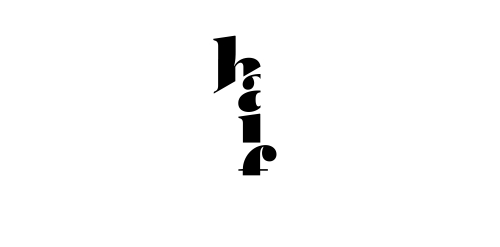
Expressive typography logo that presents 1/2. Made for fun.


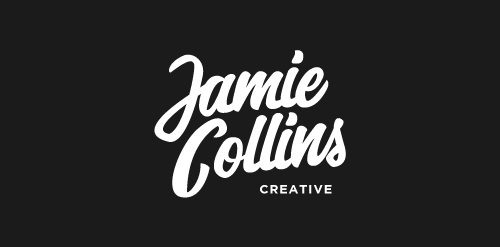
1/3 concept sketch of the personal logotype for Jamie Collins, tried to accomplish a whimsical look in this concept.

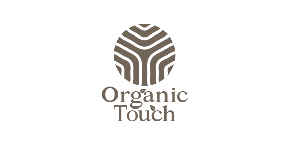
Inspired by organic products.
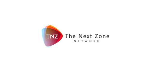
Internet Service Provider focused on wireless connection.
Architecture department at Białystok University of Technology. Description: simple, easy to remember and draw sign. Symbolical reference to steel bridges span, construction, modular grid. Including W&A letters. ("Wydział Architektury" Architecture Department). Symbolical imaging of 3 parts/triangles as 3 faculties: - architecture & town-planning, Interior architecture, Graphic design


logo 2
A logo monogram created from the first letters of company's name and, actually the owner's name.

ideris is a small company full of web 2.0 ideas.

Logotype with russian character. Special work
Brand name: Jin Sha Blog - Field: Travel, Restaurant & Resort - Year: 2013 - Location: Austria - Web: www.jinshablog.org - More About It: http://www.behance.net/gallery/Jin-Sha-Blog/9836717
dancing petal design
Some thoughts about the wordplay...
The keywords in the brief were - security, prosperity and stability, so I thought of the image of a great tree. Any critique will be appreciated.
MoonCake Cafe logo design
cafe, caramel apples
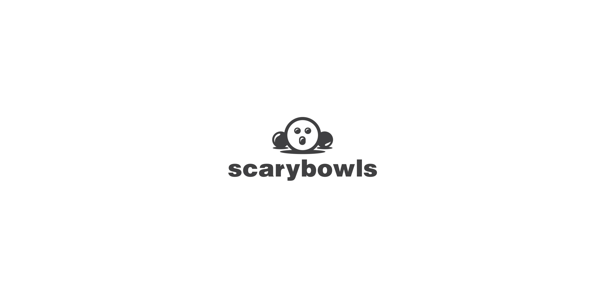
Bowling club logo.
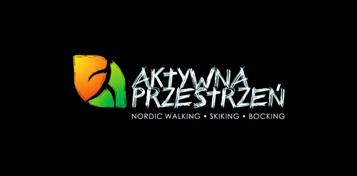
Recreation on a open space - company logo. Especially by nordic walking, bocking and skiking.
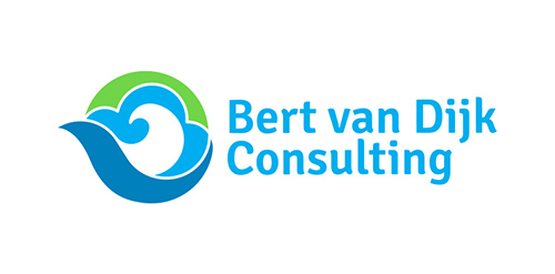
Logo for www.bertvandijkconsulting.com Bert van Dijk Consulting advises and supports projects in the energy sector, such as wind farms. The key concept here is "Powered by renewable energy from sea".
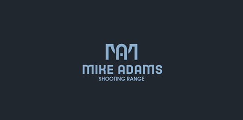
Logo for shooting range. Letters M&A stylized for sights of a gun.
☆ HONORS ☆

-
shtef-sokolovich
190 logos
-
Boldflower Design Studio
189 logos
-
Ailton Marques
115 logos
-
Light Rainer
114 logos
-
Alek • Triptic.pl
107 logos
-
almosh82
96 logos
-
sadany
96 logos
-
Duminda Perera
93 logos
-
pizelato™
91 logos
-
Aleksandar
91 logos

Recent comments
حسین:
please send me...
chirag_j:
Hello is the above issue resolved?...
mrgraphics:
great logo...
Aleksandar:
Thank you Gile!...
fraGile:
Thanks a lot!...
Marko Bulatovic:
Great work!...
Popular tags
Our logo inspiration gallery will give you the creative boost you're looking for. Get your daily dose of logo design inspiration to work on your own logo design projects and get your business going. Be amazed by our logo designers and their brand guidelines. We are here to help you impress your clients and our fellow designers. Professionalize your logo design skills and get yourself to a new level. Browse our logo design gallery and discover all the new logo design trends and much more. We know you love logos!