
Logo inspiration
Inspirational logos
Fall 7 times and get up 8 times, is a japanese saying, that has inspired this logo. The logo is for a photographer based in Canada.


company is engaged in marketing of aroma - aromatization of various premises, activities, points of sale
Flower Chef - Great online flower shop. Florist owners describe themselves as master chefs in the flower industry ;)
*
old bakery that was looking for a simple logo in an old style.
Funny logo for coffee-bar
Some experiment about verbicon, i hope you like :)
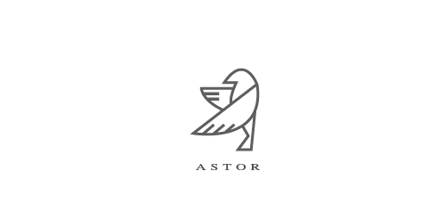
ASTOR is fresh modern dynamic brand with short easy memorable name. It will suite well to any business or industry.
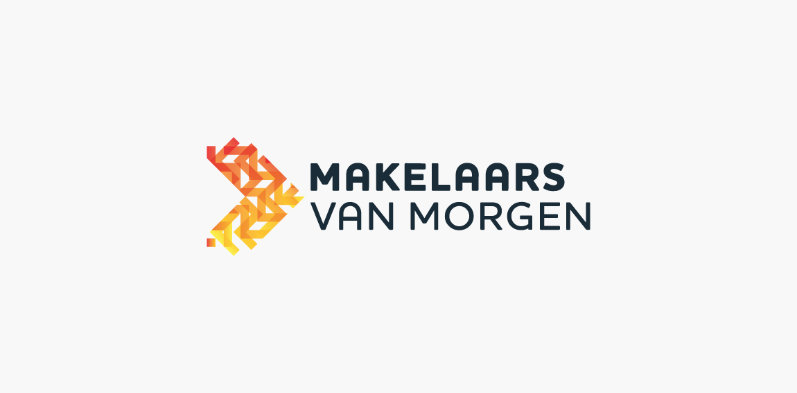
Logo design for a Dutch online real estate marketing company.
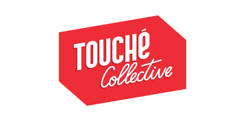
Touché Collective is a young creative collective from The Netherlands. Check them out at www.touchecollective.com

BATRONOX is fresh modern dynamic brand with short easy memorable name. It will suite well to any business or industry
culture portal logo
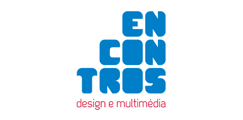
[see more in behance @ http://bit.ly/W8GJLS] Encontros Design e Multimédia is an event. It has being taken place since 2009 and consists in a week dedicated to promote and develop design and multimedia activities, workshops and meetings in the city of Braga. It's promoted by Escola Profissional de Braga. The design, organisation and communication of the event is the responsibility of a finalist student. [The brief] Encontros Design e Multimédia had a clear ambition, grow year after year, it wanted to inspire, involve and thrill the students, professionals and enthusiasts about Design and Multimedia. The logo was to be used in the website, facebook, promotional material, including posters, flyers, video, and a lot more. The goal couldn't be clearer, it had to be unusual. [The solution] The logo represents Encontros's strong ambition. It has all the elements to succeed, it's simple, relevant, it incorporates tradition, it's distinct, memorable, versatile and it stands out from the crowd. It's designed to be filled. Filled with photos, images, participants, speakers, filled with design and multimedia. It has no icons of design or multimedia and doesn't need them, it has all the qualities of both and all the creativity to be anything. [Typography] Encontros has a unique typeface, its custom and it's designed specifically for this brand. It's a bold geometric typeface designed to be filled and to get noticed in every contexts. [Colors] The colors are one of the most important elements of Encontros. The chromatic scheme is very expressive, it's a variation of the well known CMYK, providing a vast number of combinations making the brand very dynamic and inspiring as well. [see more in behance @ http://bit.ly/W8GJLS] [joserodrigues @ http://be.net/joserodrigues]
Perm Regional Library named after M. Gorky
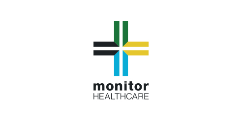
I was approached by new organisation 'Monitor Healthcare' to design their logo and brand identity.
Monitor Healthcare aim to provide people all around Africa with free medical advice via online and telephone methods. As this service is to be for the full continent I wanted to create a logo that would represent this unity.
The different colours of each section of the cross are representative of the North, East, South and West regions of Africa. The individual colours were picked based on the flags of the countries within each region.
The white cross in the middle of the logo is to symbalise the unity of the continent which Monitor Healthcare aim to provide.
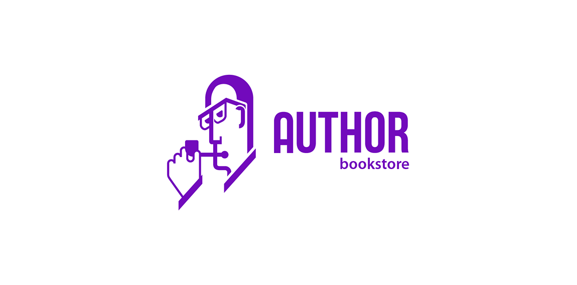
Logo for a bookstore focused on crime and detective novels.
Logo for Loucomotion design studio located in Brasil.
☆ HONORS ☆

-
shtef-sokolovich
190 logos
-
Boldflower Design Studio
189 logos
-
Ailton Marques
115 logos
-
Light Rainer
114 logos
-
Alek • Triptic.pl
107 logos
-
almosh82
96 logos
-
sadany
96 logos
-
Duminda Perera
93 logos
-
pizelato™
91 logos
-
Aleksandar
91 logos

Recent comments
حسین:
please send me...
chirag_j:
Hello is the above issue resolved?...
mrgraphics:
great logo...
Aleksandar:
Thank you Gile!...
fraGile:
Thanks a lot!...
Marko Bulatovic:
Great work!...
Popular tags
Our logo inspiration gallery will give you the creative boost you're looking for. Get your daily dose of logo design inspiration to work on your own logo design projects and get your business going. Be amazed by our logo designers and their brand guidelines. We are here to help you impress your clients and our fellow designers. Professionalize your logo design skills and get yourself to a new level. Browse our logo design gallery and discover all the new logo design trends and much more. We know you love logos!