
Logo inspiration
Inspirational logos


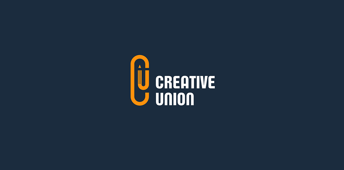
Logo for a creative agency. Letters C and U are combined into a paperclip which symbolize union and one of the tip of the paperclip is formed as a pencil - a symbol of creativity.
Ideas: the initials "D" and "P", side view of an eye with eyelashes...

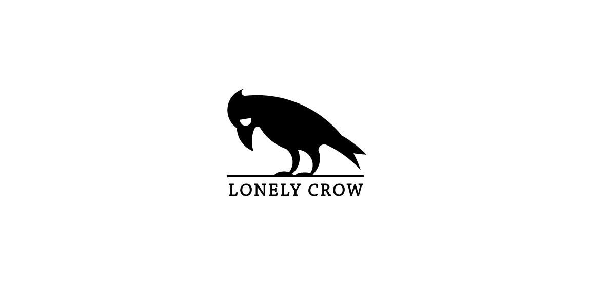
Lonely Crow logo
Militree Design & Clothing Concept Logo
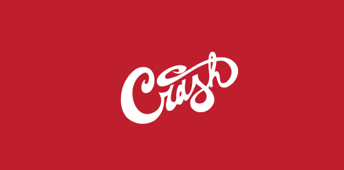
CRASH
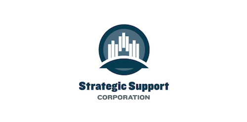
Freight Forwarding Company
WINGSO is fresh modern dynamic brand with short easy memorable name. It will suite well to any business or industry.
Revamp
The logo is an emblem of my three distinct cultural identities as a graphic designer: the head of a Chinese dragon, the body of an English lion and the tail of a Portuguese rooster. Born in a Portuguese colony in China where east meets west, I grew up in a richly diverse cultural background and have now lived in the English capital for more than ten years.
Logo for the studio of architecture and interior design
Logo para o departamento de Vigilância Ambiental da prefeitura de São José do Rio Preto
Hip-Hop/Rap/Jazz
This logo was made for a blog that is about giving tips on how to fall asleep and how to wake up early.
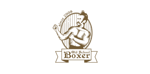
vintage boxing label
Logo for funneral company
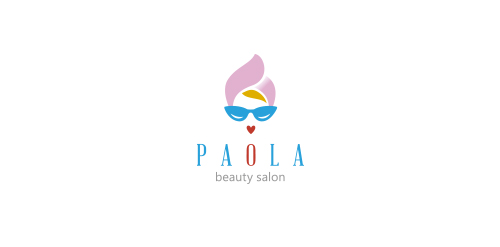
logo in retro style, designed for small beauty salon
Logo for a contest for Polish Space Agency. Logo shows a planet and arrows as a 'reaching for the stars' symbol. It's dynamic but stable as well. I'd like to show that logo as a tribute to momdernism polish logos from '60, '70 which was very expresive in its form but simple and clean as well.
It is a watch company that donates the proceeds to charity.
☆ HONORS ☆

-
shtef-sokolovich
190 logos
-
Boldflower Design Studio
189 logos
-
Ailton Marques
115 logos
-
Light Rainer
114 logos
-
Alek • Triptic.pl
107 logos
-
almosh82
96 logos
-
sadany
96 logos
-
Duminda Perera
93 logos
-
pizelato™
91 logos
-
Aleksandar
91 logos

Recent comments
حسین:
please send me...
chirag_j:
Hello is the above issue resolved?...
mrgraphics:
great logo...
Aleksandar:
Thank you Gile!...
fraGile:
Thanks a lot!...
Marko Bulatovic:
Great work!...
Popular tags
Our logo inspiration gallery will give you the creative boost you're looking for. Get your daily dose of logo design inspiration to work on your own logo design projects and get your business going. Be amazed by our logo designers and their brand guidelines. We are here to help you impress your clients and our fellow designers. Professionalize your logo design skills and get yourself to a new level. Browse our logo design gallery and discover all the new logo design trends and much more. We know you love logos!