
Logo inspiration
Inspirational logos
Yachting Service - concept --- www.nlogo.pl


A work in progress.
Installation and maintenance of vending machines.
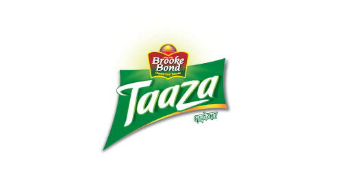
The ribbon that runs across evokes refreshment. The‘t’ & ‘z’ denotes active motion. Green colour brings out the freshness of the tea.
Ulla & Markus wedding logo
KOBALT pracownia projektowa
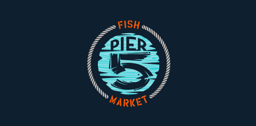
This logo is for a completely fictitious fish market.
The idea came to me when I discovered that it was possible to achieve a fish shape in the negative space within the bowl of the number 5. Dubbing my hypothetical company Pier 5 Fish Market, I created this illustrative mark in the hopes of really capturing the spirit of the nautical and maritime aesthetic. Type is custom for "Pier" and also the number 5, which is hand-rendered to look like it was painted on a wooden sign with a very wide, worn-out, thick-bristled brush. While it was important for the fish to show in negative space, it needed to look like a seemingly happenstance result of logical, real-world brush strokes. This is the minimal, alternate version of this logo.
Click here to see the case study for this logo, which chronicles its development, and includes full design rationale, sketches, electronic roughs, and alternate designs.
Identity for Boldex Oil & Gas Supply Company
Out of the box, creative design. For sale!
negative space utilised

Free Fallin' logo
Global Events Brand by designdough
Web design company based in Dublin, Ireland.
Sign on the yacht
Farowind concept / www.nlogo.pl
IT company
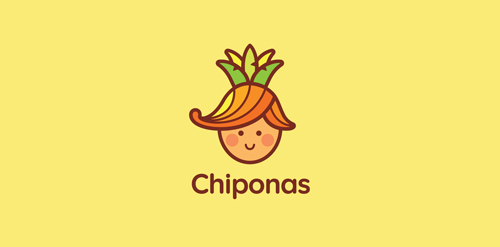
Chiponas consists of two russian words: Chipollino - onion boy (russian children's book character) and pineapple. An online store offering a wide variety of goods from children's toys to pet food. * http://en.wikipedia.org/wiki/Cipollino
Logo for pet store specializing in the sale of fish
logo design for an organic fast food company.
logo for a translation services company based in united states.
Eco farm products from milk and meat.
☆ HONORS ☆

-
shtef-sokolovich
190 logos
-
Boldflower Design Studio
189 logos
-
Ailton Marques
115 logos
-
Light Rainer
114 logos
-
Alek • Triptic.pl
107 logos
-
almosh82
96 logos
-
sadany
96 logos
-
Duminda Perera
93 logos
-
pizelato™
91 logos
-
Aleksandar
91 logos

Recent comments
حسین:
please send me...
chirag_j:
Hello is the above issue resolved?...
mrgraphics:
great logo...
Aleksandar:
Thank you Gile!...
fraGile:
Thanks a lot!...
Marko Bulatovic:
Great work!...
Popular tags
Our logo inspiration gallery will give you the creative boost you're looking for. Get your daily dose of logo design inspiration to work on your own logo design projects and get your business going. Be amazed by our logo designers and their brand guidelines. We are here to help you impress your clients and our fellow designers. Professionalize your logo design skills and get yourself to a new level. Browse our logo design gallery and discover all the new logo design trends and much more. We know you love logos!