
Logo inspiration
Inspirational logos

For purchasing contact me.


Abstract bird in the shape of a swan with increasing financial bars
Logo Blossom Mother and baby
Logo for 3D movie studio
Taaleem, which means 'education' in Arabic, is committed to inspiring students and helping them to identify and develop their passions and talents. We only recruit the best international teachers who are capable of delivering our international curricula in a creative and engaging manner. Taaleem seeks to raise the educational standards in the region. The combined experience of its core team of senior education leaders in international education policy, operations and global management best practices means Taaleem is well positioned to ensure the creative of truly exceptional schools that satisfy the most comprehensive and exacting education developmental requirements.
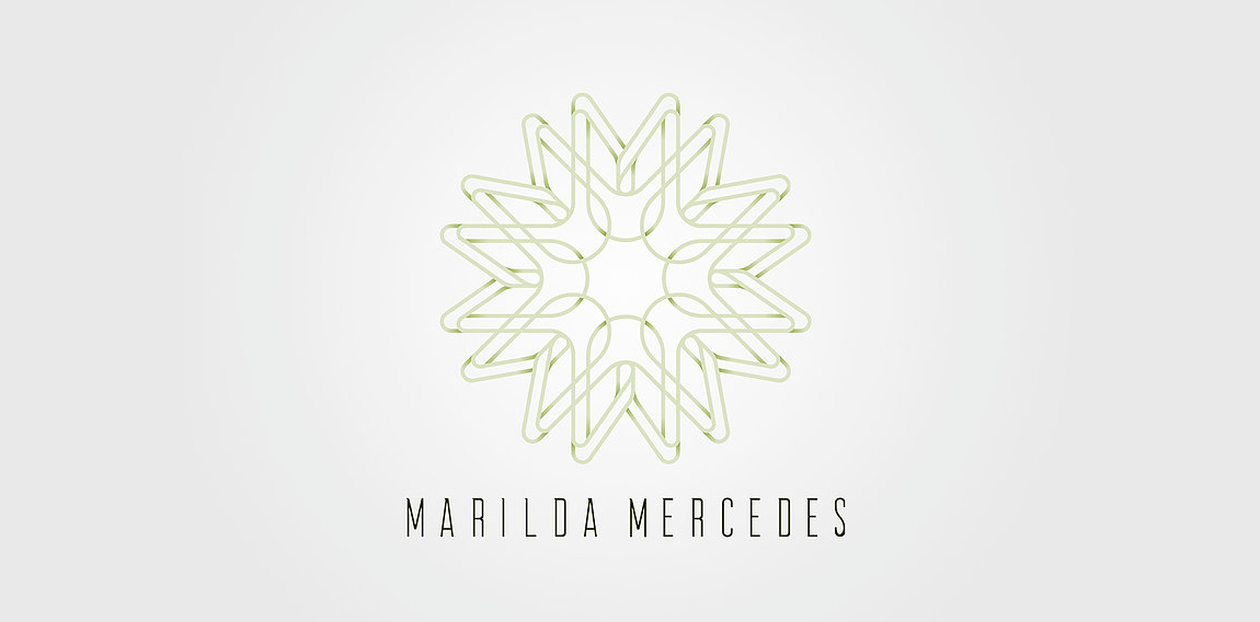
The project had as its starting point to convey the essence of the service offered. For this, they were considered as pillars of the concept, the reception, the human relation and the trust. The brand, built from the initials of the name of the professional, form a mandala that in addition to refer to energy and reflection, create a link with the patient.
Turnkey marketing solution for dental practices.
whatzever logo
Dumma Branding is the design house of Duminda Perera. Duminda is currently involved in an ongoing logo project for design every day one Original, Clever, Wordmark/Verbicons or Negative logo.
farm food online store

Logo for a home decor business. The mark represent's the companies initials CQ and the sun, sea and scenery of the Caribbean.
Its been it been a while that didn't update any Clever Wordmark, thought of comeback with this Arrow logotype today, hope i will find more time for this day to day activity in future
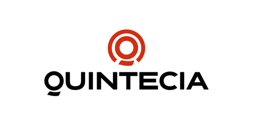
Human resources consulting organization based in Paris, Quintecia trusted Brand Brothers to redesign its corporate identity and its global branding. Professionalism, credibility, transparency and proximity are the values passed through this new identity, wich includes an original typography.
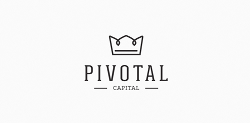
Brand name : Pivotal / Field: Real estate, Investment / Year : 2013 / Location : UK for more check it out http://www.behance.net/gallery/Logotypes-Marks-2010-2013/9215817

Finalized concept for a website which lets you manage your health records online along with many other things such as health trackers, health scoring tools, smart cards access to top doctors, and intelligent alerts & reminders. Approved by the client.
Logo PROJECT FLOW

Pegla (pegla means iron in Serbian) concept typo
Decoration In Saudi Arabia
Logo for construction company. Bright graphic sign in the form of a folding line is a symbol of precision and accurate work, transforming it takes the form of the initial letters of the name of the company «Z»
A logo for the company "Žizela" (Giselle) that designs and manufactures ballet and wedding dresses. The company's name is based on the famous Russian ballet Giselle.
☆ HONORS ☆

-
shtef-sokolovich
190 logos
-
Boldflower Design Studio
189 logos
-
Ailton Marques
115 logos
-
Light Rainer
114 logos
-
Alek • Triptic.pl
107 logos
-
almosh82
96 logos
-
sadany
96 logos
-
Duminda Perera
93 logos
-
pizelato™
91 logos
-
Aleksandar
91 logos

Recent comments
حسین:
please send me...
chirag_j:
Hello is the above issue resolved?...
mrgraphics:
great logo...
Aleksandar:
Thank you Gile!...
fraGile:
Thanks a lot!...
Marko Bulatovic:
Great work!...
Popular tags
Our logo inspiration gallery will give you the creative boost you're looking for. Get your daily dose of logo design inspiration to work on your own logo design projects and get your business going. Be amazed by our logo designers and their brand guidelines. We are here to help you impress your clients and our fellow designers. Professionalize your logo design skills and get yourself to a new level. Browse our logo design gallery and discover all the new logo design trends and much more. We know you love logos!