
Pending logos
Pending logos – Page 11
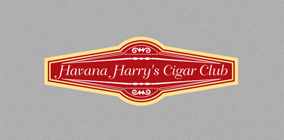
The red and gold Havana Harry's Cigar Club logo relies on its vivid colors, delicate font, and fine lines to suggest elegance and luxury.


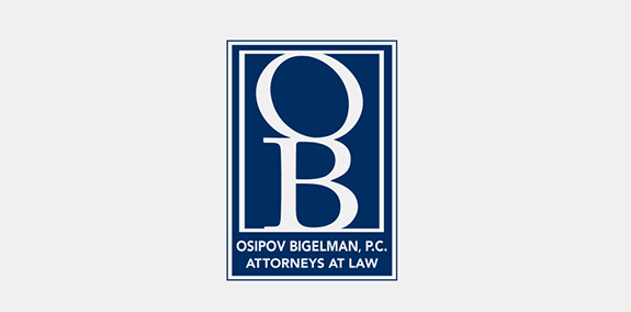
Dark blue and white color branding give this law firm's logo an elegant look. The OB monogram creates an easily recognizable symbol, while the text below it spells out Osipov Bigelman, P.C.'s full brand name.
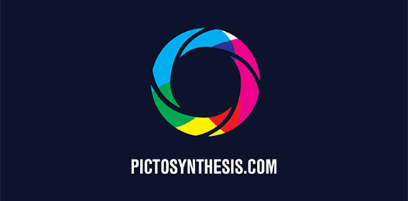
This logo for Pictosynthesis plays on the brand name by using the rainbow of colors found in a light prism to represent "synthesis" and arranging these colors in the shape of a camera lens to represent a "picture."
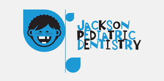
Jackson Pediatric Dentistry creates a kid-friendly feel with a cartoon of a freckle-faced kid and a messy, off-kilter font. Black and blue color branding add a professional tone to make the logo appealing to parents.

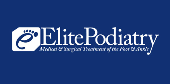
Five dots transform a lowercase e into a foot, making it the perfect symbol for Elite Podiatry. The letter also acts as an abbreviation for the brand's full name.
The Other Side logo

Logo for a website for Qura'n.
A new logo for Pixeleator advertising
Logo for radio station.
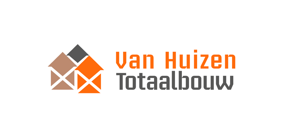
Building company. Their 3 pillars of work segment are 'Rebuild, renovate, installation'. Rebuild with concrete, grey color. Renovate with timber, brown color. Installation with copper, orange color. Scaffolding stands for building work in negative white. Houses stands for the name 'Huizen' Dutch for houses.
Logo is made of Pantone colors 1585C and CMYK 80K with an overlay of both for the brown color.
Logo in use at http://www.huizentotaalbouw.nl/.
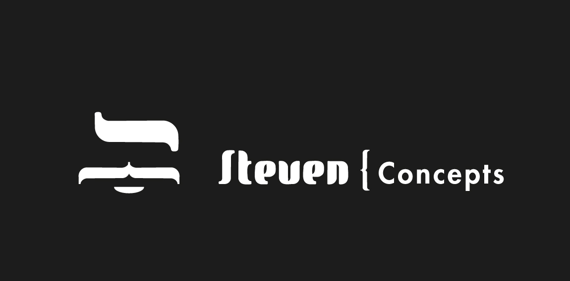
Brand builder of luxury retail startups. Initials are used as brand mark. Steven is the 'godfather of brands' just as maffia bosses tend to be. The new look has to be stylish, bold and recognizable.
It's client work, a proposal that isn't approved.
www.minahander.se

Some experiment about verbicon, i hope you like :)
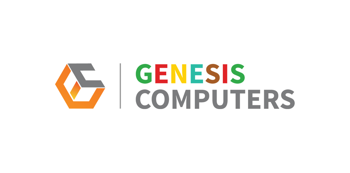
Logo design for Genesis Computers - a computer accessories retail shop
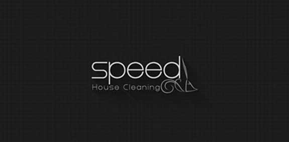
I designed this logo for house cleaning company and the concept of this logo in the sweeper and the effect on it
The Eco Realty Community logo depicts a city to emphasize the words "realty" and "community." Its gold-on-black color scheme creates a high-end look.
The Zenith Facility Services logo creates motion with slanted type and a "Z" that morphs into overlapping shapes. Its blue and white brand colors add a cool, professional tone to balance the design's energy.
The Green Hills Real Estate Group logo builds a house out of shapes in various shades of green, a clever design that emphasizes the brand's name.
*
*
*
KUKUKK Kollektiv from Berlin, Germany
Villa - Apartment located on the beautiful coast I wanted to relax in the logo signals
This is a logo I made for myself.
Please let me know what you think.