
Pending logos
Pending logos – Page 14
Logo for web development company


App for creating connected City using Bluetooth Low Energy

Students Security solution a company that provides different kinds of services like CCTV'S,Fire Alarm and security solution in school and colleges.
Exclusive car Accessories shop.
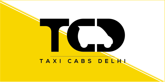
A car rental company in Delhi, Taxi Cabs Delhi provides a full-fledged, low cost and excellent taxi and cab services all around Delhi. A fleet of cars and SUVs of almost all brands like Mercedes, BMW, Ford, Ambassador, Tata Indica, Toyota Camry, Tavera, Maruti etc. are included.
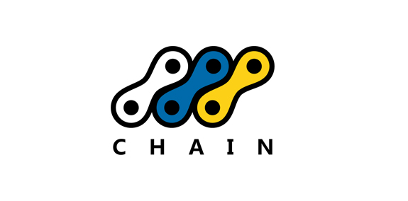
Chain logo foro a bicycle store! Feedback and support appreciated!
For Anugrah lovers
Design for looking numbers logo
The logo was created for a company offering glass services in Wroclaw, Poland.
Logo for print services
Logo for Facebook comunity
Logo for nutritionist and and professional athletic
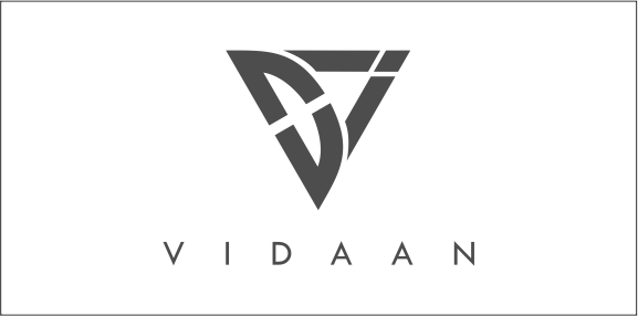
V I D A A N characters to be in the logo symbol and display the charactor of all of them uniquely. Alongside, we also wanted to have one important aspect of our attitude to reflect in the logo, a fast growing attitude! A fast growing attitude, we would like to provide our esteemed cusomters and also derive for ourselves. And to reflect the same, an upward and forward direction ARROW came much close to our imagination and rational thinking. Hence after a lot of time and creation. we came up with this logo.
Logo Design for Dog Shelter
Logo Design for Resort
Z check mark. Unused concept.
Students Stop is a platform for students need. Buy, Free lists old products, doorstep services, talk and take help from experts. In logo I replace last two letters with book and bookmark which also can be read like letters "o" and "p".
Studio Copper is an american company that handcrafts genuine copper mugs that was born in 2015.
Once upon a time, the area known as Via Padova in Milan, Italy, had a less than salubrious reputation. Our project was to help change that image by creating a new identity for the area that would bring the various groups of people – or local tribes as we called them – together. We needed to represent Via Padova as a space that welcomed every one of its citizens – a challenging proposition. The city needed a visual system, a graphic identity that could organise and simplify communication with the people. We used the letter V to symbolise a handshake – and hence the union and coming together – of two people, symbolising a community coming together.
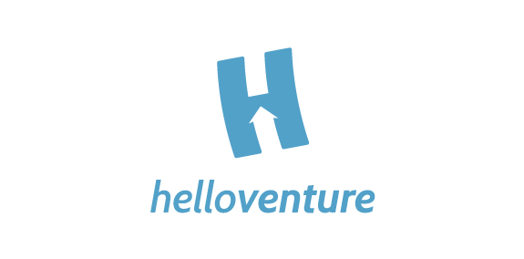
Hello Venture is an organisation that brings start-up communities together and creates spaces for entrepreneurs to learn and work. In this case, the brand identity that we created focuses on the letter H with an arrow inside to symbolise the progressive growing of the new enterprises. The H is flying up. The logotype is set in lowercase letters to emphasise the company’s humble and friendly approach. The colour scheme represents security and confidence. The result is a minimalist identity with customised typeface and flexible print material.
The logo depicts a balanced diet for good health. All the necessary food items that contain the important nutrients are displayed in the logo.
The logo is depicted in red and black colors. The hand prints and the sign of 'Om' give a religious and spiritual touch to the logo.
Logo/mascot for "bufet Pelikan".
Logo for the foundation.