
Company Folders
Company Folders, Inc. is a print marketing firm offering quality logo design services at reasonable prices. Their expert team has decades of combined expertise, helping them to design custom logos of all types - including brandmarks, wordmarks, lettermarks, combination marks, and emblems.
 Joined September 2015
 20 logos
 http://www.companyfolders.com/logo-design-services
The Russell Patterson logo creates the "RP" logo using negative space. Its color palette is also reverse of what's expected—instead of dark symbols on a white backdrop, it uses white on a dark backdrop.


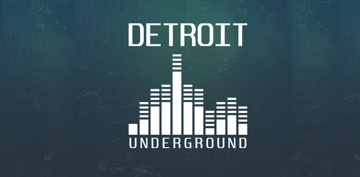
The Detroit Underground logo utilizes a flat minimal design, also featuring a graphic that resembles a skyline and a volume equalizer.

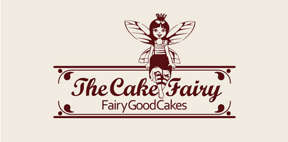
The Cake Fairy logo's illustrative style and chocolate-colored color branding add a cute retro style—and spark viewers' cravings for chocolate cake.
The Randy Parker Photography logo combines gold type with a metallic effect on a black background to create an elegant, high-end look.
The Ocean Palace Luxury Resort logo features a minimal black and white color palette to keep the focus on its intricate symbol, which bears a crown in the middle to imply luxury.
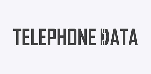
A no-nonsense sans serif font sets a professional tone for Telephone Data's logo, but one letter contains a surprise—the "D" is shaped like a phone.
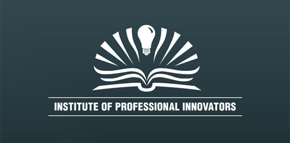
The Institute of Professional Innovators logo features a light bulb emerging from the pages of an open book to convey the concepts of bright ideas and constant study.
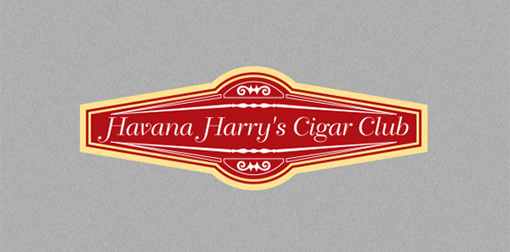
The red and gold Havana Harry's Cigar Club logo relies on its vivid colors, delicate font, and fine lines to suggest elegance and luxury.
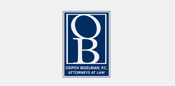
Dark blue and white color branding give this law firm's logo an elegant look. The OB monogram creates an easily recognizable symbol, while the text below it spells out Osipov Bigelman, P.C.'s full brand name.
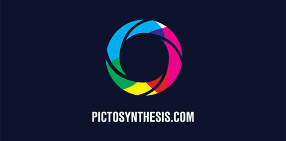
This logo for Pictosynthesis plays on the brand name by using the rainbow of colors found in a light prism to represent "synthesis" and arranging these colors in the shape of a camera lens to represent a "picture."
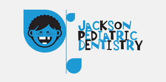
Jackson Pediatric Dentistry creates a kid-friendly feel with a cartoon of a freckle-faced kid and a messy, off-kilter font. Black and blue color branding add a professional tone to make the logo appealing to parents.
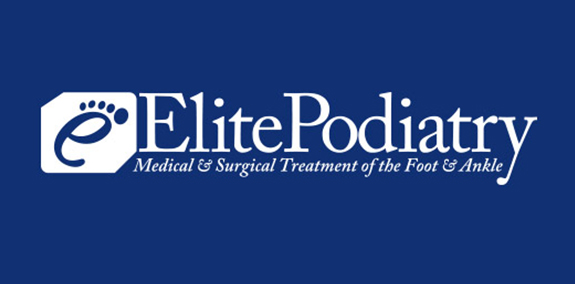
Five dots transform a lowercase e into a foot, making it the perfect symbol for Elite Podiatry. The letter also acts as an abbreviation for the brand's full name.
The Eco Realty Community logo depicts a city to emphasize the words "realty" and "community." Its gold-on-black color scheme creates a high-end look.
The Zenith Facility Services logo creates motion with slanted type and a "Z" that morphs into overlapping shapes. Its blue and white brand colors add a cool, professional tone to balance the design's energy.
The Green Hills Real Estate Group logo builds a house out of shapes in various shades of green, a clever design that emphasizes the brand's name.
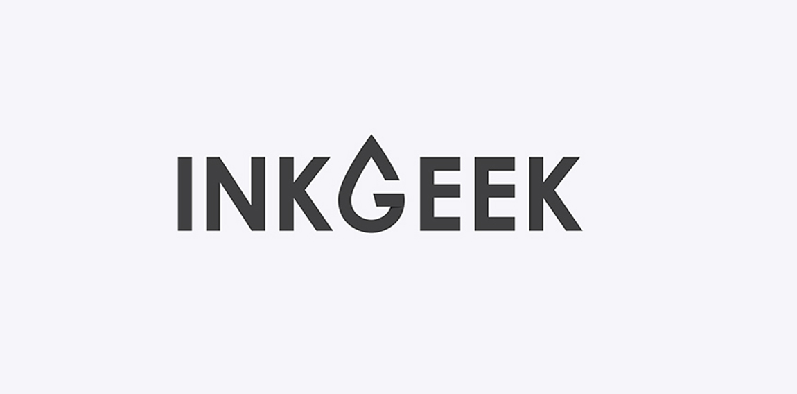
The Inkgeek logo utilizes a minimal and flat design. A typographic G is featured in the shape of a droplet of ink.
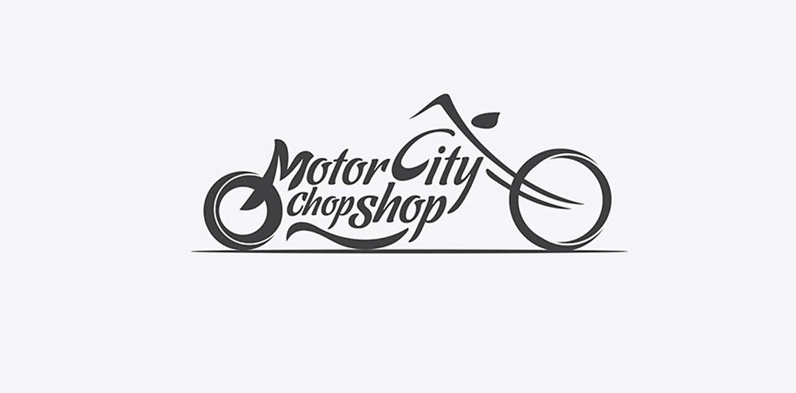
The Motor City Chop Shop logo features a flowing action, created with curved letters, lines and shapes. All of these elements combined create a raw, compelling feeling of a chopper in motion.
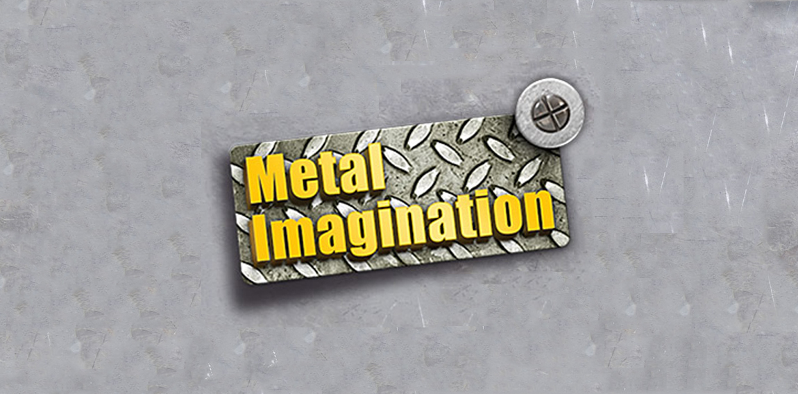
The Metal Imagination logo uses 3D graphics and metal textures to grab your attention.
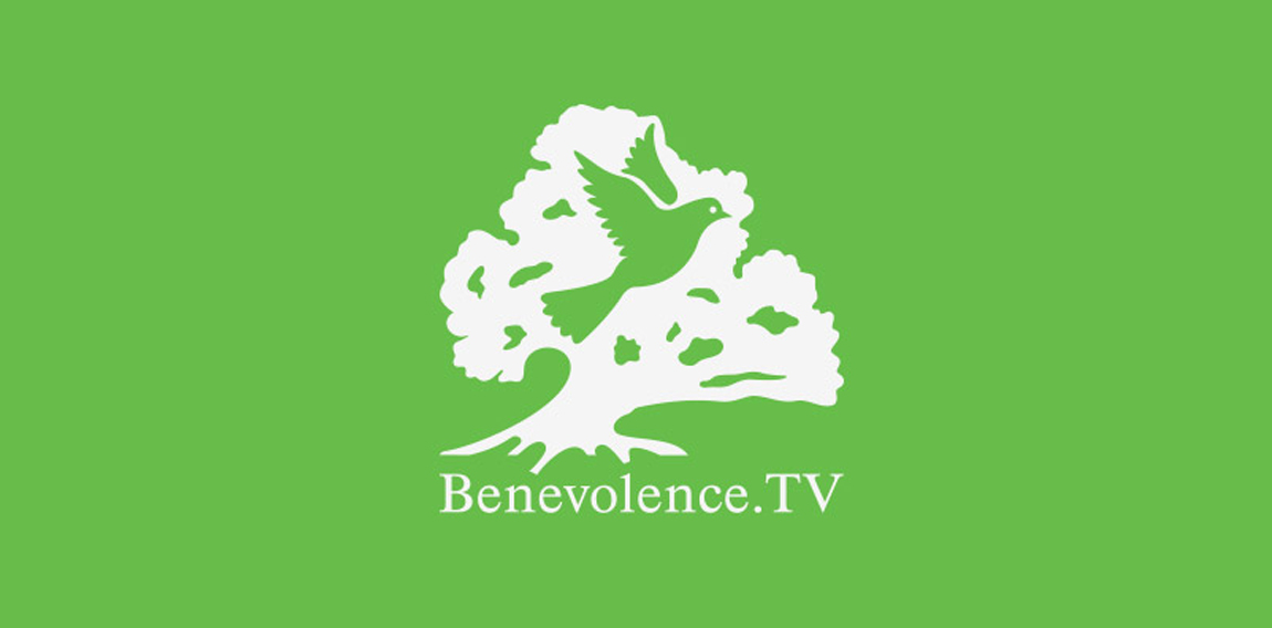
The Benevolence TV logo showcases negative space and the effectiveness of a contrasting color scheme.
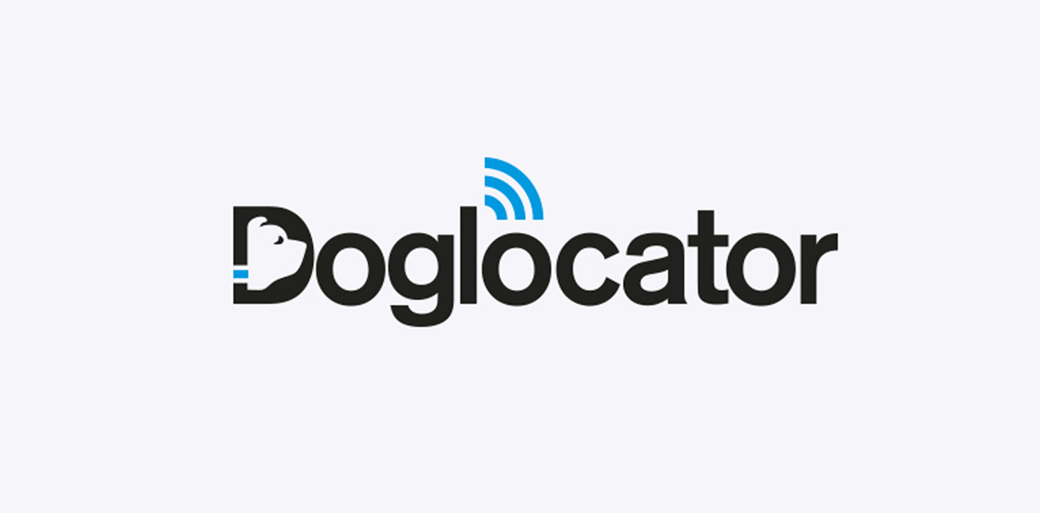
The Doglocator logo design features elements of negative space and mixes color to add detail. The negative space in the D forms a dog’s face and the minimal use of blue highlights the dog’s collar and locator waves.
Our logo inspiration gallery will give you the creative boost you're looking for. Get your daily dose of logo design inspiration to work on your own logo design projects and get your business going. Be amazed by our logo designers and their brand guidelines. We are here to help you impress your clients and our fellow designers. Professionalize your logo design skills and get yourself to a new level. Browse our logo design gallery and discover all the new logo design trends and much more. We know you love logos!