
Jan Zabransky
 Joined January 2010
 19 logos
 http://www.logomoose.com/members/janzabransky/
MG logo is unused proposal and is available for purchase. Contact me for further details.


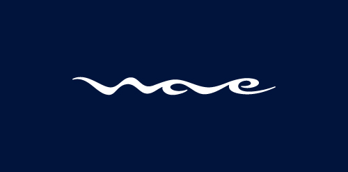
I designed logo Wave for client that is opening fast food restaurant in Sankt Petersburg, Russia. Target consumer of the restaurant are young active people, who found excitement in extreme sports, mainly water sports such as surfing or wake boarding. Client provides me with own sketches of the logo at the beginning of the project. Simple pencil sketches with name of the restaurant stylized into shape of wave was source of inspiration through whole process of logo design.
Logo design using negative space
PROJECT Panax Pharma is Czech based distributor of medicines and pharmaceuticals. I was asked to create simple and distinctive visual identity including logo manual and stationery. CONCEPT The logo contains stylized illustration of medicine mortar - traditional tool used for pharmaceuticals production and processing. The mark is reflecting susceptible and responsive approach of company through subtle rounded stylization and refined execution of it's design. Negative space used in illustration of the mortar also inspires emotions of preservation and processing content from out. Finally Optima typeface with turquoise and silver color palette completes company corporate identity design basics.
Logo for France based company that specializes in designing new ZOO parks and services related to wildlife animals housing.
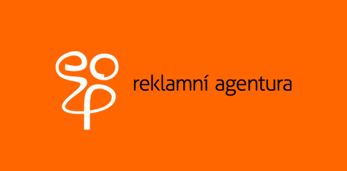
Logo design for a company creating rich media websites and microsites.
Logo for trading company and trade mark for high quality sanitary products.
Logo design for photographer.
Logo design for professional wedding photography company capturing creative wedding photos.
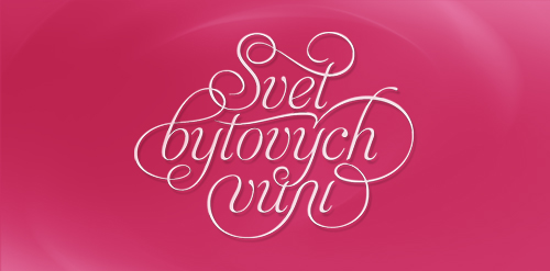
Logo for luxury home perfumes e-shop. Translation of the name is World of home perfumes (Svět bytových vůní in Czech langage).
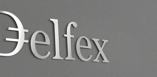
Logo and corporate identity for company trading with foreign currency. I was working on this project last two month. I made for client whole identity set from logo design, stationery design, web design with programming part, copy-writing including slogan and finally design manual. Logo on this photo is mounted in headquarters office on a wall. It was carved out of brushed aluminum plate to gain metallic look which is symbolic interpretation of currency, money and prosperity. Metallic effect literally connects whole identity. All stationery is printed by PANTONE 811 C metallic silver color. For selected materials such as business cards, compliment cards, envelopes and documents folder was used special silver metallic paper.
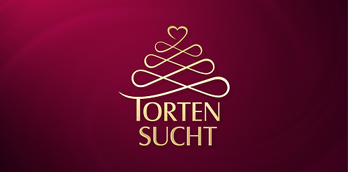
Logo for confectionery which is a young, creative, ambitious company that creates and produces individual tortes, cakes and cupcakes. The german word Tortnesucht means to be hooked on tortes. "Torten" = tortes, cakes and "Sucht" = addiction.

Coffee Cup logo
Our logo inspiration gallery will give you the creative boost you're looking for. Get your daily dose of logo design inspiration to work on your own logo design projects and get your business going. Be amazed by our logo designers and their brand guidelines. We are here to help you impress your clients and our fellow designers. Professionalize your logo design skills and get yourself to a new level. Browse our logo design gallery and discover all the new logo design trends and much more. We know you love logos!