
Agency logos (100)
Logo design for a young and dynamic full service internet agency from The Netherlands.


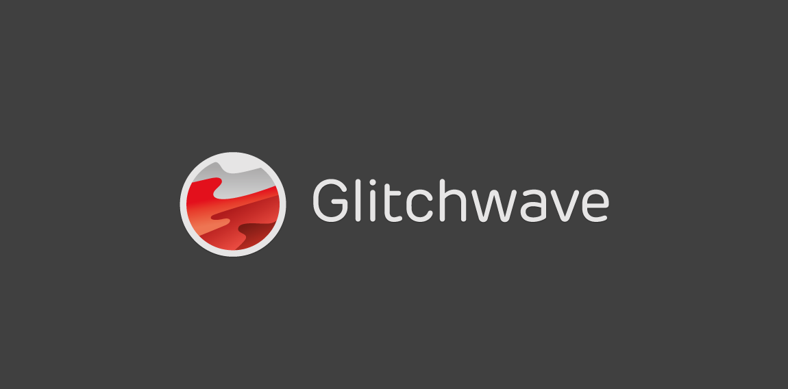
"Glitwave" icon symbolism speaks about fluid music waves, projecting light, active gaming.
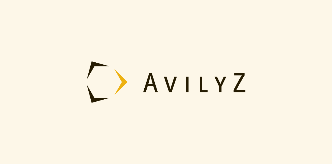
Avilyz is a Dutch consultancy agency specializing in arbitration services and means beehive in Lithuanian. The arrows from the mark represents the diffent directions and services. The white space that appears inside the arrows form a hive.
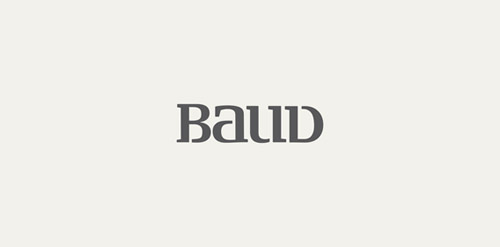
Baud is a Madrid Based Creative Branding agency that offers Packaging, Graphic Solutions and Web Design. The Agency Mainly works for International companies for online purposes and most of the top Spanish Retail Companies were Baud's design their own Brands and Packages. The Agency work has been supported by International Awards and many publications
approved logo Final and approved brand for Stimulate User Experience Agency The client went for the green color version although i liked the multicolor one more.
Logo design for inbound marketing agency. We used magnet as a symbol of attracting customers through a series of coordinated marketing actions. Additionally, curved bottom edge enhances the impression of attraction. - - - Follow us on www.fb.me/triptic.design
Our logotype.
Logotype for digital advertising agency/print house. The mark is an abstract form based on "C" letter combined from pixels (digital) with spots of paint (print house). - - Follow us on www.fb.me/triptic.design -
Restyle for a young agency
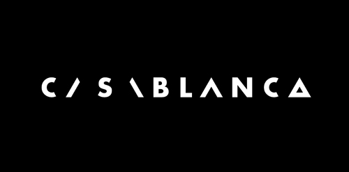
Cognitive logo developed for Casablanca creative agency. www.behance.net/gallery/20264157/Casablanca-Branding
Full service agency specialized in branding, marketing strategies, PR, campaigns, events and more. They combine creative thinking with strategic approach.
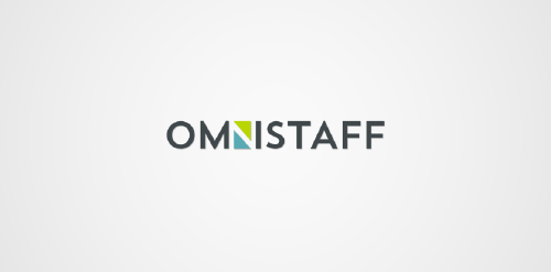
This was a commission we received from a company called Omnistaff - A recruitment Agency based in Johannesburg, South Africa. The company required a minimal logo that signified the multilateral approach they had to staffing solutions. This logo makes use of clever negative space to create the N, which just so happens to look like two arrows pointing in different directions.
BigS logo design by Art Fox Studio
BlueBell is a design studio / advertising agency based in Maceió, Brazil.
Travel agency
Digital Agency logo
Logo for our digital agency. The mark represents a pair of scissors, which was created by joining two "5" digits.
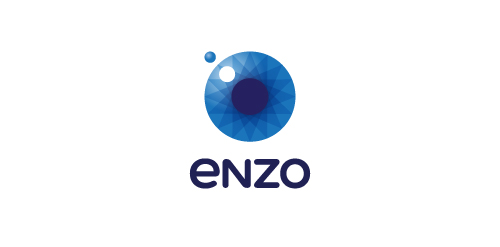
Enzo is an unusual creative agency, creating and implementing communication strategies based on authenticity. Enzo is passion and positive energy. The brand name comes from the combination of two words Energy and Zone.
Designer: Piotr Ploch
For a creative consultant agency.
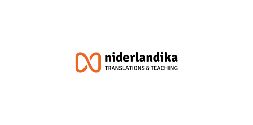
Logo for translations & teaching agency, specialized in Dutch language. The initial N icon represents the transition & transformation of one language to another.
Logo concept for a boutique consulting agency.
This logo is for a corporate oriented website, named Alice Inc.
This logo is for a ad website, named Amadine Media
This logo is for a website design agency, named Dezayo
Our logo inspiration gallery will give you the creative boost you're looking for. Get your daily dose of logo design inspiration to work on your own logo design projects and get your business going. Be amazed by our logo designers and their brand guidelines. We are here to help you impress your clients and our fellow designers. Professionalize your logo design skills and get yourself to a new level. Browse our logo design gallery and discover all the new logo design trends and much more. We know you love logos!