
Architect logos (18)
Logo proposal for hungarian architect.


Cute Logo for my House
Logo for construction company. Bright graphic sign in the form of a folding line is a symbol of precision and accurate work, transforming it takes the form of the initial letters of the name of the company «Z»
"The project for Architect and Urban Planner Laura Alves was based on the abstract forms and drafts used on a daily basis of the architect. We used orange as a color base because it inspires creativity."
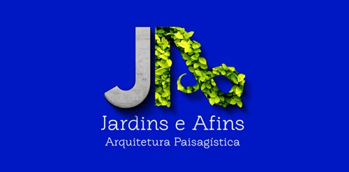
"The material and the natural." "Synthesized through the "J" all kinds of material used in day-to-day of their projects as: wood, concrete, cement, sand, gravel. And for the letter "A" seek transpire the natural side, plants and foliage used in their projects.”
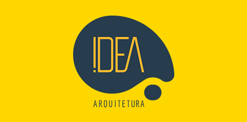
"The brand of this architecture office was designed based on a totally new study on the concept of the word IDEA. The symbol developed represents a thought or speach bubble, which is the visual representation of when you feel an insight, or in other words, an idea. The colors used in the brand are yellow which expresses attention and navy blue, which works with the seriousness and the commitment of the studio. The brand itself is applied in 8 different mutant shapes, giving the conception of the different sectors of architecture.”
"Project developed for the architect Fabricia Cortina, where the inspiration for the brand development was based on the French Curve ruler, an important element of Architecture.”
Made this logo for health minded architects
Gallegos Frixione Arquitectos is an architecture studio based in Managua, Nicaragua, founded by Herman Gallegos in 2005. The goal was to achieve a modern visual style that projects professionalism.
PRA in English means PRE or before. The logo reflects the company's commitment to details from the early stage of design process. The logo shapes and typo constructed from a specific grid system (that later used as a graphic element) and also suggest perspective. Positive and negative space.
Landscape architect logo / 2009 / 2 (rejected)
Landscape architect logo / 2009 / 1 (chosen one)
IT Consulting Company located in Washington D.C. specializing in Virtualization, Network Design and Cyber Security
i designed this logo for a pune, india based architect. the firm's name is thumbrules which means the fundamental rules of any subject. i tried to represent the same in this logo. the geometry of the logo represents the building blocks of any form of architecture.
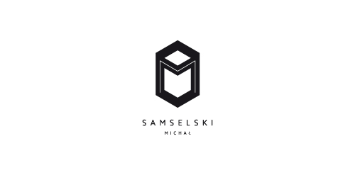
Logo for architect Michał Samselski.
Landscape architect logo / 2009 / 3 (rejected)
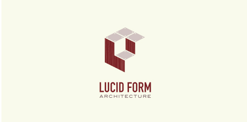
This logo is for a completely fictitious architecture studio called Lucid Form Architecture.
The icon is based on an optical illusion of a cube within a cube. Primarily, the form depicts a big cube, made of wood walls and metal-plated top surfaces, with a notch cut out of the center, resulting in a 3-D "L" shape. However, the longer one looks at this, perception begins to shift, resulting in a couple of different interpretations: 1) a small cube with a wooden wall and metal-plated bottom, in the corner of a room, hovering near the top of a tiled ceiling; 2) a room, tilted 90° clockwise, with hardwood floors, tiled walls, and a cube with a wood countertop and metal-plated side on the floor in the corner. This perception shift is important to the name, because it presents an ironic twist. To make "lucid" means to make clear, and while the icon seems to initially baffle and confuse, it ultimately encourages the viewer to challenge his or her preconceived notions of "perception." So too is the Lucid Form methodology for creating seeming impossible structures.

persia group
Our logo inspiration gallery will give you the creative boost you're looking for. Get your daily dose of logo design inspiration to work on your own logo design projects and get your business going. Be amazed by our logo designers and their brand guidelines. We are here to help you impress your clients and our fellow designers. Professionalize your logo design skills and get yourself to a new level. Browse our logo design gallery and discover all the new logo design trends and much more. We know you love logos!