
Arrow logos (39)
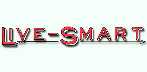
Concept for LiveSmart, a program that pairs a high school junior with a middle school eighth grader as a mentor to help them transition from the middle school into high school. I decided to go with a clean, modern look, while also remaining slightly cartoon looking since the logo is for a school program. The arrow represents guidance and transition, the two major tenants of the project.


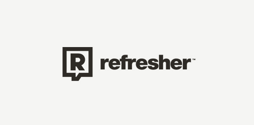
Most popular lifestyle portal in Slovakia and Czech Republic. Keeping you FRESH since 2011. The client approached me to redesign theirs logo. Refresher.sk need new logo that will reflect a primary activity. So I was looking for a way to simplify the logo, but also to have supported the idea and objectives of the portal. Gist for Logomark I chose symbol refresh, as you know for example, web browsers (symbol I wanted to get into logos peacefully and therefore I chose negative space), it is added to the symbol of conversation (bubble), which can be further used in communication portal (printed materials, merchandising, etc.), and the letter R. Scripture for the logo, I chose Helvetica. It is distinctive, timeless and elegant, expressing emotion is just FRESH :)

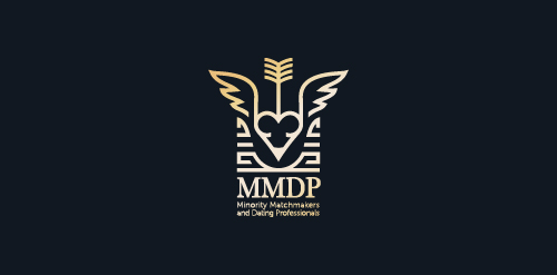
The 'mark' is a combination of a various stylized elements: female torso (heart shaped), pencil top, wings, arrow (fletching - book, shaft), crib.
(MMDP - Minority Matchmakers and Dating Professionals ALL RIGHTS RESERVED)
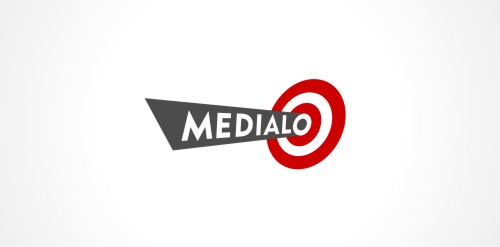
Marketing agency. One of initial proposals presented to the client. Spot-on solutions. Arrow hitting bull`s-eye. Rotated 90 degrees clockwise could also work as an exclamation mark.
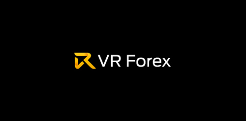
For a forex trading brokerage firm. The mark is an arrow formed by the letters V and R
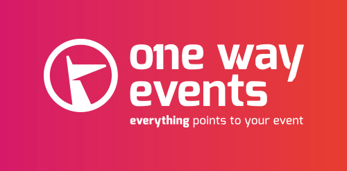
There's only one company for your event. Everything points to your event...
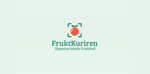
Logo for fruit transportation company, they transport fruit around all world. Logo arrow shows 4 world directions.
logo for leadmoyton, which specializes in mobile lead generation.
A combination of continius round shapes and sharp edges to form a logo to represent speed, curviness, emotion, risk.
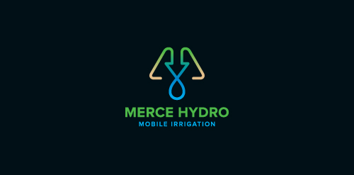
Merce Hydro, a mobile irrigation company based in Northern Victoria, Australia specialise in redevelopment of drought effected areas for the purpose of farming & residential properties. The Mark is based on the use of a water drop, an arrow, pipes & finished off with an M. The arrow symbolises function & the arrow/drop cross section symbolises design - both core factors in engineering & invention of their systems. Green represents growth, their aim. Brown represents destination (drought area) their market. Water represents sustainabilty, their long term plan, and finally the pipe represents management, their ongoing analysis & monitoring of their network.
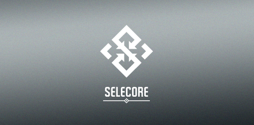
Selecore is company located in Finland, primarily focusing on importing new innovative products and secondary focus is in exporting items produced in Finland. Client wanted serious, modern and strong logo. He also mentioned that he loves when the logo has a hidden feature or message.
In the mark letter "S" is made of arrows pointing inside (import). In the negative space you can see arrows pointing out(export). The negative space also forms a cross which is connection to Finnish flag.
The Perfect Score : A credit repairing company.

Center of automation - is the use of information technologies to reduce the need for human work.
Brand Brothers created the visual identity and branding of this young delivery company with one goal: make it attractive and promote a business whose communication is often neglected by creating a recognizable brand with a strong visual, playing with the main transportation codes.

Strategija magazine portal about business and strategies.
Our logo inspiration gallery will give you the creative boost you're looking for. Get your daily dose of logo design inspiration to work on your own logo design projects and get your business going. Be amazed by our logo designers and their brand guidelines. We are here to help you impress your clients and our fellow designers. Professionalize your logo design skills and get yourself to a new level. Browse our logo design gallery and discover all the new logo design trends and much more. We know you love logos!