
Blue logos (328)
Dove


It contains two letters G in one symbol.
Sixth Saving Operation - S + O + 6 in one symbol

A geometric and minimalist logo design of an octopus.
FairApp Logo Design
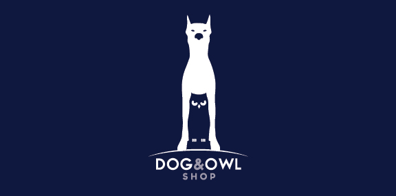
Dog and Owl shop logo design. Owl is below the dog.
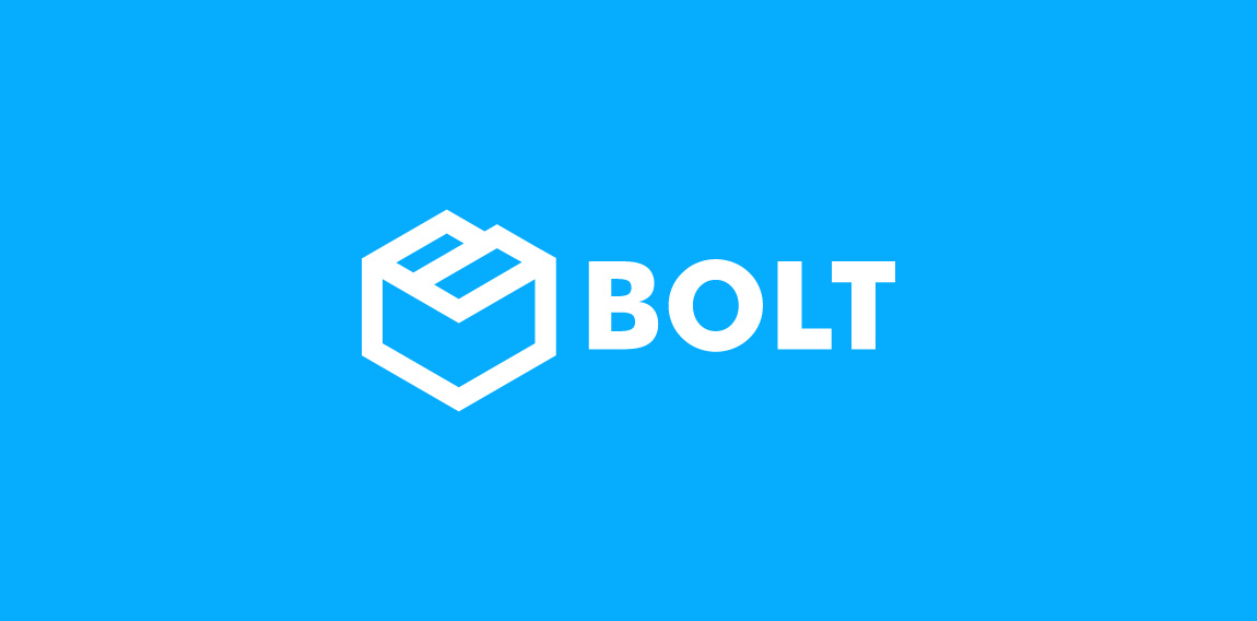
Brand identity for IT company Bolt MSP
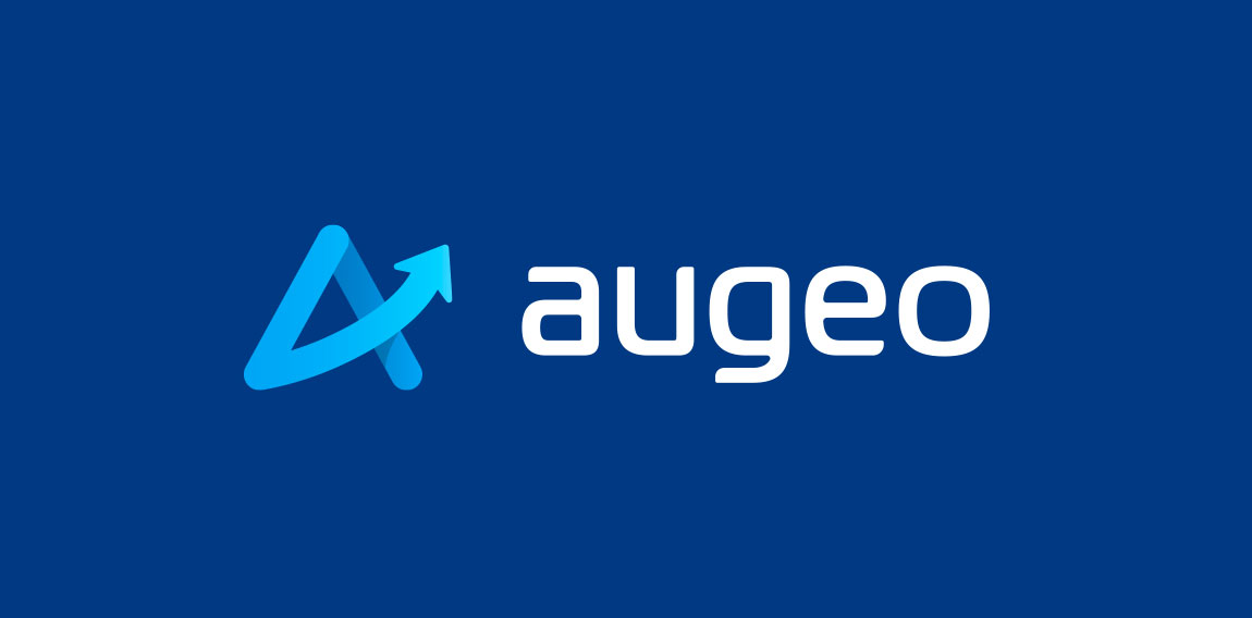
Augeo is latin for growth. I turned the crossbar of the A into an ascending arrow. I then created a custom modern typeface to accommodate the modern icon.

Due to the nature of the services offered by Benchmark they’re seen as the ‘nuts and bolts’ of the fitness industry, keeping everything together and working well. This influenced the concept behind the symbol in the logo design, with three nuts representing the three brands of treadmills they offer support and spare parts for.
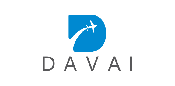
Logo for travel company
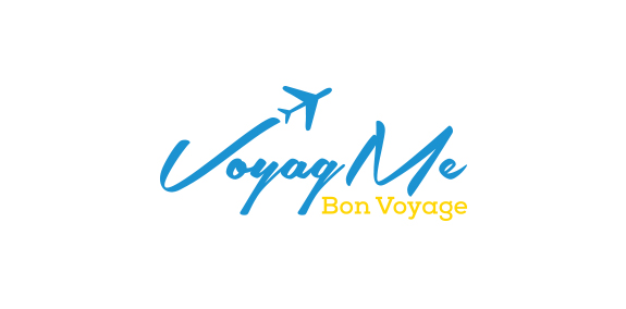
Logo for travel agency..
Public Affairs
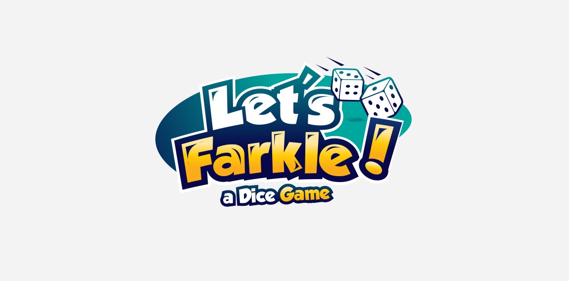
playful logo for a dice game with bold font and colors with dice cubes to represent what they do !
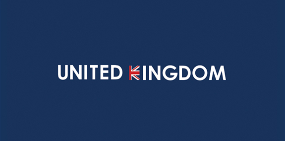
Country names, logotypes
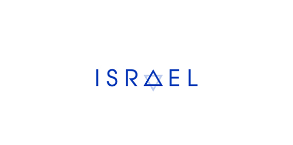
Country names, logotypes
Dotsens is a Polish IoT technology company. It produces small sensors for intelligent houses, cars, cities.
Logo for web developer.
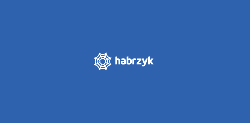
Logo show spider web. My client is building web, as spider is building his spider web. He is also ready to work, you can email him at: kamil.habrzyk@gmail.com
Ready to work - pkowal98@gmail.com
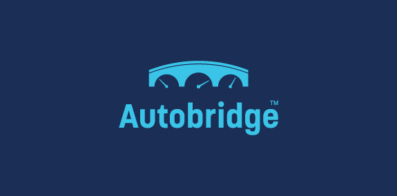
Bridge +car dashboard
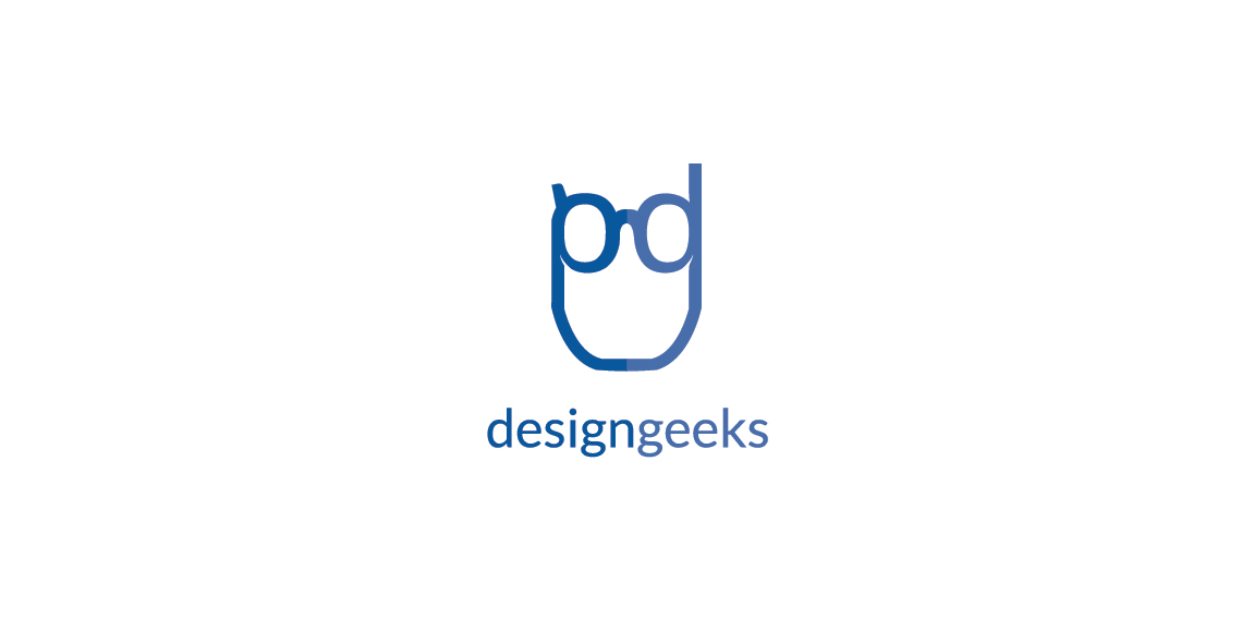
Logo for design company. Idea: Initials d and g (rotated) are creating geek's glasses. Letters extends and make full face shape.
Logo for women wear store located in Hurghada, Egypt.
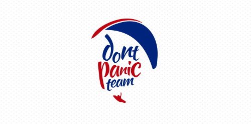
Logo for a Paragliding team from Venezuela
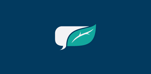
GrowthTalk is an organization of like minded individuals who share the common vision of bringing young leaders together from different mediums and providing a central bridge for growth around the world. For this mark, I wanted to fuse together the ideas of conversation and growth.
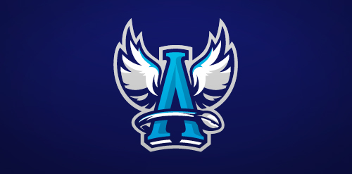
Rebranding of Angels Toruń Football Team
A new brand for women wear.