
Bold logos (44)
Logo for a Culture Producer, working with actors, dancers, writers, etc, wich lives or has something related to suburbian culture of Brazil (hip-hop, samba, graffitti, street art, literature).


Ready made logo design.
The Background Burner quickly removes the background from any image or photo.
i designed this logo for a pune, india based business house which is into multiple lines of business and now lts lead by a new leader and they are expanding their presence in other industries as well as states of the country. the name of the young leader starts with " A" so i incorporated an " A " in the logo.
i designed this logo for a pune, india based architect. the firm's name is thumbrules which means the fundamental rules of any subject. i tried to represent the same in this logo. the geometry of the logo represents the building blocks of any form of architecture.
Logo for pet store specializing in the sale of fish
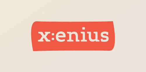
Custom logo as part of a design study of the TV program 'x:enius' running on arte. Detail: http://dribbble.com/shots/396196-x-enius/attachments/21789
The vending machine company Candy Solutions required a bright, bold and playful logo to reach its consumers and to stand out from competitors. The "CS" symbol was created through an experimental process of drawing with striped toothpaste before being digitally rendered to resemble rock candy. Red and yellow were used dominantly within the design as they have been linked to the stimulation of appetite - important in the impulse purchasing of food.
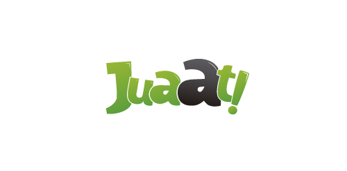
Juaat! which can be translated to english as "Whaat!" it is mostly an exclamation and a surprise phrase for what is going on the page. Amazing prices for amazing products and services. The shape of the logo tries to give this surprise intention on the web. Juaat! is a website for discount coupons in Lima, Perú.
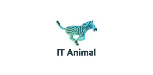
Logo called "IT animal" captures a moment of running zebra. Logo has exceptional color palette.
I saw this logo in my dream. So gathered all that memory to this MISHKA logo.
Logo I've designed for local textile print workshop focused on printing music, games, movies, web and pop culture oriented merchandise.
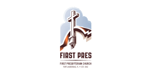
Redesign of the church's old logo in a stylized, illustrative manner, making it more welcoming, contemporary, friendly, casual, & upbeat. Client specified a rendering of the church’s architectural arch and cross in the perspective in this photo, and required an emphasis on the church's nickname, “First Pres."
Here, crisp, exacting vectors emphasize the architectural soundness of the church — a metaphor for the concept of faith as the solid foundation in one's life. This design makes use of hatching to add gradient dimensionality, enabling it to easily reduce down to 1-color. Colors are indicative of the building itself, including terracotta roof. Check my Flickr case study or Dribbble for more images, detail, and full design rationale.
Bold Re-Brand for a Property Developer
Great logo for pet industries with minimalism cat character. Clean, modern and subtle.
A work in progress
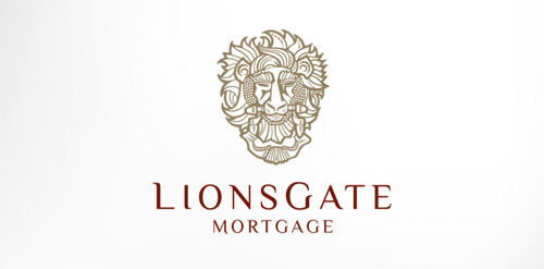
Antique, ornate, brass lion head door knocker logo for a growing and expanding mortgage company that wanted a new look, name, brand and image for their company. The brass knocker represents the entry way into the threshold of the home and the comfort a home signifies.
Indoor/outdoor music venue and restaurant serving the best food from around the world.
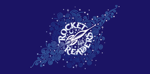
A special program for gifted readers Age 3 - 6, the formative years

A logo that represents the global presence in wealth management and promote the name of the company, Dougherty Wealth Management. This client needed to move from a "company look" to a "corporate look". It was important to reference the new logo from the client's older logo but give it a fresh new look, more polished and sophisticated. The client wanted more of a "3D feel" rather than a flat color. The blue diagonals and curves represent global motion while the bold classic "D" promoted the name "Dougherty".
Our logo inspiration gallery will give you the creative boost you're looking for. Get your daily dose of logo design inspiration to work on your own logo design projects and get your business going. Be amazed by our logo designers and their brand guidelines. We are here to help you impress your clients and our fellow designers. Professionalize your logo design skills and get yourself to a new level. Browse our logo design gallery and discover all the new logo design trends and much more. We know you love logos!