
Bottle logos (25)
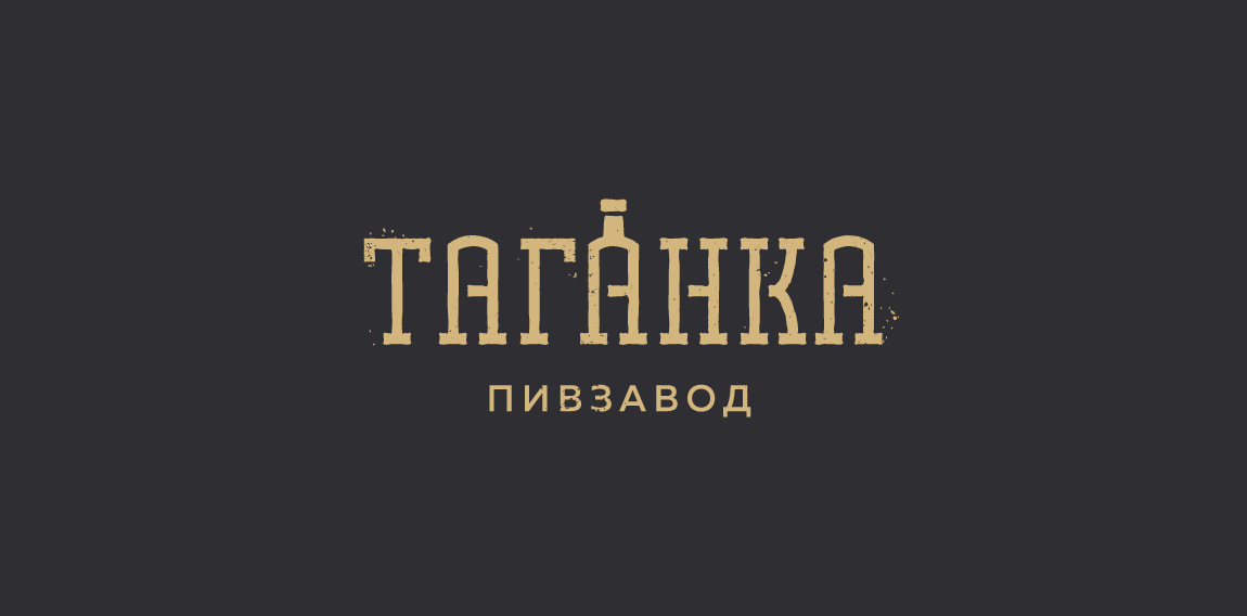
Huuuge logo search for Taganka Brewery. Full search: https://www.behance.net/portfolio/editor?project_id=63651085


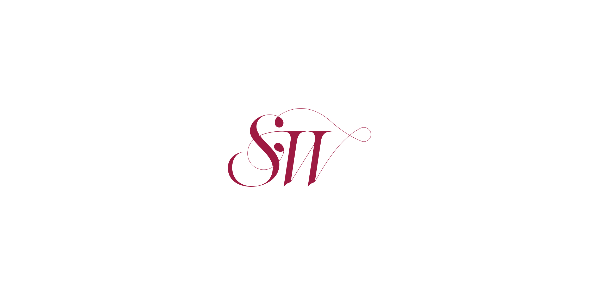
Sunny Wines is a small wine importer from Warsaw/Poland. The aim was to combine letters SW with wine symbols like grapes or cork screw, but the client wanted to see also more elegant symbol combining those letters.

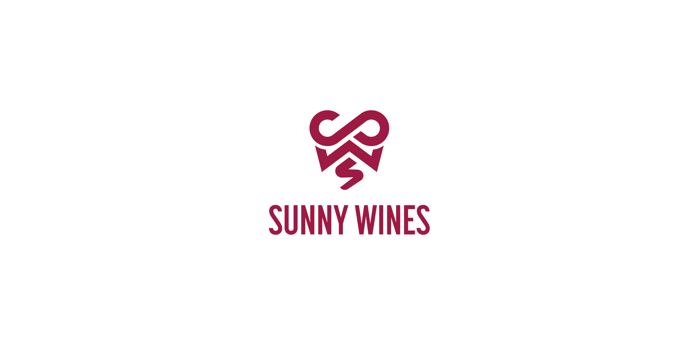
Sunny Wines is a small wine importer from Warsaw/Poland. The aim was to combine letters SW with wine symbols like grapes or cork screw, but the client wanted to see also more elegant symbol combining those letters.
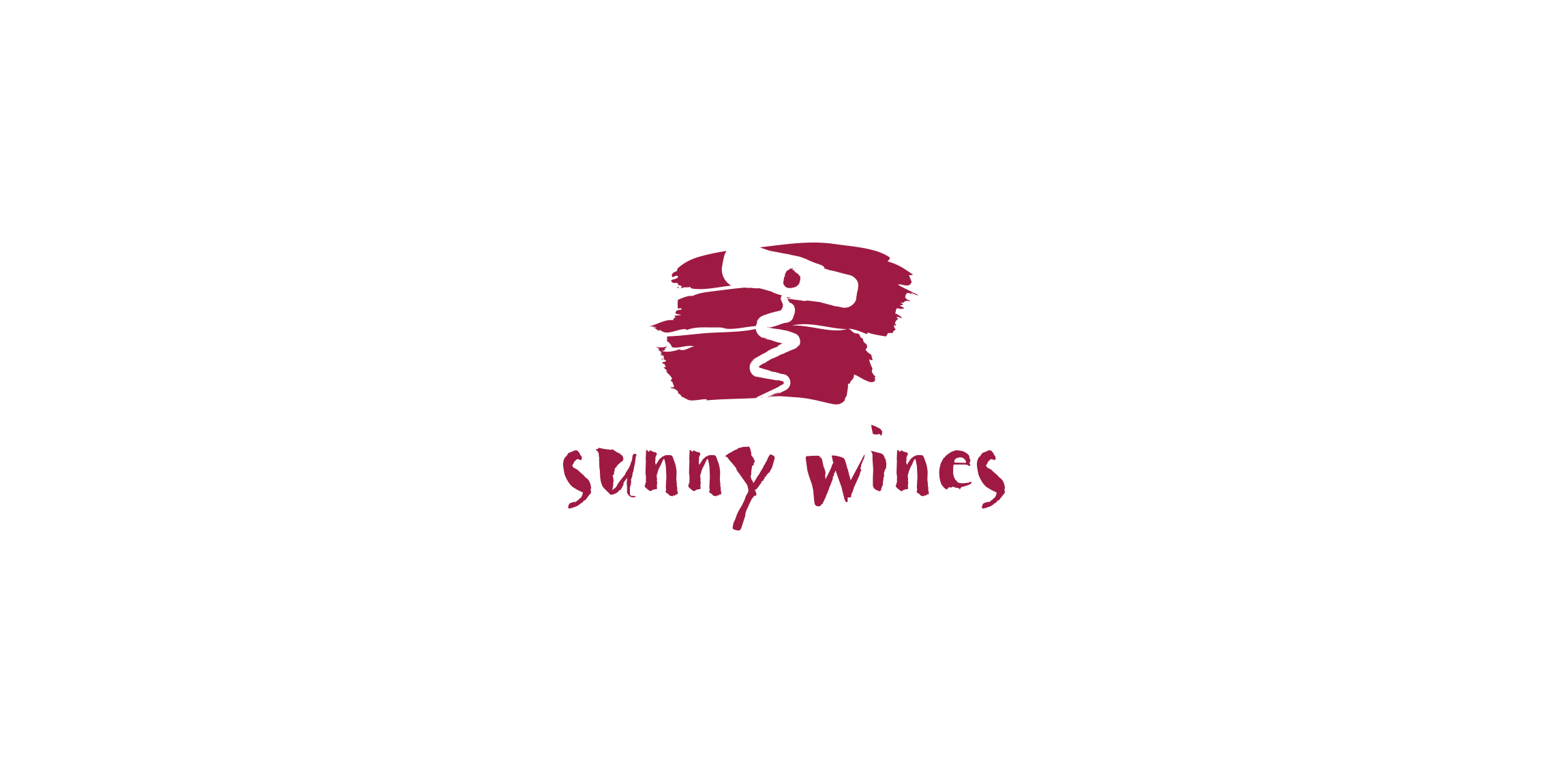
Sunny Wines is a small wine importer from Warsaw/Poland. The aim was to combine letters SW with wine symbols like grapes or cork screw, but the client wanted to see also more elegant symbol combining those letters.
Sunny Wines is a small wine importer from Warsaw/Poland. The aim was to combine letters SW with wine symbols like grapes or cork screw, but the client wanted to see also more elegant symbol combining those letters.

A bottle and corkscrew shaped maiden carrying grapes. A nice logo for wine makers and sellers, for sale on BrandCrowd. http://www.brandcrowd.com/logo-design/details/90720
Logo process and branding: https://www.behance.net/gallery/31767063/Peaceful-Bay-Logo-Branding A wine company requested a logo that would represent Peaceful Bay a region located in a South -West Australia. Doing some research, I found out that whales visit the southern Ocean, a great symbol for the label and name. After multiple sketches this is the final result.
High quality wines
Logo concept for Bar & Night Club for sale.
Logo design for a perfume brand. The initials "E" in Eva and "E" in Elvis were both combined to create a perfume bottle in the negative space.
Logo design for a with wine dealing, U.S.A.
Visual design
Logo for a custom made wine labels and winery.
Developed for a food science orginisation, the goal is to maximise dietry intake for the purposes of weight loss, muscle growth and/or general well being. They also develop meal plans for people with food allergies. The concept; a focus on things like protein supplements, vitamins & other nutrients in their isolated forms - such as whey, the protein strain isolated from cow's milk that aides muscle development. The bottle is half full; therefore the fruit is still growing, when the chemical mixture is at its prime, the bottle will be full & the fruit complete.
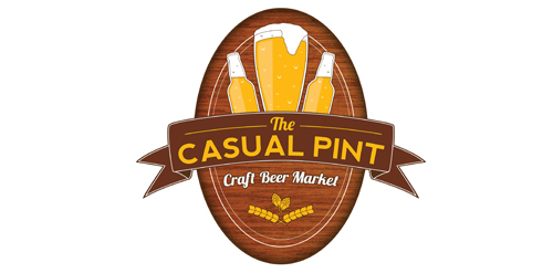
Logo design for the Casual Pint, a craft beer market
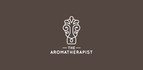
Unused proposal for an aromatherapist
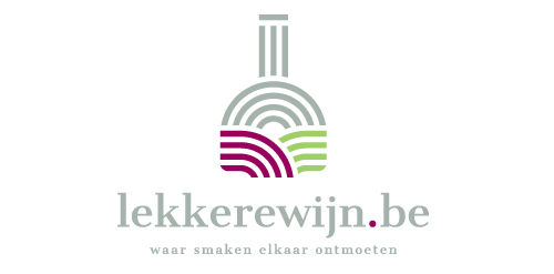
Lekkerwijn.be means in the Belgian / Dutch 'tastefull wine. The logo symbolizes a wine bottle, a sunset and two rows of vines. The 2-colored rows of vines also visualize the bottle label.
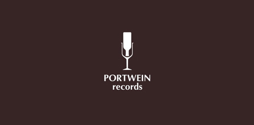
Portwein (port wine) recording studio
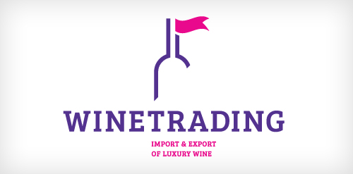
WineTrading is a expert in luxury wine. They import and export luxury wine to Belgium and other countries. WineTrading is a young company with a fresh perspective on their profession.
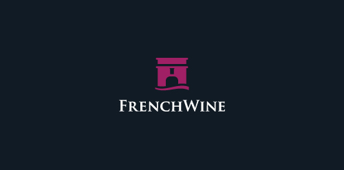
Logo for a winery situated in a fortress.
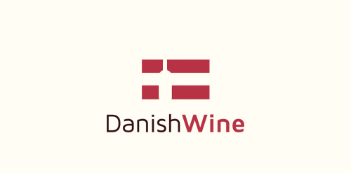
The concept for "Danish Wine" incorporating a bottle of wine in their flag.
Mark consists of Trumph arc with bottle of wine in the negative space. After I have created this logo, other people started to create logos with wine and it happened that in dribbble it is the third playoff in the legendary playoffs section. If you are keen to see all wine collection, you can look it @Behance This logo also has been featured @Logopond
open "competition" with some of the best designers to create country-based wine bottles ... http://www.behance.net/gallery/Conceptual-Wine-Tributes/2458423
Our logo inspiration gallery will give you the creative boost you're looking for. Get your daily dose of logo design inspiration to work on your own logo design projects and get your business going. Be amazed by our logo designers and their brand guidelines. We are here to help you impress your clients and our fellow designers. Professionalize your logo design skills and get yourself to a new level. Browse our logo design gallery and discover all the new logo design trends and much more. We know you love logos!