Brand logos (366)

You can check the construction of it at Dribbble. Deer logo. It is unused, so if you are interested in it contact me.


Finance.

Logotype for digital advertising agency/print house. The mark is an abstract form based on "C" letter combined from pixels (digital) with spots of paint (print house). - - Follow us on www.fb.me/triptic.design -
Corexus - logo design. Based on C logo symbol, core and technology.
inklio - logo design. Based on custom typeface, K ink drop mark and print technology.
CENOXO - logo design. Based on customized typeface, strong C logo mark, technology, brain, development and connection.
Bitrony - logo design. Based on custom typeface, B logo mark, bit technology and security.
Plusso - logo design. Based on custom typeface and plus symbol.

Logo proposal for MakersCentral. Its a project to build a community for makers. Makers in this case are enthusiasts of 3D printing, machining, wood working, electronics, and wearables. Anything that uses technology to create a physical item. Rejected,
Clean and simple logo showing a tick/ check mark and building brick. For sale.

Unused concept for Colorado Sping based car repair shop. - - - Logotype is a combination of tire (their main profession), globe angled about 22.1° (inclination angle of the earth) with tire wrench incorporated in it to make mark more dynamic. - - Follow us on www.fb.me/triptic.design -

Luxline is brand of high quality, luxury appliances. They are introducing a new product, a Gold edition of our Luxline Portable hot water system. The product is a portable showering and hot water system for caravan, camping, animal washing, and boating use. As suggested by the Luxline brand, they want to create a sense of luxury and high quality. While the product is for use outdoors and camping, it is for people who want to do these things in comfort.

Podere principe della macchia, a new company of food products but most of all bee products.
The company in place at Santa Anastasia at the Feet of Mount Vesuvius where characteristic landscape of Naples, ancient and protected characterize the product in the selection and quality.
The brand wants to position itself predominantly in the range of products taste / quality and traditional products, the rediscovery of ancient flavors.
Objective.
the objective of the client was that of a logo that represents the company by projecting the old family coat of arms with its ancient values and traditions in our times.
I joined the old coat of arms of Caracciolo Rossi consists of a shield bendy gold and red to the head of blue.
This is the blazon that refers to the union of Charles bed (junior) that Gambacorta, Marquis of Celenza and Count of Macchia, in 1641 was awarded the title of Prince of Blur. He married Faustina Caracciolo, daughter of the Marquis of Brienza. Then I ran the whole thing in a modern and dynamic giving the shape of a shield that could drop drop indentificare precisely a drop of honey, and I worked on the various symbols of the coat of arms.
Unused concept for digital agency. - - - follow us on www.fb.me/triptic.design - -
Simple chameleon logo. Full presentation here - http://graphicriver.net/item/chameleon-logo-template/9317280

Logo design for online shop with games on PC. - - - Made for Motyf.pl - - - Live on www.inexus.eu

Cognitive logo developed for Casablanca creative agency. www.behance.net/gallery/20264157/Casablanca-Branding

"CSR w wielkim formacie" in english mean "CSR in large format". It is a Corporate Social Responsibility program started by Opinion company (large printhouse). - - - An elephant is a symbol of big/large (format), intelligent/wisdom (responsibility) in multicolor squares form as a symbol of print. - - - As seen on www.csropinion.pl

Is an establishment dedicated to the sell and preparation of speciality food and coffee. They know the place where the coffee grew and the different procedures are realized to obtain a variety of flavors, smells and acidity. In the part of the tea we work with one of the best houses of tea in the country named Carabanserai, located in Roma D.F., they provide french tea and realize their own mixtures of excellent quality. By our part we realize the redesign of their identity where we look to keep and stylize the main elements of their old logo, as the top hatted, the gentleman’s mustache and the cup of coffee, the result is a clean logo, sophisticated and with an european tendency, to give the classic touch on the composition of the new identity and unique consume experience. On the packaging we use ziploc type bags of rice paper to keep the freshness of the tea and also the coffee, and we tag with two stickers, one with the illustration of coffee beans and another one with the picture of a cup of tea.

Italian Music Band branding
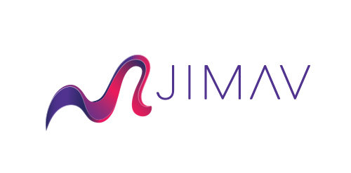
The identity of the builder JIMAV is based on the inspiration that we had with organic architecture. With curved forms we achieved a symbol with plenty life, which is balanced with a simple, legible and solid typography. The logo is a form developed with the approach of the letter “J” of Jiménez and the letter “A”of Avelar, which compound the name of the builder JIMAV. We developed a variety of the logo’s versions and compositions for the use in different applications and to make easier it’s reproduction.