
Branding logos (454)
ENTERTAINMENT COMPANY


RED PINE INTERNATIONAL JSC http://cargocollective.com/oceancreative/Logo-Collection
logo created for a real state services company based in mexico.
Logo & identity design for Ecological & Green products. Created by Hatim Alami for Altam Med Morocco.
Logo design for a Design Brand, Morocco. By Hatim Alami.
Logo design for a Consulting – Import / Export company, Morocco. Created by Hatim Alami
The key to open plan living!
http://cargocollective.com/oceancreative/Logo-Collection
Fresh Fruits
Silver in the City, the unconventional gift shop located on Massachusetts Avenue in Indianapolis launches a creative rebrand. Originally a jewelry boutique, Silver in the City had gradually expanded its offerings to include housewares and other gift items.
Branding is a process. Logo made of strips is the process of creation.
Bread and cuisines
Brand name : Rogues Gallery / Field: Animation, vfx / Year : 2012 / Location : USA
Brand name : Sidea Field: Vintage interior and furniture Year : 2013 Location : India Branding Agency: Bratus
Brand name : Pivotal / Field: Real estate, Investment / Year : 2013 / Location : UK for more check it out http://www.behance.net/gallery/Logotypes-Marks-2010-2013/9215817
Swark is a company that works with real estate investment in Porto's historic areas. The creation of the logo was inspired by the architectural and cultural richness of Porto: the tiles, the stucco, the wrought iron railings, the wallpaper, the doors, ... The logo is a junction and interpretation of various elements and it can turn into one of them: it may be a tile, a stucco in the ceiling or the wall paper of a noble house, it can be an element of a door or integrate a railing of a balcony overlooking the Douro.
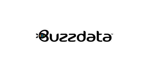
BuzzData is a social platform/network where you can publish and discuss data. BuzzData lets you publish your data in a smarter, easier way. It's about data and a part of it to visualize the information. You can attach articles, visualizations, apps and even source code... etc. www.buzzdata.com Identity solution: A custom made uniqe Typography with a varying thickness shows buzz and motion. The front letter "B"ee can also be used as a standalone favicon which is very important for a social network company since it is easier to incorporate it in very small sizes around the web for buttons and links. The Bee has a uniqe shape, is very memorable and iconic. The colors which are used into the negative space of the bee are resembling the companies main product >data< which comes from the social network users in unlimited variations... everyone can publish and discuss data. The color forms are reminiscent of chart bars, pies (statistics).

For a local anesthesiologist team in the ulm. They wanted the town's landmark incorporated somehow in the logo. The Minister of ulm is the tallest church in the world. For those who don't know the landmark of ulm follow this link for more information: http://en.wikipedia.org/wiki/Ulm_Minster
Footwear manufacturer Sweden
The logo of the Dove ( drinks, food). http://www.ekran.in.ua/
Segunda opción de logotipo personal. Me dedico al diseño gráfico y deseaba tener un logotipo muy conceptual e irregular para así hacer referencia a muchos caminos que existen al solucionar un problema.
El color rojo lo elegí porque es muy llamativo, fuerte e imponente, incuso hasta un poco agresivo. Usé triángulos porque son una figura geométrica que representa sustento, soporte, fuerza; y al estar todos en contacto representa solidez, trabajo en equipo, estabilidad, expansión y progreso. Las puntas al igual que el color son un poco agresivas, podría parecer una desventaja, pero también representa seguridad, iniciativa, avance y valor, lo que es bueno para toda marca.
Logo EcoLife. http://www.ekran.in.ua/
logo designed for pizelato immagine corporativa's anniversary.
logo created for a mexican cuisine restaurant based in spain.
Our logo inspiration gallery will give you the creative boost you're looking for. Get your daily dose of logo design inspiration to work on your own logo design projects and get your business going. Be amazed by our logo designers and their brand guidelines. We are here to help you impress your clients and our fellow designers. Professionalize your logo design skills and get yourself to a new level. Browse our logo design gallery and discover all the new logo design trends and much more. We know you love logos!