
Company logos (79)
A logo for construction company United Engineering Company


graphic design company
Logo para construtora. Logo for construction company.
Bulgarian Stock Company
Logo para empresa de logística. Logo for logistics company.
Logo para empresa financeira. Logo for financial company.
Logo for design company. Idea: Initials d and g (rotated) are creating geek's glasses. Letters extends and make full face shape.
LOGO PARA EMPRESA DE ADMINISTRAÇÃO DE INFORMAÇÕES E BACKUP. LOGO FOR INFORMATION AND BACKUP ADMINISTRATION COMPANY
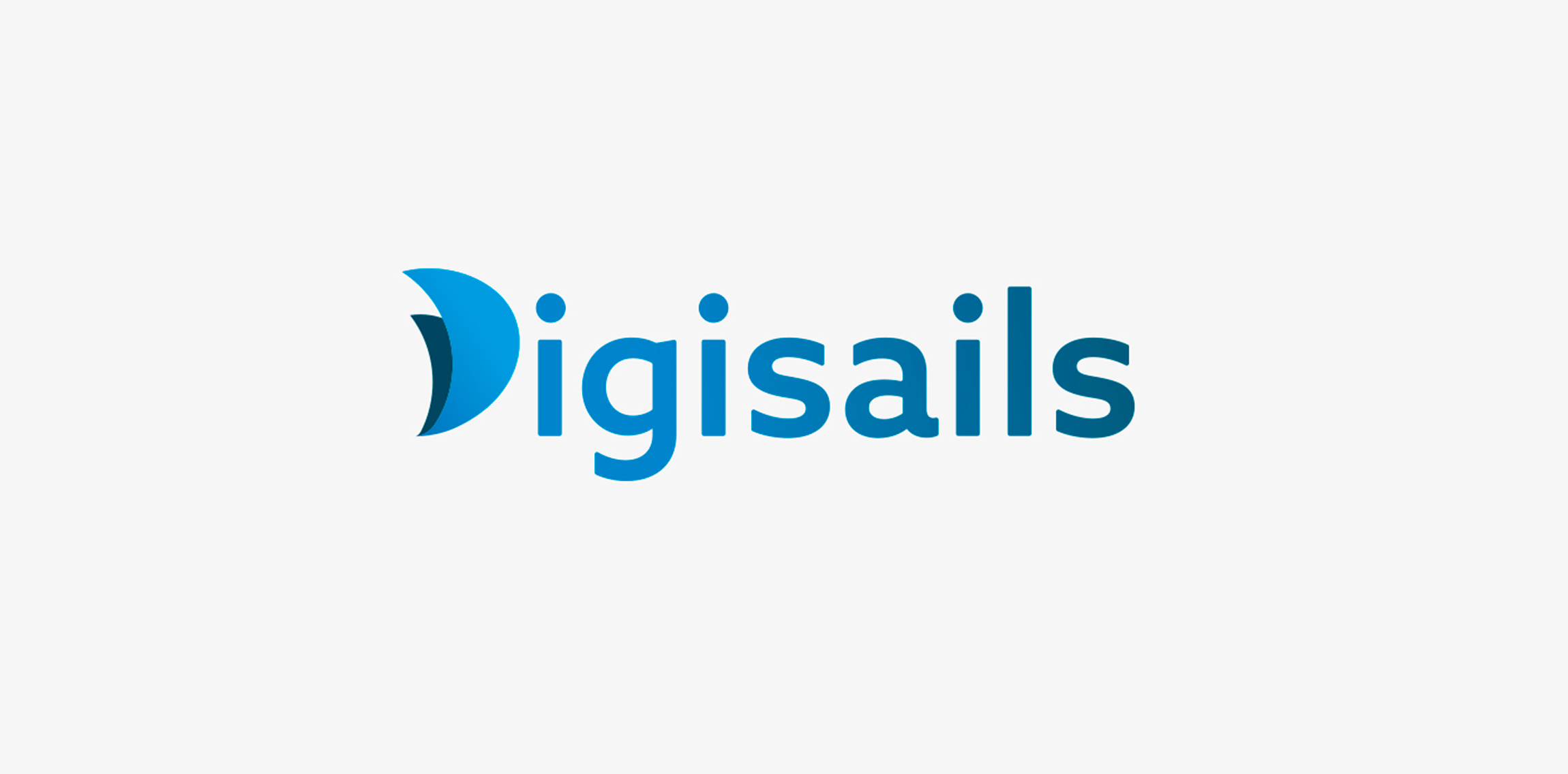
THE CLIENT Digisails is a brand new consulting company that focus on assisting businesses in the digitalization of their internal and external services. Digsails's aim is to shape companies’DNA and take them step by step on the road to success in the digital world. Digisails’s values: · Research · Innovation · Transformation · Involvement · Technology THE CONCEPT "Set sail in the digital world". Companies can’t ignore the ongoing digital revolution anymore. Sailing in this new era is not an effortless task, hence the nautical metaphor: Digisails is the best solution for proceeding along the right course and not get lost in the shifting of your own core. THE OBJECTIVE To instil these values in an up-to-date logotype, clear and tailored to each company’s needs. An increasingly web-oriented logo, nevertheless viable on printouts and unusual media, such as fabrics or other materials. THE SOLUTION The logo is a combination of symbols and typography. The initial, “D”, is represented by two sails swelled by the wind. This symbol will be repeated in the development of the entire identity system. Its colours reflect the blue sea, conveying, at once, a modern and technologic spirit.
Unused idea for a business Consultants company
LOGO PARA CONSTRUTORA LOGO FOR CONSTRUCTION COMPANY
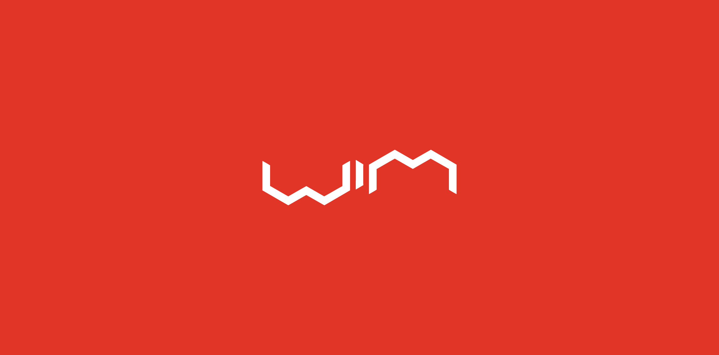
WIM Mobile is a computer technology company that specializes in high-tech enthusiast peripherals.
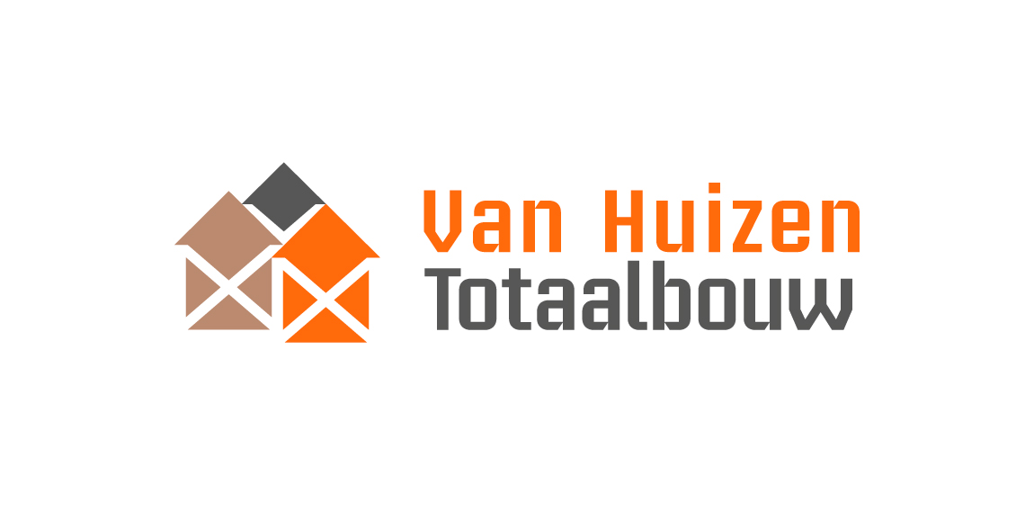
Building company. Their 3 pillars of work segment are 'Rebuild, renovate, installation'. Rebuild with concrete, grey color. Renovate with timber, brown color. Installation with copper, orange color. Scaffolding stands for building work in negative white. Houses stands for the name 'Huizen' Dutch for houses.
Logo is made of Pantone colors 1585C and CMYK 80K with an overlay of both for the brown color.
Logo in use at http://www.huizentotaalbouw.nl/.
VISORY FIRM SPECIALIZING IN CORPORATE RESTRUCTURINGS, CHALLENGED BUSINESSES, LITIGATION, AND OTHER SPECIAL SITUATIONS.
Dutch web hosting business.
Law company
Logo for web development company
Nugno is a company that was formed when two compatible and creative individuals – Luca & El – came together. Grafting in collaboration, the pair multiply the excellence of their work, producing result- and experience-driven work. Their mission was to design an identity to define a distinct brand style that communicated the core values at the heart of the business – passion and creative brilliance. The final design combined a minimal typographic aesthetic and simple colour palette to create a distinctive visual identity communicating the purity of their style.
The company is a ICT Solution provider.
This is a design for an IT company called WEBCOM, and the long name: WEBCOM Hungary. I would like to receive a review for it. Thanks.
This is a simple beautiful vector art.
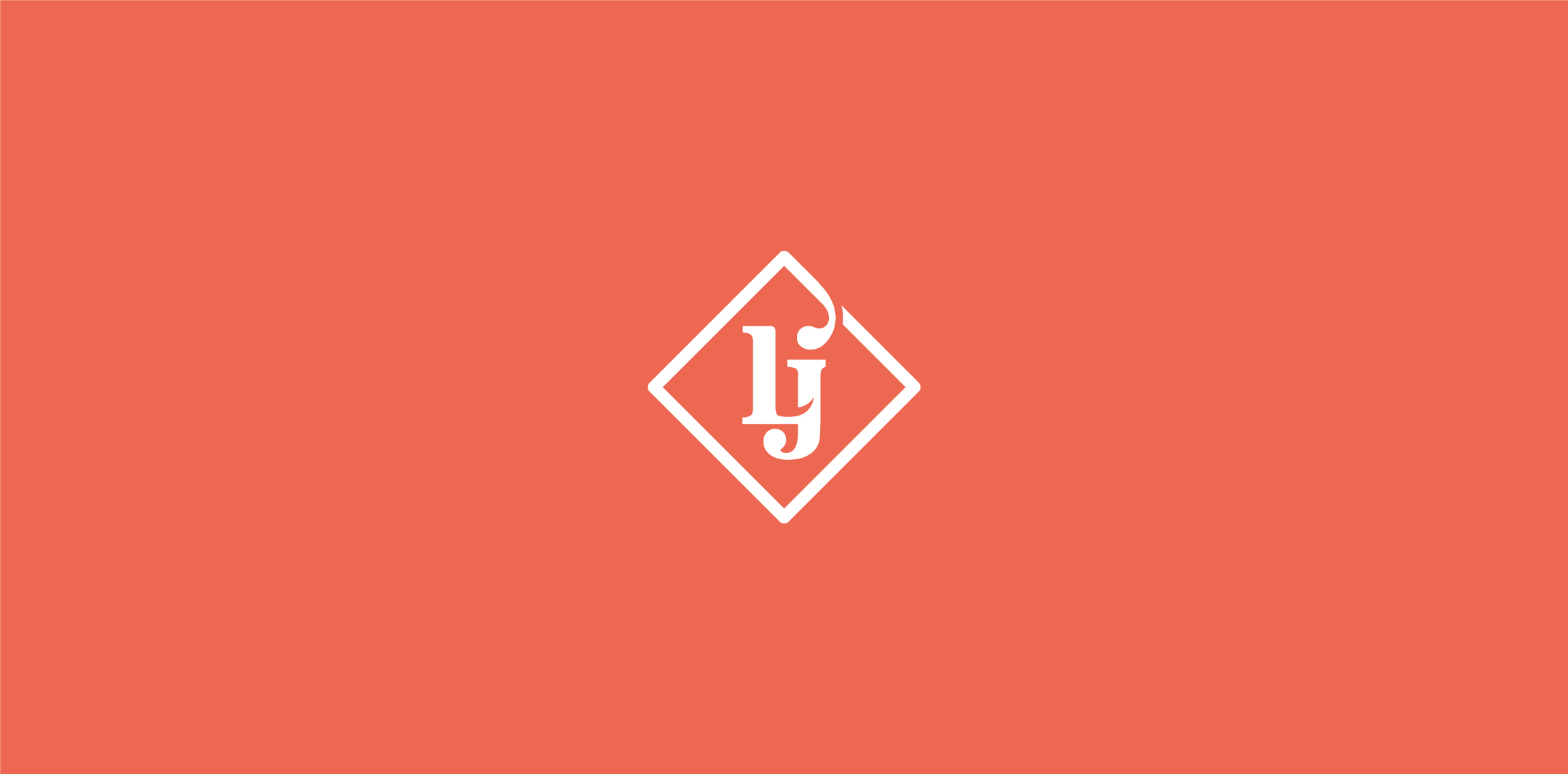
LJ International Trading Co., LTD LJ Is the company about manufacturing and distributes products of personal care in Vietnam. We research and production of effective products for consumers. Confidence in its products by a refund policy. Develop own distribution channels and overcome the shortcomings of the distribution in Vietnam, such as counterfeiting brands, fake labels and products, ... With professional consultants team, We can answering any questions and solving all problems that arise quickly. More at: www.behance.net/gallery/21490549/LJ-International-Trading-Co-LTD
residency and construction company
Full service agency specialized in branding, marketing strategies, PR, campaigns, events and more. They combine creative thinking with strategic approach.
Our logo inspiration gallery will give you the creative boost you're looking for. Get your daily dose of logo design inspiration to work on your own logo design projects and get your business going. Be amazed by our logo designers and their brand guidelines. We are here to help you impress your clients and our fellow designers. Professionalize your logo design skills and get yourself to a new level. Browse our logo design gallery and discover all the new logo design trends and much more. We know you love logos!