
Cool logos (48)
Duminda Perera 2015 logo


QUAQUA is a Fashion brand
I create this Logo with simplicity.Like this Logo? If you want to buy this Logo you have to go to this URL--- http://fiverr.com/ikramshagor
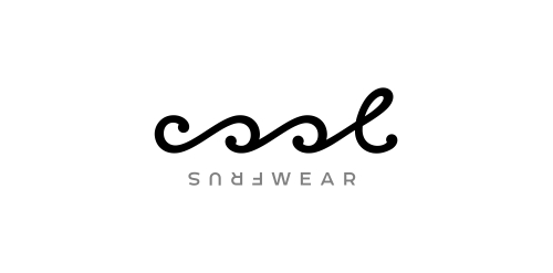
Typographic logo for water sportswear brand that expresses the waves & turning just like in the surfing.
Thatcher Theory Violin Logo
Logo For Purple Ninja Websites
Possible logo for Aces a division of Acesse
Logo For neighborhood bar.
Freeloader Inc. is a New Delhi, India based design agency and this modest logo was designed keeping in mind the name and its nature of business. Hopefully, you all like it :)
Vikin
Revamp
Real estate blog in Los Angeles

A logo for a new artist commerce community
A simple and very powerful logo which can be used for any type of a product company.. I ideally had an electronics company in mind(in my dreams lol)..color can be altered..."porcupine products are.."
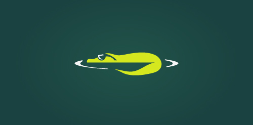
Unused concept. The logo depicts a cool crocodile!
dating site
A possible morgue name.
This is a logo for sale A minimal and professional logo. It can works for many business like, design studios, video games, video game clans, surf, jet ski company, and many more. More info at http://graphicriver.net/item/hunter-logo/634852?ref=cooledition
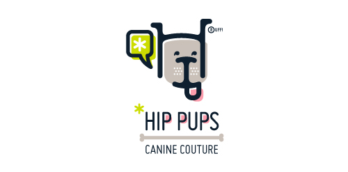
This fictitious company logo is the result of happenstance typographic exploration. I was playing around with H and I letterforms set in Platelet, and, after placing the I within the H, I noticed that it started to look like a dog face. After some modification, and with the addition of a curved P for an extended dog tongue, the resulting typographic illustration spelled "HIP." I thought it would be fun to name this fictitious company Hip Pups, which could be a shop that sells high-end dog accessories. The Registered symbol is integrated creatively into the mark by spelling "RUFF!"
My own logo
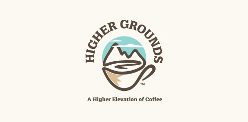
'Higher Grounds' is coffee shop in Cloudcroft (New Mexico) situated 9000ft above the sea level with cool hills.. It's a kinda tourist spot.. So that's where this logo came from.. My idea is to show the place (Cloudcroft) with mountains and to take it over the coffee in a single line drawing.. And few colors added to make it more scenic by having the business on the core of the logo.. so it's kinda 50% for the business and 50% for the place..

my new logo avatar.. what do tou think?
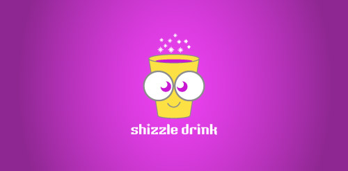
The coolest drink of all time! :)
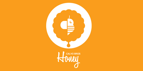
CALVO BROS or CALVO Brothers is a new company that specializes in organic honey and pollen. The Calvo Brothers wanted a logo that included a "C" and a "B", They also wanted one logo that could work across all mediums and have the ability to evolve with company. The Logo Finished Logo includes an abstract B inside a flower and at the bottom of the flower there is a drop of honey. The abstract Bee in the center is "C" (the wing) and a "B" the Body.
Our logo inspiration gallery will give you the creative boost you're looking for. Get your daily dose of logo design inspiration to work on your own logo design projects and get your business going. Be amazed by our logo designers and their brand guidelines. We are here to help you impress your clients and our fellow designers. Professionalize your logo design skills and get yourself to a new level. Browse our logo design gallery and discover all the new logo design trends and much more. We know you love logos!