
Creative logos (260)
Branding is a process. Logo made of strips is the process of creation.


A logo design for my personal website
Perfect logo for creative agency, corporate, printing house.
Brand for creative agency, design agency and similar.
A simple logo using negative space for GM Construction.
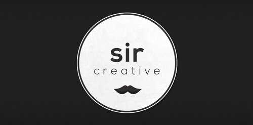
Logo design created for Sir Creative, my online freelance portfolio identity. Visit me at: www.sircreative.com
Email me: [email protected]
Logo for my portfolio.
This logo is part of a complete identity for a creative agency in Amsterdam. It's bold and combines the names in a strong way.
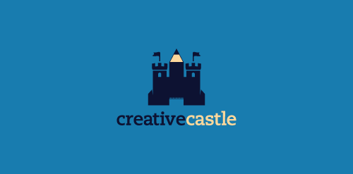
Logo proposal for a webdesign agency. Inspiration: a castle which instead of a middle tower has a pen pointing up.

A logo for a new artist commerce community
KOER Music
Creative Agency in Russia.
- Consulting on foreign investment in Ukraine support investment processes - Energy projects based on the theme of green energy, solar, wind, biomass - Woodworking, wood processing factory with export to the West
logo for AV design
Touché Collective is a young creative collective from The Netherlands. Check them out at www.touchecollective.com
For SponsorSquare.com, nice clean modern logo with a clean square graphic representing and replacing the word square
You can now view this logo animated by the brilliant Dan Johnson of 'spin my logo' www.vimeo.com/47336194
The concept is based of my ideation process. The dynamite represents the initial spark of an idea, while the pencil relates to the creative result.
Propuesta de logotipo para agencia de publicidad y estudio de animación, se pretende transmitir una sensación de dinamismo (aludiendo a la animación) con lar formas curvas y el uso de un espacio en 3D. El color verde saturado y sus formas irregulares lo proveen de una mayo pregnancia y resalto.
Logo proposal for advertising agency and animation studio, is intended to convey a sense of dynamism (referring to the animation) with lar curved shapes and the use of a 3D space. The saturated green and irregular shapes provide the pregnance and shoulder May 1
![Ideas Infinitas [infinite ideas]](https://www.logomoose.com/wp-content/uploads/2013/04/ideasinfinitas-01-01.jpg)
Logotipo de mi próxima agencia de diseño. Como el nombre lo dice representa una constante producción de ideas originales. Los dos bulbos aluden a las IDEAS, que al unirse (los bulbos) forman el símbolo de INFINITO.
[My next logo design agency. As the name implies is a constant production of original ideas. The two bulbs refer to the IDEAS, which to join (the bulbs) are the symbol of infinity.]

Logo with a "C" shape to emphasize the business name. Its colours represent the creativity from the professionals and/or businesses that use the service.
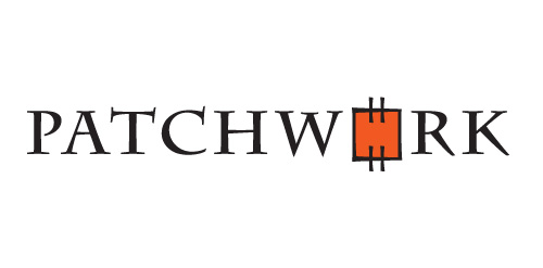
PATCHWORK is a logo that represents the art of making great designs from basic shapes pieced together so that 1+1>2. It has the perfect eye-catcher - a colourful "patch" combined with a typeface that looks as if sewn. These match to create a strong and memorable logo.
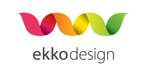
A logo for a webdesign business in Norway. "Ekko" means echo. Clean, simple and elegant logo.
Bright and colourful, a logo that represents colour, energy and youth.
Our logo inspiration gallery will give you the creative boost you're looking for. Get your daily dose of logo design inspiration to work on your own logo design projects and get your business going. Be amazed by our logo designers and their brand guidelines. We are here to help you impress your clients and our fellow designers. Professionalize your logo design skills and get yourself to a new level. Browse our logo design gallery and discover all the new logo design trends and much more. We know you love logos!