Custom logos (71)
Corexus - logo design. Based on C logo symbol, core and technology.


inklio - logo design. Based on custom typeface, K ink drop mark and print technology.
CENOXO - logo design. Based on customized typeface, strong C logo mark, technology, brain, development and connection.

Bitrony - logo design. Based on custom typeface, B logo mark, bit technology and security.
Plusso - logo design. Based on custom typeface and plus symbol.

Logo design made for Toronto based company producing fully customizable cardboard packaging. - - - Live on www.boxcaptain.com

Logo for a local blogshop.

custom lettering for fun & for sale
"PB" monogram for fun. Monogram is for sale.

A concept. A visual play on words.

Logo for a company based in San Jose, CA
This is a logo I made for fun for the company I work for called Greenvis. Greenvis specialises in durable district cooling and heating. The logo ended up not being used, but I still like to show the custom font - 100% self made (still working on some letters like S and I).
BELLISO - logo and mark for beauty and fashion brand.
BELLISO = from Italian words bellissimo, bellissima
http://RadekBlaska.com
BYOLA.com - fresh, bold and green brand.
Custom typeface design.
more at: http://RadekBlaska.com
Ranoro - modern, bold and dynamic logo / brand. Designed with custom typeface.
more at: http://RadekBlaska.com
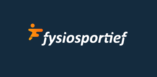
Logo design for a Dutch sport physiotherapy company called 'fysiosportief'. They asked me to come up with a new refreshing logo for their business. The client preferred the type to be custom and as friendly looking, easy to read and a little twist integrated in it that shows some sort of speed and dynamic. The icon is a combination with the letter 'F' together with a running human. Also tried to perfect the balance by adding that same shadow effect from the typo.

Internet portal - daily dose of motivation and inspiration for your healthy body and mind. Strength, diet, self esteem. When designing typography for the word "fitcult" I was inspired by the characteristics of the fitness (muscle, power, energy, dynamic). Custom lettering is a specific high contrast between horizontal and vertical strokes. The letter "f" and "i" are connected to the ligatures.
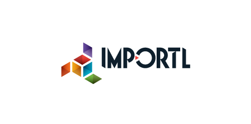
This is a logo for a completely fictitious entity named IMPORTL, which could be an open source web development site, or some type of developer software.
The idea is that the triangular facets form a series of open holes, or "portals," in multidimensional space. The central facets can also be seen to form a cube which is open on three sides. Lying before each opening is another opening on that side's respective "floor," yet, in an Escher-like paradox, where spatial orientation is an irrelevant construct, there is no floor. There is no up, down, left, right, back, or forth. This hyperspatial environment suggests infinite possibilities for the arrangement, manipulation, and exchange of data.
For color, the idea is that the primary colors that form the central cube beget the secondary colors that rotate outward, suggesting expansion, transformation, evolution.
The mark employs a custom typeface that compliments the angularity of the mark.
Click here to see the case study for this logo, which chronicles its development, and includes full design rationale, sketches, electronic roughs, and alternate designs.
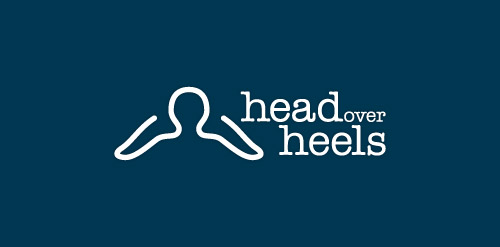
An idea exploration for a shoe maker who's specialty is 100% customized foot wears. Thus its a head (intelligence) over heels . A person can choose or present their own design of the footwear. H
Custom typography for Gatmo.
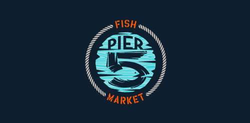
This logo is for a completely fictitious fish market.
The idea came to me when I discovered that it was possible to achieve a fish shape in the negative space within the bowl of the number 5. Dubbing my hypothetical company Pier 5 Fish Market, I created this illustrative mark in the hopes of really capturing the spirit of the nautical and maritime aesthetic. Type is custom for "Pier" and also the number 5, which is hand-rendered to look like it was painted on a wooden sign with a very wide, worn-out, thick-bristled brush. While it was important for the fish to show in negative space, it needed to look like a seemingly happenstance result of logical, real-world brush strokes. This is the minimal, alternate version of this logo.
Click here to see the case study for this logo, which chronicles its development, and includes full design rationale, sketches, electronic roughs, and alternate designs.
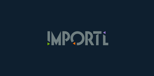
This is a logo for a completely fictitious entity named IMPORTL, which could be an open source web development site, or some type of developer software.
This wordmark features triangular facets — symbolic of the flow of data — that point inward toward the name, reinforcing the namesake.
The mark employs a custom typeface that compliments the triangle shapes.
Click here to see the case study for this logo, which chronicles its development, and includes full design rationale, sketches, electronic roughs, and alternate designs.

Entry for a logo competition for the famous dubstep dj Rusko

Self identity, custom typeface.