
Custom logos (71)
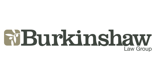
Urban Jungle designed the Burkinshaw Law Group corporate identity. The subdued identity was inspired by Olde England and grounded upon the firm’s core values of wisdom, service, and goodwill. It incorporates a completely customized font treatment based off the Clarendon typeface.


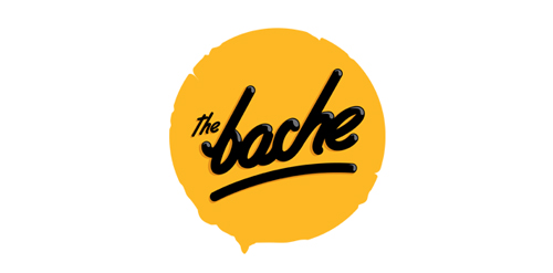
The Bache is the name of own small business in video productions and graphic design. It is pronounced as ‘The Badzje'. Little shameless self-promotion right here: www.thebache.nl

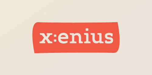
Custom logo as part of a design study of the TV program 'x:enius' running on arte. Detail: http://dribbble.com/shots/396196-x-enius/attachments/21789
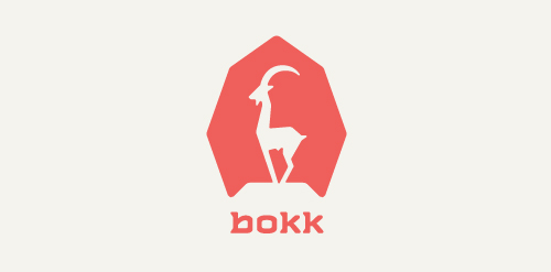
I recently realized I've never designed anything animal related. So I decided to give it a try with this ibex. The logotype was custom made and incorporates characteristics of the ibex. (The name bokk is derived from the word sprinbok.)
Cathijane - custom typo logo for a web design studio
a logo made for my own project - custom type.
logo for custom motorcycle
My second custom typo. For my lovely girlfriend :)
Logo idea for a coffee shop. Custom font
Vesea logotype
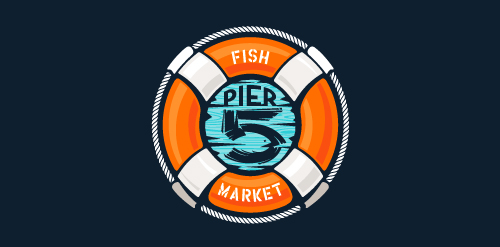
This logo is for a completely fictitious fish market.
The idea came to me when I discovered that it was possible to achieve a fish shape in the negative space within the bowl of the number 5. Dubbing my hypothetical company Pier 5 Fish Market, I created this very maximalist and illustrative mark in the hopes of really capturing the spirit of the nautical and maritime aesthetic. Type is custom for "Pier" and also the number 5, which is hand-rendered to look like it was painted on a wooden sign with a very wide, worn-out, thick-bristled brush. While it was important for the fish to show in negative space, it needed to look like a seemingly happenstance result of logical, real-world brush strokes. In the full lockup, the addition of the life preserver takes less emphasis off this gimmick, allowing one to slowly discover the fish.
Click here to see the case study for this logo, which chronicles its development, and includes full design rationale, sketches, electronic roughs, and alternate designs.
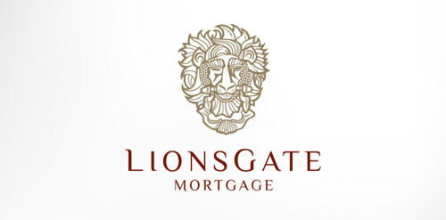
Antique, ornate, brass lion head door knocker logo for a growing and expanding mortgage company that wanted a new look, name, brand and image for their company. The brass knocker represents the entry way into the threshold of the home and the comfort a home signifies.
Logo for my art & design studio.
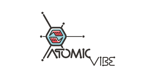
I define ATOMICvibe as the "a-HA!" moment of clarity in the creative process. Like nuclear fusion, it's when tiny ideas coalesce, and then explode into beautiful design.
The logo visually depicts this creative reaction. Forming abstract A & V shapes, the converging hands cradle the tiny beginnings of a big idea, fusing them until they discharge a shockwave of creativity. The custom type, designed to perfectly integrate with the mark, is meant to symbolize electron paths. Heavily inspired by retro imagery from the Atomic Age: science, the Space Race, Sputnik, the iconic George Nelson Ball Clock.
Click here to see the case study for this logo, which chronicles its development, and includes full design rationale, sketches, electronic roughs, and alternate designs.
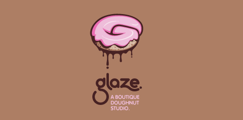
This is a totally fictional company that I refer to as "a boutique doughnut studio." I envision it as a trendy, metropolitan bakery that allows customers to glaze and decorate their own unique doughnuts. I wanted this to look really tactile, gooey, and sweet - like you really want to take a bite. Type for "glaze" is custom, and reflects the roundness of a doughnut. Click here to view my Flickr stream for full design rationale and additional images.
Indoor/outdoor music venue and restaurant serving the best food from around the world.
A special program for gifted readers Age 3 - 6, the formative years
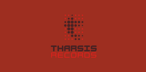
Unused proposal for an electronic dance music label, specializing in Tech House and Electro.
The name is taken from the Tharsis region on Mars, the largest volcano range in our solar system.
The symbol represents the blips and bleeps of the electronic music. Color is indicative of Mars. Custom type coincides with the roundness of the dots, and reflects the synthetic techiness of the music.
Click here to see the case study for this logo, which chronicles its development, and includes full design rationale, sketches, electronic roughs, and alternate designs.
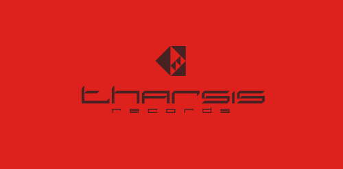
Unused proposal for an electronic dance music label, specializing in Tech House and Electro.
The name is taken from the Tharsis region on Mars, the largest volcano range in our solar system.
The symbol is a stylized, geometrical representation of the unique arrangement of the Tharsis volcanoes, while the individual facets can be seen to represent movement in music. The type is custom, and reflects the 45 degree angles in the symbol. Color is indicative of Mars. Overall, I wanted the aesthetics of the mark to coincide with the synthetic techiness of the music, but I also wanted it to look very futuristic and sci-fi, as if it were an emblem on a Martian spacecraft.
Click here to see the case study for this logo, which chronicles its development, and includes full design rationale, sketches, electronic roughs, and alternate designs.
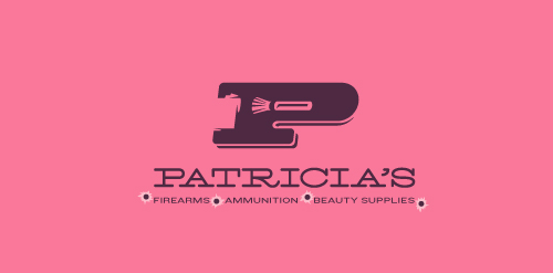
This logo for a completely fictitious company started when I noticed that the negative space with the letter P set in the typeface Blackoak looked a bit like a gun firing a bullet. This got me thinking of how interesting it would be if there were a super-girly, female-owned and operated boutique, catering only to women, which sells not only firearms and ammunition, but also beauty supplies. Everything a modern woman needs! Hey, if you're gonna make up a logo and a company to go with it, why not have a little fun with it? Here, the left side of the P reveals the profile of a gun barrel in negative space, while the negative space within the bowl of the P reveals a makeup brush, which doubles as a bullet being fired. The P mark, based on the Blackoak letterform, is constructed by hand, and the type for "Patricia's" is based on Archive Antique Extended, and is also constructed by hand. I did this because I wanted rounded corners and edges to give the logo a more feminine touch.
Click here to see the case study for this logo, which chronicles its development, and includes full design rationale, sketches, electronic roughs, and alternate designs.
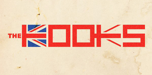
Just a draft idea for British band The Kooks as part of an international design competition that resulted in a second place for me.
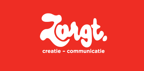
Completely handwritten logo type for Haarlem (The Netherlands) based communication agency. The letter 'o' consists of a subtile heart.
Marketing agency. Selected proposal. It turned out that the most important thing for the client was the impression of experience, seriousness, stability and ability to take on the most demanding jobs. Custom made lettering was a big part of why they have decided to go with this design.
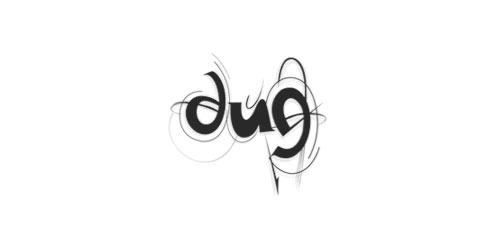
DUG (dans uten grenser) trsl. "dance without limits) A dance organisation which focuses on attracting youths to the dancefloor. By targeting all youths the goal is to make dance interesting, cool and including
Our logo inspiration gallery will give you the creative boost you're looking for. Get your daily dose of logo design inspiration to work on your own logo design projects and get your business going. Be amazed by our logo designers and their brand guidelines. We are here to help you impress your clients and our fellow designers. Professionalize your logo design skills and get yourself to a new level. Browse our logo design gallery and discover all the new logo design trends and much more. We know you love logos!