
D logos (17)
Doctor bio nutritionist "Elisa De Filippi" The logo contains the initials: "E" "D" "F"


Logo for travel company.

Logo for travel company
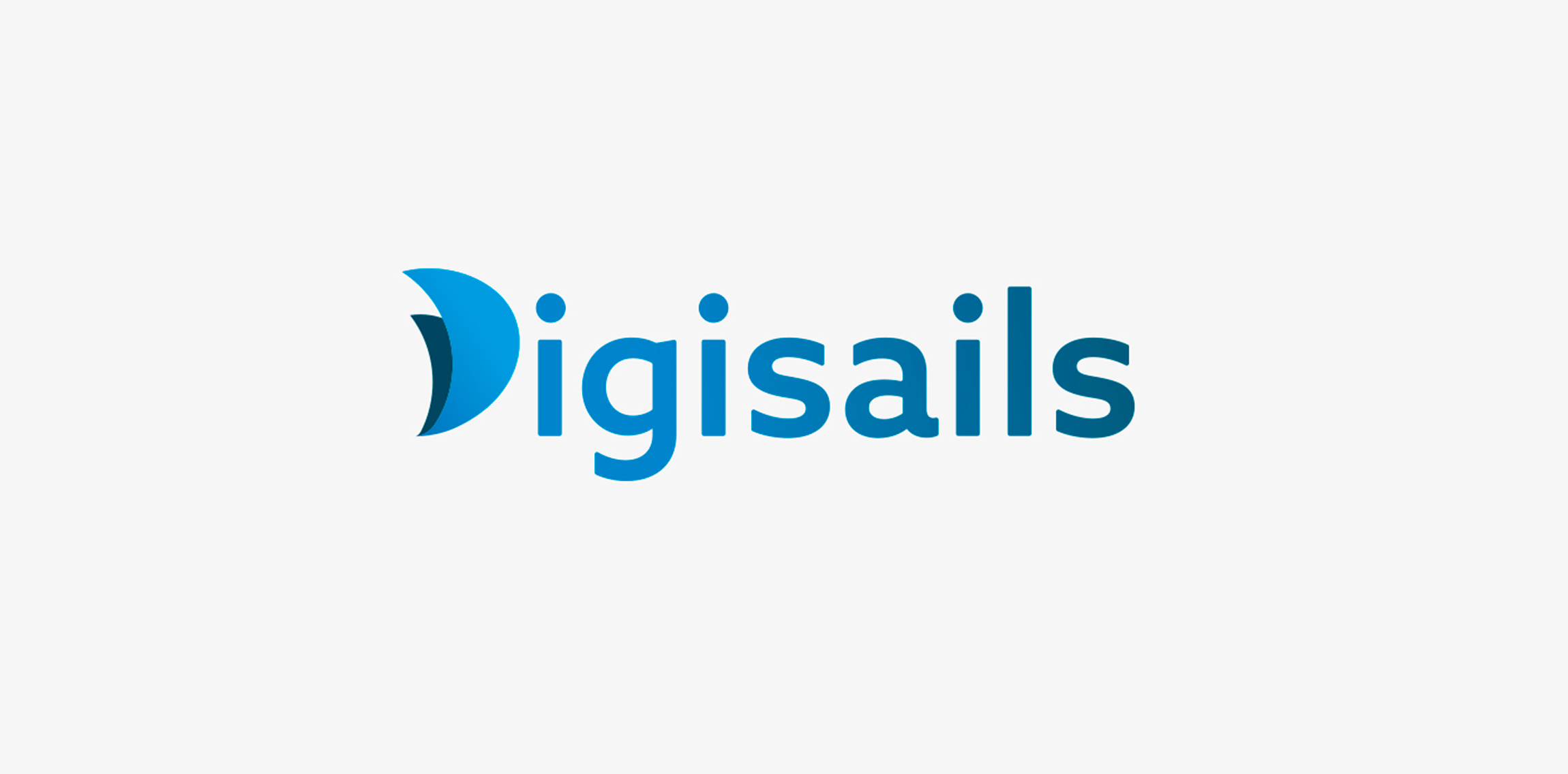
THE CLIENT Digisails is a brand new consulting company that focus on assisting businesses in the digitalization of their internal and external services. Digsails's aim is to shape companies’DNA and take them step by step on the road to success in the digital world. Digisails’s values: · Research · Innovation · Transformation · Involvement · Technology THE CONCEPT "Set sail in the digital world". Companies can’t ignore the ongoing digital revolution anymore. Sailing in this new era is not an effortless task, hence the nautical metaphor: Digisails is the best solution for proceeding along the right course and not get lost in the shifting of your own core. THE OBJECTIVE To instil these values in an up-to-date logotype, clear and tailored to each company’s needs. An increasingly web-oriented logo, nevertheless viable on printouts and unusual media, such as fabrics or other materials. THE SOLUTION The logo is a combination of symbols and typography. The initial, “D”, is represented by two sails swelled by the wind. This symbol will be repeated in the development of the entire identity system. Its colours reflect the blue sea, conveying, at once, a modern and technologic spirit.
Digital D for E-learning project
Conceptual logo mark.
Quail eggs logo - HMD
Logotype made for devamjewelry.com - manufacturer of unique & luxury jewelry adorned with diamonds and gemstones. • • • Made for Twindots (UK) • • • Follow us on www.instagram.com/triptic.pl

Unused logo design I did in 2013. For Sale!
Graphics & Printing Industry
Web application that helps to effectively manage time, employees/co-workers, customers, and sales. DayTab supports the process of customer communication, collaboration and information sharing within the company. Its functionality centers around the concept of structure, hence the simple "tree" metaphor in the logo. The symbol is built only with circle segments and - with a bit of imagination - you could even see human silhouettes there. It shouldn`t require much effort to notice the "D" initial.
Inspired by the ancient Japanese art of folding paper, the negative space from an origami-styled “D” creates Diploma’s icon. Using a deep charcoal colour treatment on a bold stylized version of the Museo Sans typeface, the identity combines vivid aqua and chartreuse colours, designed to strengthen the company’s fortified position as “the definitive partner for medical device sales in specialized healthcare markets.”
Investment company
A logo for a premium domain reseller - fast project.
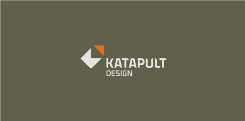
Katapult Design is a firm out of Australia who offers industrial and graphic design services. Concept: Client requested a very, very simple solution. The red corner piece appears as if it's being hurled away and the resulting two pieces are abstract K and D letterforms.

A logo that represents the global presence in wealth management and promote the name of the company, Dougherty Wealth Management. This client needed to move from a "company look" to a "corporate look". It was important to reference the new logo from the client's older logo but give it a fresh new look, more polished and sophisticated. The client wanted more of a "3D feel" rather than a flat color. The blue diagonals and curves represent global motion while the bold classic "D" promoted the name "Dougherty".
c d and negative space utilised
Our logo inspiration gallery will give you the creative boost you're looking for. Get your daily dose of logo design inspiration to work on your own logo design projects and get your business going. Be amazed by our logo designers and their brand guidelines. We are here to help you impress your clients and our fellow designers. Professionalize your logo design skills and get yourself to a new level. Browse our logo design gallery and discover all the new logo design trends and much more. We know you love logos!