
Dainin logos (10)
Logo for construction company based on Brazil The mark is made of the combination of the letter M (company first letter) + a building that represent solidity, stability and trustworthy. The concept for their new identity aims at being fresh, modern and bold.


Logo for a line of products for adolescent and young adult audiences. The main concept is to design a sustainable brand that can introduce many products. The mark is mainly inspired by the shape and color of the feature product of the company, the molly pop, a fashionable candy.

Logo for the 30th anniversary of the Asamblea Nacional de Nicaragua.
Logo for the celebration of the 50th Anniversary of La Curacao, the biggest appliances and electronics store in the Nicaragua.
Logo made for a biker meetup event organized here in Managua, part of a visual identity project, check it out here http://on.be.net/1PzVWlV
This Logo is part of a complete corporate Identity project for Nexus Consultores Full project http://on.be.net/17ShF3u
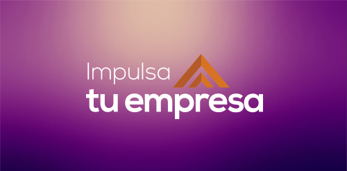
An old logo made in 2012 for the first edition of Impulsa tu empresa a business accelerator program implemented by Technoserve. Check the identity project http://on.be.net/1bG1sih
Logo for a Ecommerce website
Gallegos Frixione Arquitectos is an architecture studio based in Managua, Nicaragua, founded by Herman Gallegos in 2005. The goal was to achieve a modern visual style that projects professionalism.
Logo for a travel agency based in Managua, Nicaragua The company wanted to reflect a modern, fun and energetic logo that makes it stand out.
Our logo inspiration gallery will give you the creative boost you're looking for. Get your daily dose of logo design inspiration to work on your own logo design projects and get your business going. Be amazed by our logo designers and their brand guidelines. We are here to help you impress your clients and our fellow designers. Professionalize your logo design skills and get yourself to a new level. Browse our logo design gallery and discover all the new logo design trends and much more. We know you love logos!