
Education logos (51)
IHC provides students from the MENASA region with an American style college education in arts and sciences and serves as a pathway for transfer to elite universities in the United States as well as regional institutions.


Greenfield Community School provides a high quality, creative and challenging international education, based on the International Baccalaureate Philosophy. We foster within each student, staff member and community member an enduring passion for learning and empowering each individual to become a caring global citizen.
Logo design for an educational foundation that helps youths develop a love for education. The logo combines a heart shape as the book cover and a candle formed out of the book spline and the sheet at the center of the book to signify the light education gives.

A private education publishing company launches a new website, "Online Degree Completion", to cover issues around going back to school to complete Bachelor's degrees.

Logo designed for a new company, an academic service provider.
Hekademia is an archaic Greek name for the land that contained a sacred grove of olive trees dedicated to Athena, goddess of wisdom. It is the place in which Plato built his school of philosophy. The logo needed to reflect this theme and include an olive or olive tree reference.
A fun and wacky logo designed to be engaging for students without overstepping the bounds of good taste!
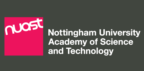
Part of new brand identity for the Nottingham University Academy of Science and Technology (NUAST), based in Nottingham UK. This is the landscape version. An option B exists which is in the Pantone 206 colour and is used on a white background. A square version is also used.
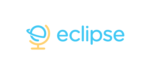
Eclipse offer specialist training software - mostly linguistic, but also teachings on grammar, syntax, etc. The use of the globe device reinforces the idea that language & communication is a ‘global’ exercise. Conceptually the design is of course inspired by a globe on its axis/stand. Since the idea of the eclipse is not necessary representative of solar or lunar, the mark focuses on how eclipses are created, orbit – The precise moment the Earth/Moon orbit is in relation to the Sun. The planet also forming an abstract E, creating a subtle monogram.

Logo designed for secret revealing website.
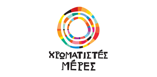
Colourful Days (Chromatistes Meres) is a company active in the field of experiential education, with programs for children as well as training seminars for adults. The programmes, divided in thematic circles are designed by specialist educators – animators, and cover a variety of educational and entertainment-related subjects. The target is the high quality of the end result. Every programme is experiential as well as educational. Built around theatrical games, it accomplishes its target through games, constructions and a lot of imagination, providing to children the opportunity to play, to express themselves and to create. The logo, inspired by the ‘circles’ of the programmes has been designed so as to express joy, playing, movement through a mosaic of colours and experiences
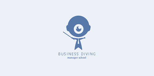
Logo concept for a manager school.
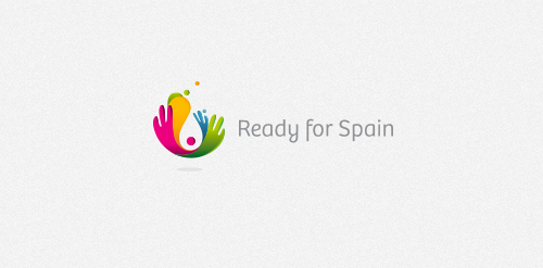
The "Ready for Spain" aims to provide services to anyone who is thinking of traveling to Spain.
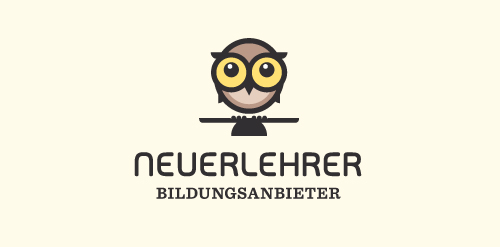
For Neuerlehrer (New Tutor) an education provider. This concept deals with the idea of well-balanced study. The mortarboard of course doubling as a see-saw. General vibe requested was light-hearted/friendly/playful, they wanted a logo the could double as a character/mascot to be used as a guide through the software, remember the paperclip helper from Microsoft Word? Similar/same premise. The represented 'age' of the owl is that of an owl chick, so that it can grow up along side the student.
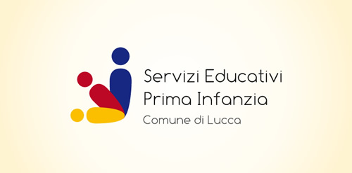
Early childhood education services Lucca
Project for competition.
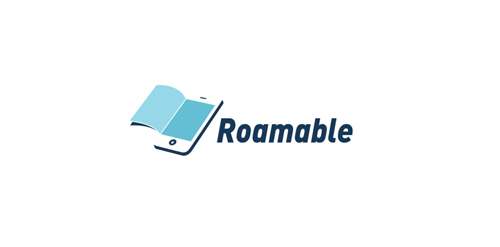
Roamable develop mobile learning (mLearning) solutions for corporations and higher education institutions. They harness the portability of small, mobile devices to help leaders grown their organizations in a new way.
Designed by www.logodesigncreation.com
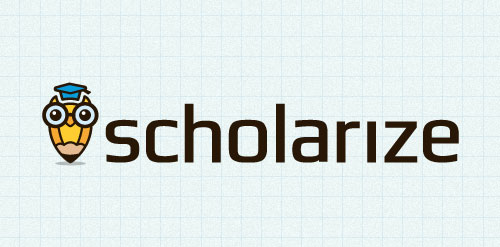
A Work in progress logo for a Content Management System that helps teachers/schools. 'Schola' (Latin for School) + Organize = Scholarize. The symbol is a combination of an owl (represents wisdom) and a pencil (represents education)
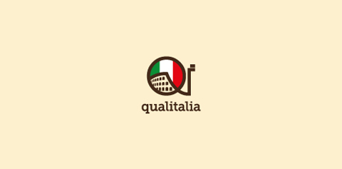
A logo made for a very original (and small) italian language school in Warsaw / Poland. I wanted to keep it simple. The 'qi' letters stand for 'quality' and 'italy'.
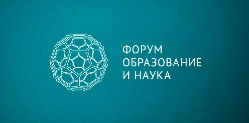
Designer: Denis Aristov Client: "Perm Fair" Exhibition Center Industry: Event, Forum Keywords: forum, science, education, molecule, structure, complex, blue
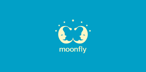
The main characters of the logo designed using positive space are two "sleepy" moons! There is however another character- hidden in the design! Seek for it!

maktabkhooneh.ir
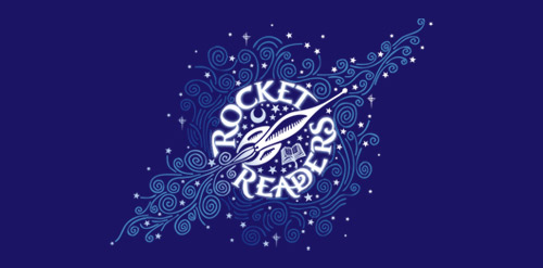
A special program for gifted readers Age 3 - 6, the formative years
Reseller and consultant, specialist in interactive solutions for education and businesses, Motiv'Solutions is operating in a booming market. With an innovative and complete strategy, the company offers complete solutions: consulting, services, installation, training... Here at Brand Brothers, our challenge was to design for them a professional and reassuring visual identity and branding, that would leave a mark in people's minds.
Our logo inspiration gallery will give you the creative boost you're looking for. Get your daily dose of logo design inspiration to work on your own logo design projects and get your business going. Be amazed by our logo designers and their brand guidelines. We are here to help you impress your clients and our fellow designers. Professionalize your logo design skills and get yourself to a new level. Browse our logo design gallery and discover all the new logo design trends and much more. We know you love logos!