
Hammer logos (12)
Logo for mining company.


Ingenious and simple brand. For sale!
Logo created for a guitar builder.
Logotype created for Polish studio specializing in artistic wood processing. The mark refers to two "T" letters, metal nails & hammer chisel. "Tartak" name mean sawmill. • • • follow us on www.instagram.com/triptic.pl

Symbol of the company, which operates in the agricultural auctions. Symbol contains the colors of growth and auction hammer.
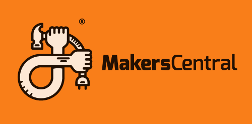
Logo proposal for MakersCentral. Its a project to build a community for makers. Makers in this case are enthusiasts of 3D printing, machining, wood working, electronics, and wearables. Anything that uses technology to create a physical item. Rejected,
Small, family-owned construction company.
A logo I made for my brother's company
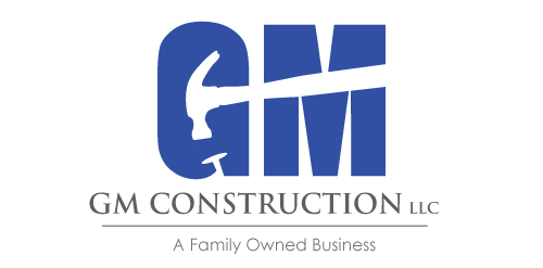
A simple logo using negative space for GM Construction.
one of three concepts for marketing company / just for fun. This is the original concept, please delete the another. Thanks
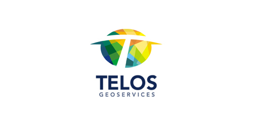
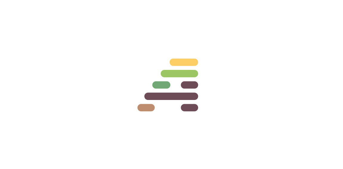
Logo for company which offers technical and geological services in the mining sector. The mark is inspired from from the shape of the 'prospector hammer".The varied colors /sections symbolize the numerous data and information that the company collects and presents in a compact form to its clients .The colors and section also communicate the idea that the company is adept at exploring varied terrains and areas
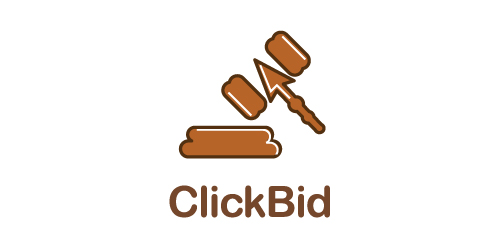
for auction website.
Our logo inspiration gallery will give you the creative boost you're looking for. Get your daily dose of logo design inspiration to work on your own logo design projects and get your business going. Be amazed by our logo designers and their brand guidelines. We are here to help you impress your clients and our fellow designers. Professionalize your logo design skills and get yourself to a new level. Browse our logo design gallery and discover all the new logo design trends and much more. We know you love logos!