Lines logos (38)

This classically designed logo retains the history or this sporting organisation but gives it a completely modern brand.


Logo for real estate company or other. It is for sale.


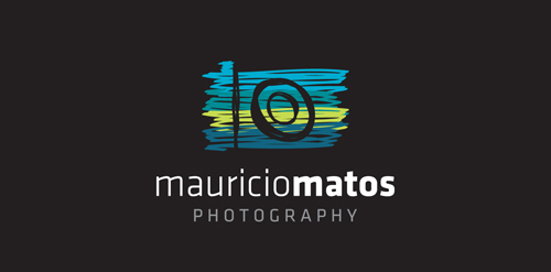
A new logo for a travel photographer.

Designer: Denis Aristov Client: Revitech Ltd. Iindustry: Water Supply and Sewerage Service Keywords: revival, technology, energy-saving, efficiency, service, lines, house, building, tree, leaf, sustainable, use, of, natural, resources, water, supply and sewerage, nature
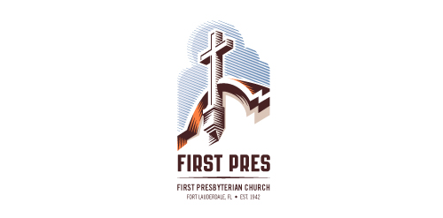
Redesign of the church's old logo in a stylized, illustrative manner, making it more welcoming, contemporary, friendly, casual, & upbeat. Client specified a rendering of the church’s architectural arch and cross in the perspective in this photo, and required an emphasis on the church's nickname, “First Pres."
Here, crisp, exacting vectors emphasize the architectural soundness of the church — a metaphor for the concept of faith as the solid foundation in one's life. This design makes use of hatching to add gradient dimensionality, enabling it to easily reduce down to 1-color. Colors are indicative of the building itself, including terracotta roof. Check my Flickr case study or Dribbble for more images, detail, and full design rationale.
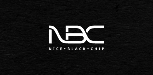
Nice Black Chip is a small, intelligent team of experts in fields of electronics hardware and software.
Client wanted strong, clean design in black and white.

Network of Scientists.. Logo is the concept of a Thinker formed by a connective line..

Logo for IT-Bureau