
Logotype logos (308)
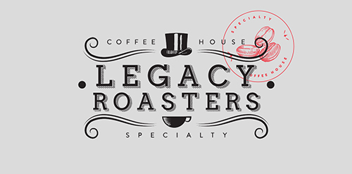
Is an establishment dedicated to the sell and preparation of speciality food and coffee. They know the place where the coffee grew and the different procedures are realized to obtain a variety of flavors, smells and acidity. In the part of the tea we work with one of the best houses of tea in the country named Carabanserai, located in Roma D.F., they provide french tea and realize their own mixtures of excellent quality. By our part we realize the redesign of their identity where we look to keep and stylize the main elements of their old logo, as the top hatted, the gentleman’s mustache and the cup of coffee, the result is a clean logo, sophisticated and with an european tendency, to give the classic touch on the composition of the new identity and unique consume experience. On the packaging we use ziploc type bags of rice paper to keep the freshness of the tea and also the coffee, and we tag with two stickers, one with the illustration of coffee beans and another one with the picture of a cup of tea.


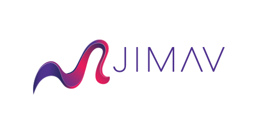
The identity of the builder JIMAV is based on the inspiration that we had with organic architecture. With curved forms we achieved a symbol with plenty life, which is balanced with a simple, legible and solid typography. The logo is a form developed with the approach of the letter “J” of Jiménez and the letter “A”of Avelar, which compound the name of the builder JIMAV. We developed a variety of the logo’s versions and compositions for the use in different applications and to make easier it’s reproduction.
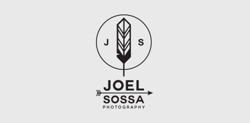
Personal identity for Joel Sossa, professional photographer from Guadalajara, México.Passionate by arrows, feathers and all about yaqui, cherokee, north american indians and their culture, the reason why the logo is. One of the most important and subtle elements on this logo is the circle, which represents the dream catcher like the circle of the camera lens, Joel Sossa is always capturing natural moments, people and landscapes with a particular style.
GRYPH. logo concept
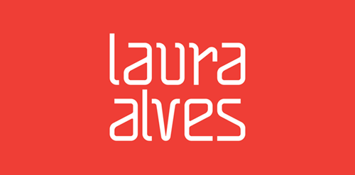
"The project for Architect and Urban Planner Laura Alves was based on the abstract forms and drafts used on a daily basis of the architect. We used orange as a color base because it inspires creativity."
Logotype for videoproduction called Cameleon movie
Urban Park logo concept
e-LifeStyle logo concept
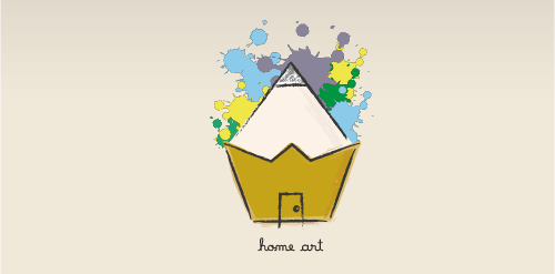
Logotype for everything that is associated with art.
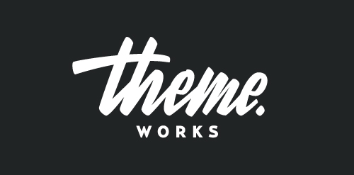
Logotype for Theme.Works. Website to design your Wordpress theme.
Been working on this custom lettering logotype for a design agency based in Australia last week, we are both really excited about the outcome.
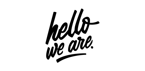
Lettering logotype for "hello, we are." a studio based in Austria which specializes in animation and visuals.
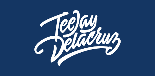
Logotype for photographer TeeJay Delacruz.
A concept. A visual play on words.
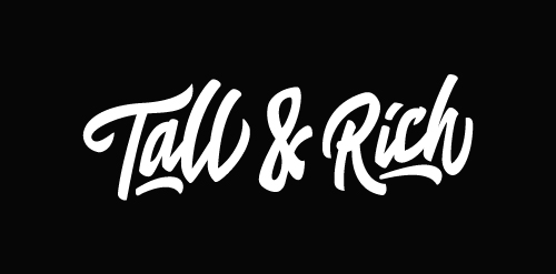
Logo for Tall & Rich, a DJ couple from the Netherlands.
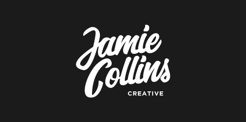
1/3 concept sketch of the personal logotype for Jamie Collins, tried to accomplish a whimsical look in this concept.
An An hotel is located in District 1, Ho Chi Minh city. It has vintage glamour style and provides professional service in hotel and tourism.
Fancy Design is my personal project. This is the branding for Fancy Design. My work includes designing branding, logo and website. I work with people all over the world.
GBOX STUDIOS aim is to create a full service offering clients the highest quality of work with a comprehensive understanding of modern production, their services include advertising, products, automotive, portraits, beauty, editorial photography and video production. Gbox brand mark was inspired by the brand name and the lens - a visual representation of their world, we aim to create powerful simplicity, all components are coherence based on a box. Full branding case studies : https://www.behance.net/gallery/18065083/Gbox-Studios-Brand-identity-
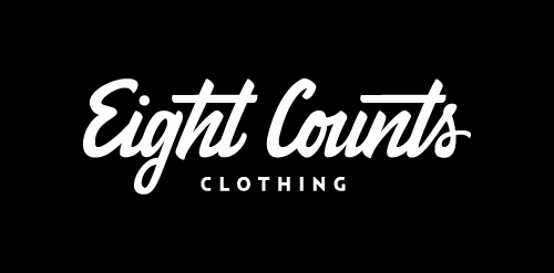
Logo for Belgium apparel Eight Counts Clothing.
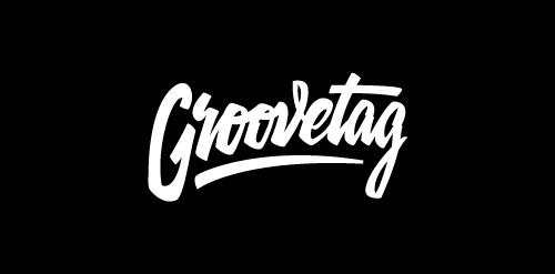
Logo for Dutch DJ couple Groovetag.
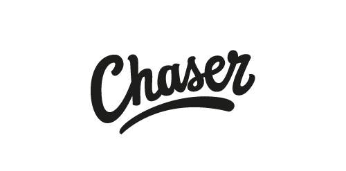
Chaser by Paul von Excite
http://www.facebook.com/paulvonexcite
ICT24H is an information technology in Vietnam. ICT24H is a IT service company, provides the quantity training program, strategy and consulting technical about many products and technologies.
Our logo inspiration gallery will give you the creative boost you're looking for. Get your daily dose of logo design inspiration to work on your own logo design projects and get your business going. Be amazed by our logo designers and their brand guidelines. We are here to help you impress your clients and our fellow designers. Professionalize your logo design skills and get yourself to a new level. Browse our logo design gallery and discover all the new logo design trends and much more. We know you love logos!