
Marketing logos (65)
Corporate Image Project - 2005
This is a bitter-sweet logo for me, but I liked how it turned out so I went ahead and posted it here anyways =) So, this guy from France showed up where I worked at the time, and made a deal with the owners to buy the place; it was a small coffee shop kinda thing, and I was running all the design-marketing aspects of the place. He asks if I would like to create the corporate image for a business he has and I say sure; but when the time to pay comes up, *poof* the guy is nowhere to be found. Not only did he take all my work with him (estimated at 1,500 usd!) but didn't buy the place AFTER he took money from the register and the owners!
Well, needless to say he has several lawsuits waiting for him should he ever decide to come back and visit ;)
Leave a rate to show some love!!


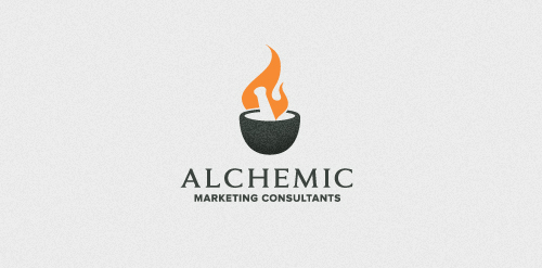
For a Marketing/PR Company. The concept behind the mark is based on the age-old alchemic practice of attempting to artificially mass produce gold by way of fusion/synthesis with other elements. Since gold has only one stable isotope (the element Au) a massive chemical reaction would need to occur to generate this isotope. There is only x3 active protons difference between Lead & Gold. They're 'chemically' different...reaction to solvents, melting temp, etc...but, if you were to extract those x3 protons from lead theoretically, you would have gold. Things like American Idol employ this 'extraction' tactic...slowly removing the unnecessary protons (contestants) till they have their 'golden result' - a season winner.
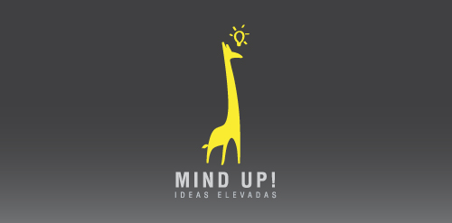
School project which was to create a Mkting Agency. Mind Up! is the idea we came with (: Slogan says: High Ideas.
one of three concepts for marketing company / just for fun. This is the original concept, please delete the another. Thanks
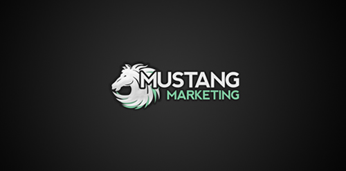
Mustang Marketing - interactive agency from Lublin, Poland, specializing in e-marketing, webdesign and branding. More info at http://mustang-marketing.pl or http://facebook.com/agencjamustangmarketing
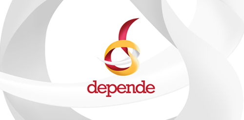
Depende is a company that connects Polish and Spanish advertising market.

Logo for new media agency called VOLUME MEDIA. Symbol represent all new media as tv, internet, web, video together in one colourfull media box.
Marketing and management company
Nomadikus - tommorow's problems, today's solutions
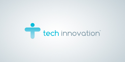
This was the beginning of an entire branding and identity package. Tech Innovation is a marketing rep firm that bridges the gap between manufacturers and consumers by providing innovative marketing strategies.
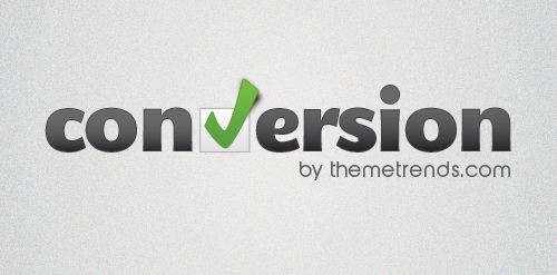
Logo for a new wordpress theme that is focused around creating and managing landing pages. Check it out at ThemeTrends.com
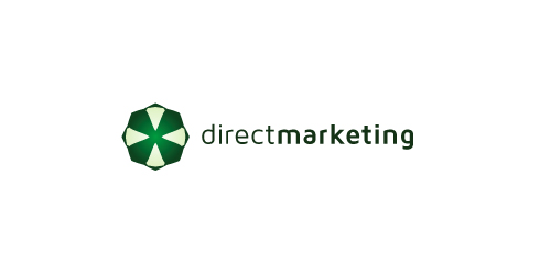
The direct marketing logo represents a marketing agency. The arrows in the logo represent the communication back and forth. This logo could also be working for any other kind of company. You can buy it here: Direct Marketing
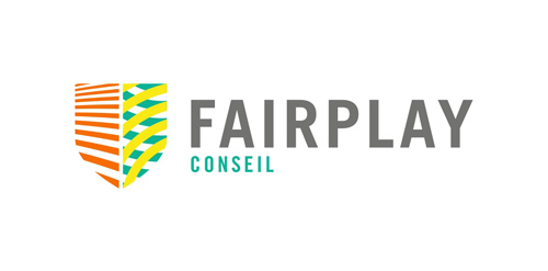
FairPlay is a sports & cultural marketing agency. We chose to design a colorful identity, that could also change and evolve. The logo consists of a shield - evoking the prestige of major sports clubs, with a left side wearing stripes (meaning fair, straight, respectful) and a right side reprensenting the "play" side: curves, meaning creativity, fun, and competition.
Marketing agency. Selected proposal. It turned out that the most important thing for the client was the impression of experience, seriousness, stability and ability to take on the most demanding jobs. Custom made lettering was a big part of why they have decided to go with this design.
Marketing agency. One of initial proposals presented to the client.
Logo for a marketing company.
Logo design for internet marketing company with expertise in creating and managing large online campaigns for local and national businesses.
Our logo inspiration gallery will give you the creative boost you're looking for. Get your daily dose of logo design inspiration to work on your own logo design projects and get your business going. Be amazed by our logo designers and their brand guidelines. We are here to help you impress your clients and our fellow designers. Professionalize your logo design skills and get yourself to a new level. Browse our logo design gallery and discover all the new logo design trends and much more. We know you love logos!