
Medical logos (52)
Logo designed for company which sells supplements


Logo for pharmaceutical company
Company logo in selling medical equipment
Medical equipment.
Company engaged in the development of tests for HIV Indications
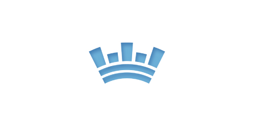
This is the symbol for Crown Tenant Advisors, a Medical Realty Consutation Firm. The intent was to give a new company a simple, recognizable identity by incorporating a skyline into a crown.
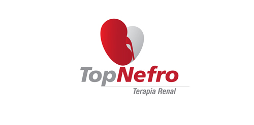
Logo for a kidney therapy clinic
Logo design for a medical foundation 'Sanitas'.
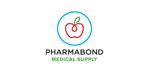
Pharmabond are a new medicinal supply company in the US, deal with mostly bulk supply for private practices. The apple represents health; it is a continuous line with a loop implying ongoing health. The loop doubles as a droplet, to symbolise medicine, water, purification, etc. The leaf is also a subtle P. The blue enclosure is a protective seal to ensure ongoing health.
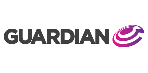
Inspired by Super Heroes and Greek Legend, Urban Jungle designed the Guardian identity. Integrating the “G” of the product’s name into a Captain American-esque shield, and using a charcoal colour treatment on a bold stylized version of the Gotham typeface, the identity blends a vivid colour palette of pink and purple, giving the identity strength and modernity.
Inspired by the ancient Japanese art of folding paper, the negative space from an origami-styled “D” creates Diploma’s icon. Using a deep charcoal colour treatment on a bold stylized version of the Museo Sans typeface, the identity combines vivid aqua and chartreuse colours, designed to strengthen the company’s fortified position as “the definitive partner for medical device sales in specialized healthcare markets.”
Inspired by the Spirograph, Urban Jungle designed the identity using a combination of four semi-transparent aqua and ochre circles. The circles symbolize the convergence of two unique corporate entities into one new corporate brand identity — Vantage. Using charcoal for the typeface, the identity blends a vibrant colour palette giving it a fresh, smart and energetic feel, and reflects the youthful and contemporary edge of the company.
Research and experimental laboratory.
Unused proposal for holistic centre.
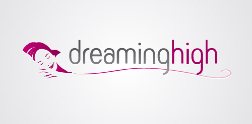
Dreaming High Vector Logo. A logo with a woman sleeping and making dreams up high.Simple and elegant logo vector for your design projects. Under Creative Commons 3.0 Attribution License. Font : http://new.myfonts.com/fonts/font-o-rama/longing/?refby=los
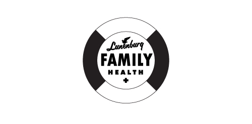
This logo was developed for the health clinic in the small seaside town of Lunenburg, Nova Scotia. They wanted it to appeal to ALL groups of people as it is a "birth to death" clinic.
private medical service
Sign for sale
Creative logo that illustrates the product branding.
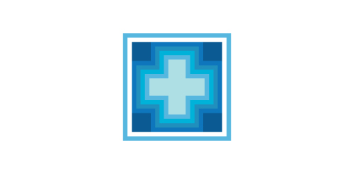
A logo for a start-up in Medical Supplies, the small 'plus' shape refers to the medical activities.
Logo for Center Dr. Sauta. It is a drug rehab center. This is a non-governmental public organization. The center helps people get rid of the dependency problems.
medical center
This logo is for a new drug that reduces itching in dogs and cats
iPracticeMD is a nationwide medical billing and revenue cycle management firm in the US.
Our logo inspiration gallery will give you the creative boost you're looking for. Get your daily dose of logo design inspiration to work on your own logo design projects and get your business going. Be amazed by our logo designers and their brand guidelines. We are here to help you impress your clients and our fellow designers. Professionalize your logo design skills and get yourself to a new level. Browse our logo design gallery and discover all the new logo design trends and much more. We know you love logos!