
Minimal logos (268)
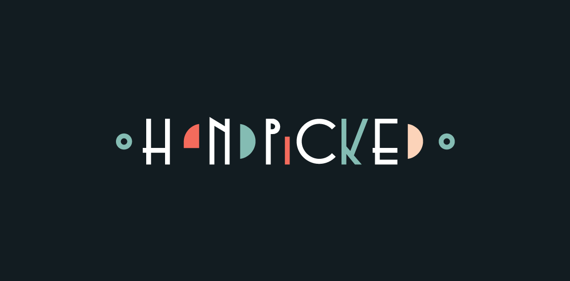
Contemporary design for online publication. With custom-made wordmark and clever use of negative space, this logo is unique and modern with touch of vintage art deco/art noveau look.


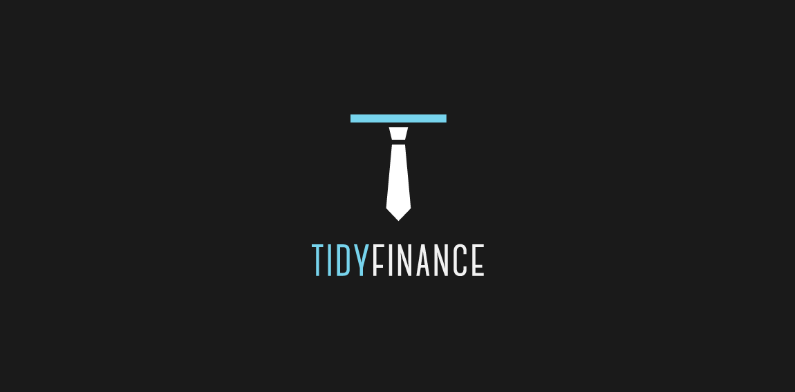
Clever, minimalistic concept for accounting company. I have combined hand windshield wiper (refering to company name: tidy, clean) and the tie symbolize business). It is also in the shape of company initial (T).
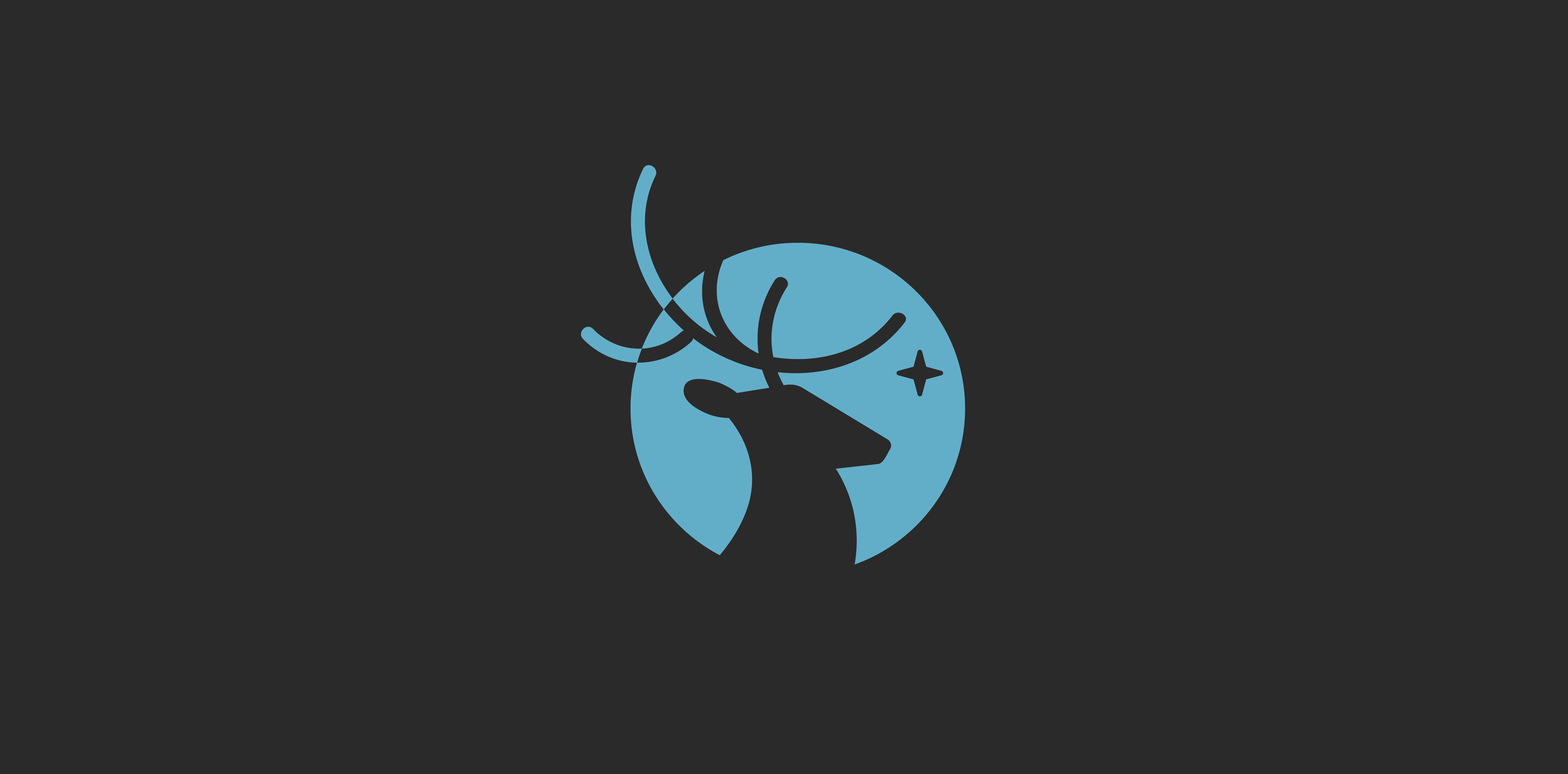
Clean, clever, negative space logo. I have combined these simple shapes - deer silhouette and full moon.
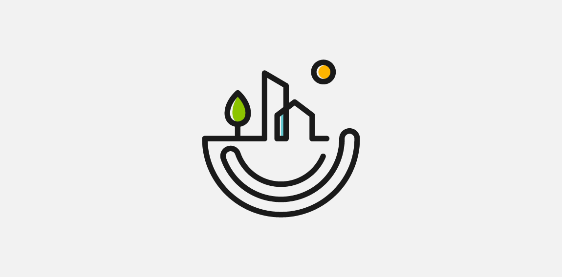
Logo proposal for Nest Homes real-estate company. Minimalistic, modern and clever concept.
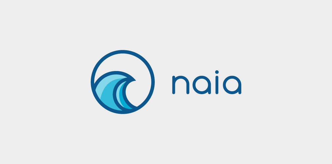
Logo for app development company. Naia means dolphin in hawaiian, but client wanted ocean symbolism (wave) in simple and modern way. Abstract, geometric wave shape. Overall look is minimalistic, modern and distinctive.
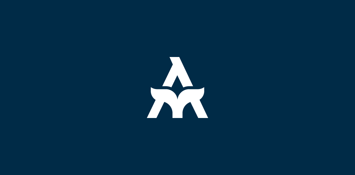
Simple, minimalistic and modern logo concept. Lettermark A and fish tail incorporated in subtle way make this concept - memorable, unique and clever.
Edgy, modern logo for television production company. Client wanted simple, but clever and bold logo so I came up on this idea (based on company name).
Vulpes AI provides artificial intelligence software and consulting services.
Clever wordmark for non-profit organization.
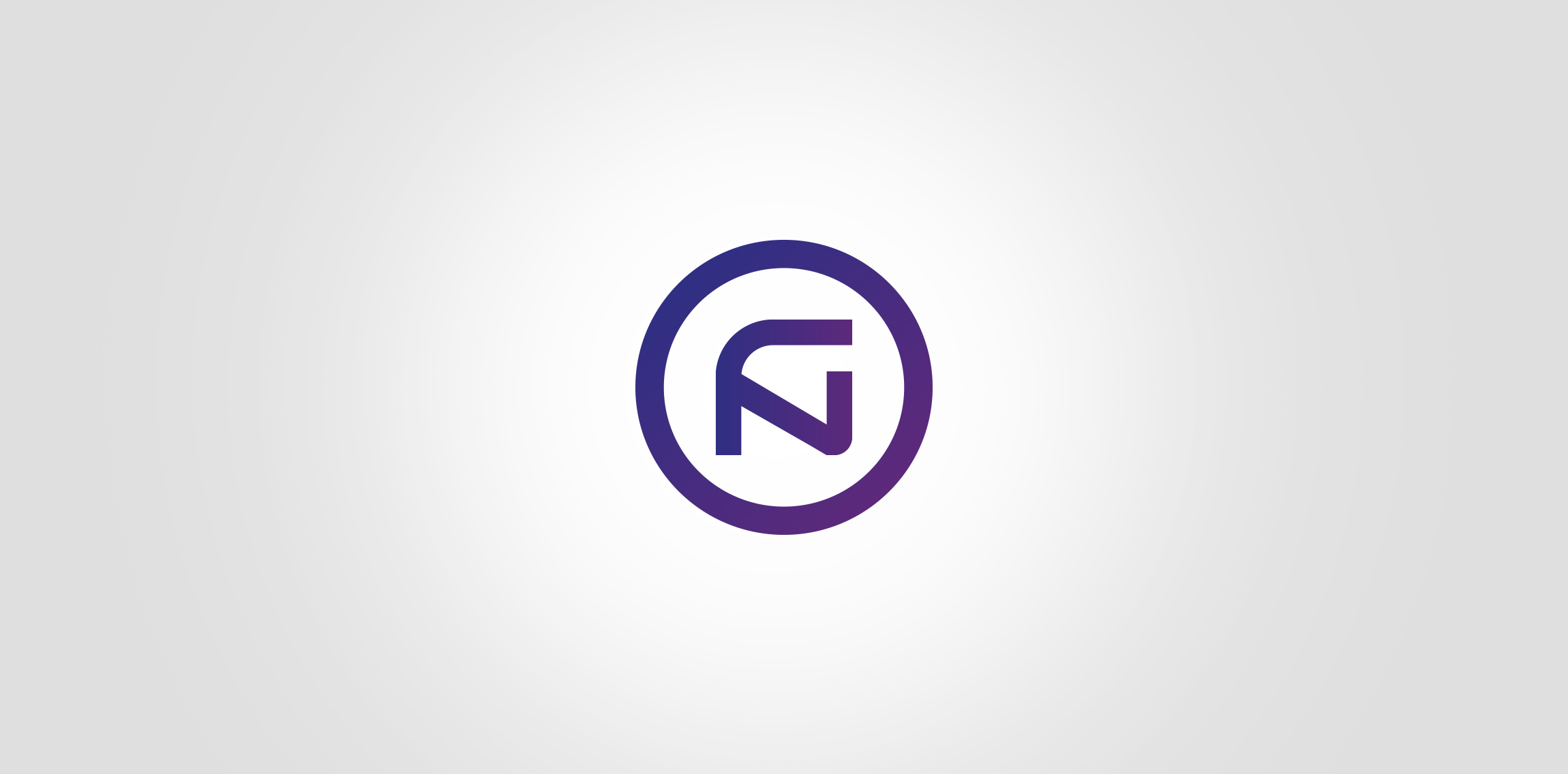
A company that specializes in smarthome technology. The emblem was built from the first letters of FUTURE and NEXT
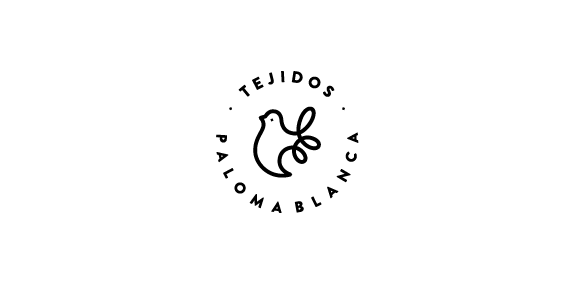
Tejidos Paloma Blanca - Proposal, full project in Behance https://www.behance.net/gallery/43324171/Tejidos-Paloma-Blanca-Branding
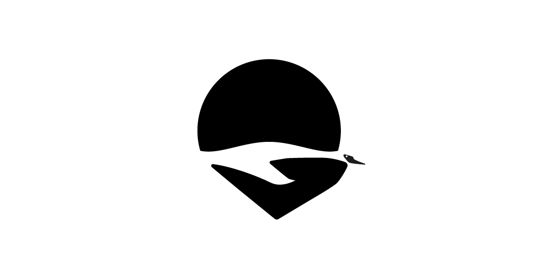
Care for the environment, this logo I've made out of a personal interest for our nature. It shows a flying swan in negative space and a hand an sun. That means you to take care for the nature.
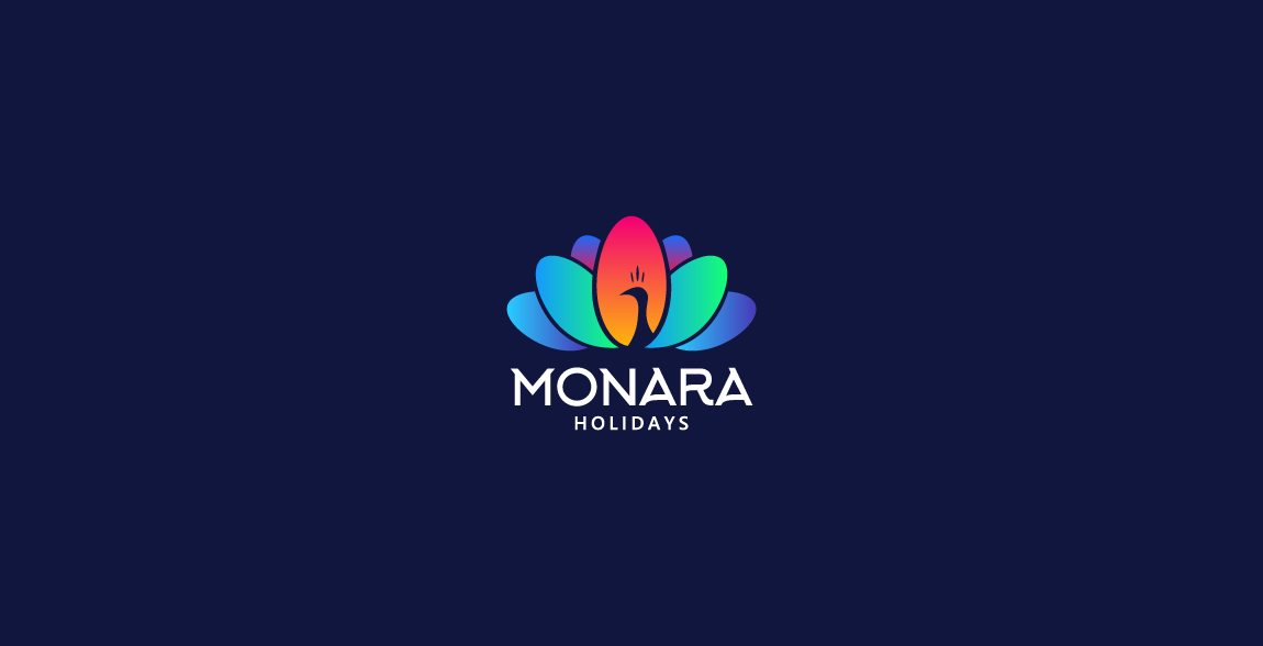
Monara Holidays undertaking Inbound Tourism, Ticketing, Reservations and Holidays in Sri Lanka. "Monara" means "Peacock"in Sinhala
Monara Holidays undertaking Inbound Tourism, Ticketing, Reservations and Holidays in Sri Lanka. "Monara" means "Peacock"in Sinhala
Logo for Fashion Stylist
Natural Cosmetics Brand. For more information about the brand or further projects visit my profile at: http://www.upwork.com/o/profiles/users/_~01322354571058e06e/
Logo design for 10 x DADS.
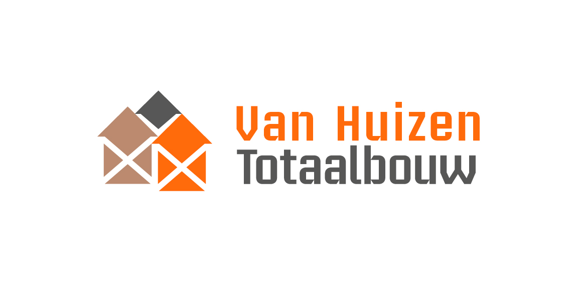
Building company. Their 3 pillars of work segment are 'Rebuild, renovate, installation'. Rebuild with concrete, grey color. Renovate with timber, brown color. Installation with copper, orange color. Scaffolding stands for building work in negative white. Houses stands for the name 'Huizen' Dutch for houses.
Logo is made of Pantone colors 1585C and CMYK 80K with an overlay of both for the brown color.
Logo in use at http://www.huizentotaalbouw.nl/.
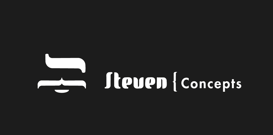
Brand builder of luxury retail startups. Initials are used as brand mark. Steven is the 'godfather of brands' just as maffia bosses tend to be. The new look has to be stylish, bold and recognizable.
It's client work, a proposal that isn't approved.
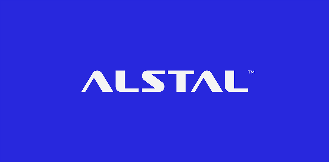
ALSTAL - Building
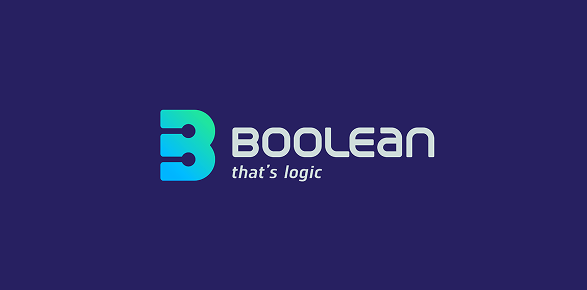
Boolean ''Our company associates group of engineers. who devoted their lives for continuous improvement of skills in field of navigation and communication industry. We have a long tradition in maritime technology. Today Booleanconsists of 7 engineers with level from 2 to 15 years of experience in maritime service. Many years of work on first line of service resulted with close relations with customers and suppliers of equipment. Main activities of the company are repairs of navigation and communication on board of commercial ships.'' Offer. -Proffessional maritime navigation and -- -communication service. -Annual surveys and overhauls. -Projects. -IT solutions. -Research and development. -International service coordination. -Equipment delivery and installation
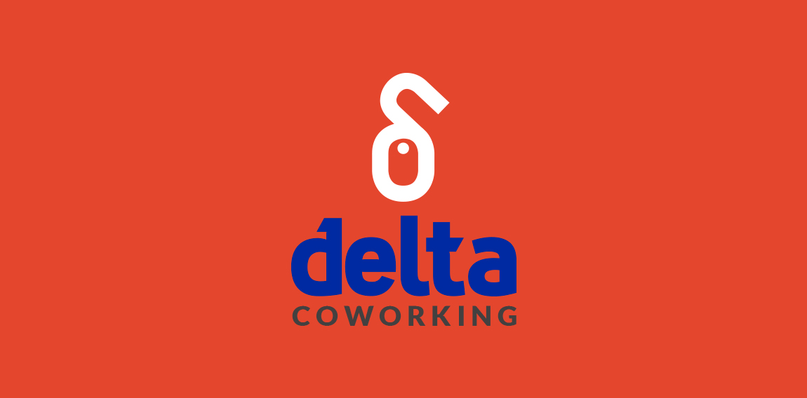
Logo for a coworking offices in Spain. The shape is a mouse (refering to computers and office) fusioned with the lower case "Delta" letter from the Greek alphabet.
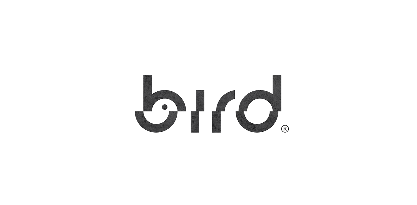
bird
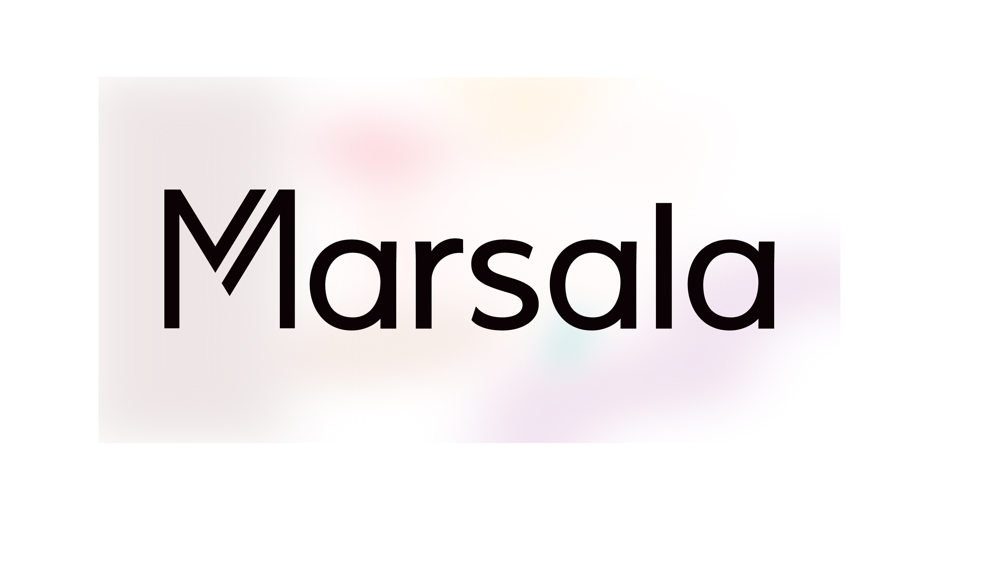
Marsala is a Textiles Agency, exporting clothes and fabrics.
A fresh, clean, post-modern, friendly identity which uses a subtle suggestion of color referring to sample fabrics, in combination with Black typography, communicating the identity and its content clearly and to the point.
Our logo inspiration gallery will give you the creative boost you're looking for. Get your daily dose of logo design inspiration to work on your own logo design projects and get your business going. Be amazed by our logo designers and their brand guidelines. We are here to help you impress your clients and our fellow designers. Professionalize your logo design skills and get yourself to a new level. Browse our logo design gallery and discover all the new logo design trends and much more. We know you love logos!