
Music logos (264)
Logo for music producer


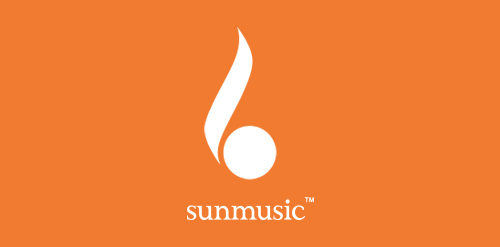
Music Label The harmony of the simple shapes used, the color chosen, makes clear and direct the concept behind the brand: the union of the sun, represented by a flame, more, the empty spaces game of the treble clef.
Italian Music Band branding
Natures Visual Design is Production House. this logo design inspiration form letters NVD+Bullet shape.

Logo made for selling purpose on brandcrowd.
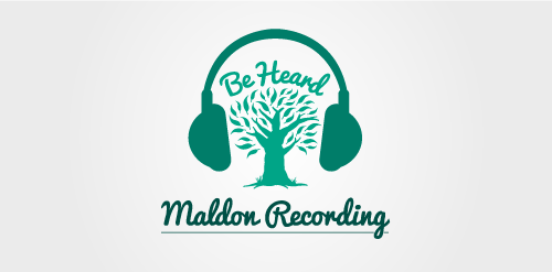
Inspired by the surrounding bushland in regional Victoria. As suggested by the tagline 'Be Heard', Maldon Recording is a business committed to helping up and coming artists grow as musicians and share their musical work. Maldon Recording offers professional recording of EPs and studio albums and strongly believe in staying true to your roots.
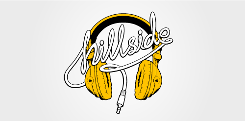
From a series of logos designed for Residential Services for university students. Each logo was inspired by an element of the traditionally youthful and relaxed student lifestyle. The 'Hillside' logo pays tribute to headphones, often considered to be a fundamental student accessory to motivate work ethic. Sometimes listening to a favourite band or album is necessary to focus and switch the mind into study mode.
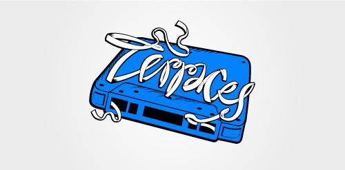
From a series of logos designed for Residential Services for university students. Each logo was inspired by an element of the traditionally youthful and relaxed student lifestyle. The 'Terraces' logo pays tribute to the cassette mixtape, which once played a huge part in the discovery of an individual's musical taste. Favourite songs were recorded on mixtapes and often shared amongst friends during their formative student years.
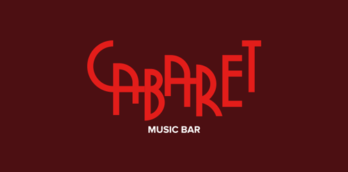
"The typography was based on Art Deco of the 40s and 50’s themed cabaret was applied in all material of the bar, since the internal communication such as clothing and outdoor applications.”
Award-winning music production company
goldsteinmusic.com
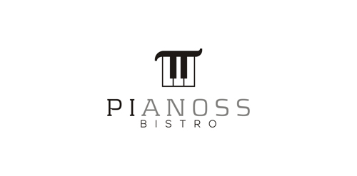
concept: NUMBER PI + PIANO = PIANOSS Number PI reads as PIE, so it is perfect for bistro or restaurant. This one is for sale.
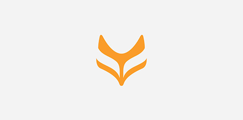
Working on a fox face logomark for a music producer in UK. More on Behance: https://www.behance.net/gallery/20029271/Logo-design-for-a-music-producer
"The conception for this idea was simple, to join M and B with a CDJ and a lonpglay disc, frequently used by DJs. On the construction grid we developed a system where it doesn’t matter the angle or rotation of the brand, you will always be reading and M and a B just like a disc or CDJ.”
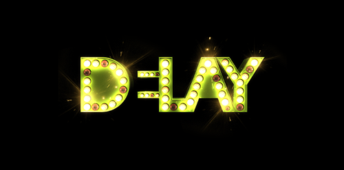
"DELAY is all about keeping you updated on everything that happens in the music industry without taking away our references. A music and events producer that exceeds the limits of stereotypes. Here is your meeting with DELAY. After all, everything that involves music deserves an echo, an effect, a little extra time of reproduction. For the design of this brand we aimed to work in a way that it would represent several different applications in different situations like rock, indie or pop. The brand would change according to what would be released, to adecquate itself to the kind of information it should bring.”
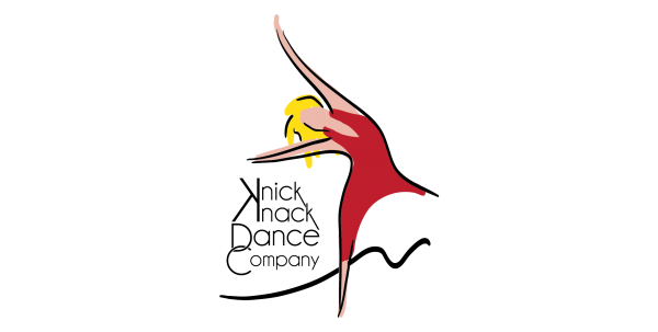
Stefania Striccoli's Knick Knack Dance Company
Logo Earthbeat - musical event
Event OverGround
Music info website
Bulgarian hard techno project
Tonalisa logo contest entry.
Logo for post-rock band Seanné
Logo design for a UK based electronic music producer. View the complete project on Behance: https://www.behance.net/gallery/17732431/Feint-Logo-Design
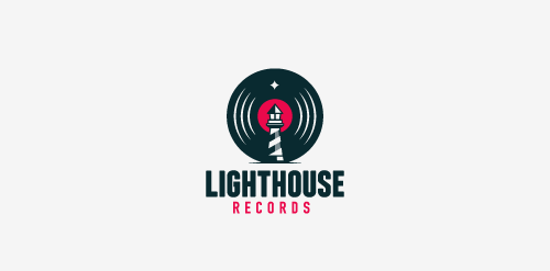
Logo for a Record label.
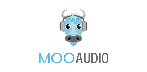
A modern logo design excellent for audio related companies.
Our logo inspiration gallery will give you the creative boost you're looking for. Get your daily dose of logo design inspiration to work on your own logo design projects and get your business going. Be amazed by our logo designers and their brand guidelines. We are here to help you impress your clients and our fellow designers. Professionalize your logo design skills and get yourself to a new level. Browse our logo design gallery and discover all the new logo design trends and much more. We know you love logos!