
Original logos (7)
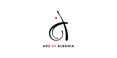
Ads of Albania, which is a social media page dealing with Ads industry in Albania, launched a competition for a new logo at the Design Overview Tirana - DOiT 2013. This Logo proposal got Bronze Award judged by industry professionals in the region.


About the logo Hello! I'm working on a project with some cool hardcore techies. They know all about coding and stuff. Uhm, we are currently between two logos for their company. And the other version has a low-poly kind of style, while this one has a more stroke approach. Im just wondering what you guys think of this? Seen something that looks like it, does it suck? Is it great? Im open for honest feedback, I truly believe that honest feedback is the way we hate each other more, but also make better logo's!
Logo for advertising company

Logo for Click Print Hand

Logo for Click Prints Blocks

Logo for Click Print Pencil
![Ideas Infinitas [infinite ideas]](https://www.logomoose.com/wp-content/uploads/2013/04/ideasinfinitas-01-01.jpg)
Logotipo de mi próxima agencia de diseño. Como el nombre lo dice representa una constante producción de ideas originales. Los dos bulbos aluden a las IDEAS, que al unirse (los bulbos) forman el símbolo de INFINITO.
[My next logo design agency. As the name implies is a constant production of original ideas. The two bulbs refer to the IDEAS, which to join (the bulbs) are the symbol of infinity.]
Our logo inspiration gallery will give you the creative boost you're looking for. Get your daily dose of logo design inspiration to work on your own logo design projects and get your business going. Be amazed by our logo designers and their brand guidelines. We are here to help you impress your clients and our fellow designers. Professionalize your logo design skills and get yourself to a new level. Browse our logo design gallery and discover all the new logo design trends and much more. We know you love logos!