
P logos (18)

Propose is a data hub for collecting, analysing and combining big data from different physical sources.


Palio is an advertising agency powered to ignite brands in bold and beautifully disruptive ways.
Monogram made for fun. In case of interest it is for sale.

PrimusNote logo
The client want it a Latter logo something luxury and elegant with the GP so our designer figure it out a unique and great way how to connect Those "GP" and the design got a luxury and modern touch. www.prowaystudios.com
:)

MPB - My Poor Brain. The design and illustration alter-ego of Tim Smith. Brain powered graphics fun.

The Peoples Fitness is a website providing information, articles and advice for fitness and gym users. The concept was a monogram of the letters 'T,P & F'.

International Annual Publishing Exhibition & Conference in London
Childcare Business

Stylist is Pr but not like people
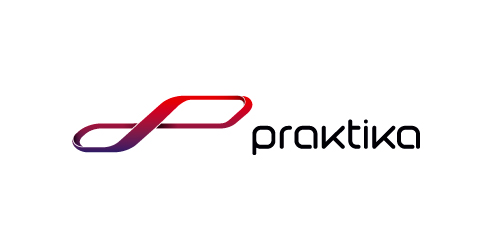
Designer: Denis Aristov | Client: Praktika Auto Center | Industry: Retail, Auto Service | Keywords: P, initials, Moebius's tape, infinity, speedway, racing, track, car, auto, gradient, red, violet, dynamic, motion
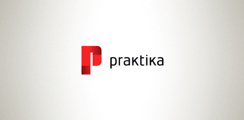
Designer: Denis Aristov Client: Praktika – Strategic Communications Agency Industry: PR (Public Relations) Keywords: pr, public, relations, p, r, initials, red, gradient, practice

Combining the letter of “P” and the letter of “S” to be the logo.
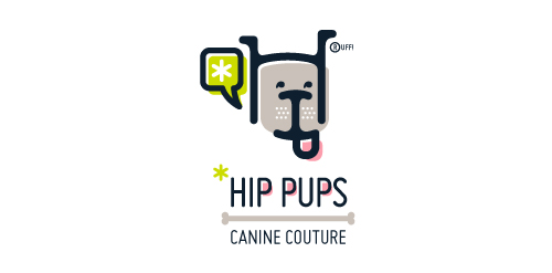
This fictitious company logo is the result of happenstance typographic exploration. I was playing around with H and I letterforms set in Platelet, and, after placing the I within the H, I noticed that it started to look like a dog face. After some modification, and with the addition of a curved P for an extended dog tongue, the resulting typographic illustration spelled "HIP." I thought it would be fun to name this fictitious company Hip Pups, which could be a shop that sells high-end dog accessories. The Registered symbol is integrated creatively into the mark by spelling "RUFF!"

iPracticeMD is a nationwide medical billing and revenue cycle management firm in the US.
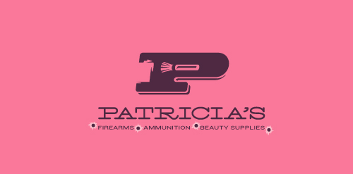
This logo for a completely fictitious company started when I noticed that the negative space with the letter P set in the typeface Blackoak looked a bit like a gun firing a bullet. This got me thinking of how interesting it would be if there were a super-girly, female-owned and operated boutique, catering only to women, which sells not only firearms and ammunition, but also beauty supplies. Everything a modern woman needs! Hey, if you're gonna make up a logo and a company to go with it, why not have a little fun with it? Here, the left side of the P reveals the profile of a gun barrel in negative space, while the negative space within the bowl of the P reveals a makeup brush, which doubles as a bullet being fired. The P mark, based on the Blackoak letterform, is constructed by hand, and the type for "Patricia's" is based on Archive Antique Extended, and is also constructed by hand. I did this because I wanted rounded corners and edges to give the logo a more feminine touch.
Click here to see the case study for this logo, which chronicles its development, and includes full design rationale, sketches, electronic roughs, and alternate designs.
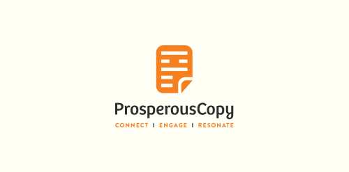
Identity for a Northford, US based B2B/B2C writing and editing agency that serves large multinational and global firms, businesses of all sizes, nonprofit organizations, and entrepreneurs.
Our logo inspiration gallery will give you the creative boost you're looking for. Get your daily dose of logo design inspiration to work on your own logo design projects and get your business going. Be amazed by our logo designers and their brand guidelines. We are here to help you impress your clients and our fellow designers. Professionalize your logo design skills and get yourself to a new level. Browse our logo design gallery and discover all the new logo design trends and much more. We know you love logos!