
Portugal logos (7)
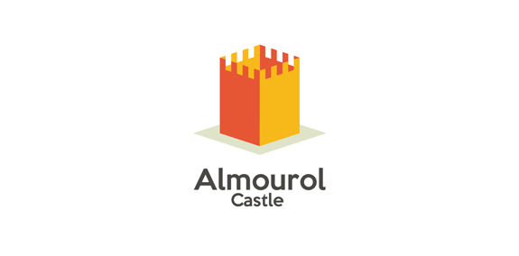
I created an icon of the Castle as simple and you can guess which is the Castle, the Portuguese can guess which is a Almourol castle, stays in Portugal, in the District of Santarém.


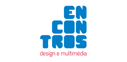
[see more in behance @ http://bit.ly/W8GJLS] Encontros Design e Multimédia is an event. It has being taken place since 2009 and consists in a week dedicated to promote and develop design and multimedia activities, workshops and meetings in the city of Braga. It's promoted by Escola Profissional de Braga. The design, organisation and communication of the event is the responsibility of a finalist student. [The brief] Encontros Design e Multimédia had a clear ambition, grow year after year, it wanted to inspire, involve and thrill the students, professionals and enthusiasts about Design and Multimedia. The logo was to be used in the website, facebook, promotional material, including posters, flyers, video, and a lot more. The goal couldn't be clearer, it had to be unusual. [The solution] The logo represents Encontros's strong ambition. It has all the elements to succeed, it's simple, relevant, it incorporates tradition, it's distinct, memorable, versatile and it stands out from the crowd. It's designed to be filled. Filled with photos, images, participants, speakers, filled with design and multimedia. It has no icons of design or multimedia and doesn't need them, it has all the qualities of both and all the creativity to be anything. [Typography] Encontros has a unique typeface, its custom and it's designed specifically for this brand. It's a bold geometric typeface designed to be filled and to get noticed in every contexts. [Colors] The colors are one of the most important elements of Encontros. The chromatic scheme is very expressive, it's a variation of the well known CMYK, providing a vast number of combinations making the brand very dynamic and inspiring as well. [see more in behance @ http://bit.ly/W8GJLS] [joserodrigues @ http://be.net/joserodrigues]
“Seixe” is a Portuguese word that comes from the Arab culture and describes a type of rock, very typical on certain rivers in the Portuguese Costa Vicentina e Sudoeste Alentejano natural park. SEIXE brand’s symbol represents the strong idea from the rock and, also, the existing connections between the local culture and all other areas, symbolised by the connection among the SEIXE last three letters (i – x – e).
The logo is an emblem of my three distinct cultural identities as a graphic designer: the head of a Chinese dragon, the body of an English lion and the tail of a Portuguese rooster. Born in a Portuguese colony in China where east meets west, I grew up in a richly diverse cultural background and have now lived in the English capital for more than ten years.

This is a logotype that i've made for a portuguese medical center and plastic surgery clinic...
The Portuguese discount voucher.
The Portuguese discount vouchers
Our logo inspiration gallery will give you the creative boost you're looking for. Get your daily dose of logo design inspiration to work on your own logo design projects and get your business going. Be amazed by our logo designers and their brand guidelines. We are here to help you impress your clients and our fellow designers. Professionalize your logo design skills and get yourself to a new level. Browse our logo design gallery and discover all the new logo design trends and much more. We know you love logos!