
Purple logos (56)
F Alphabet


I decided to challenge myself to create logotypes everyday with random words.
A grape-to-wine transition. Logo for winery, wine shop, restaurant and other wine related business.
This is a logo for a speech therapist center. We created a parrot ( a bird that talks fluently) and gave him the form of the letter a.

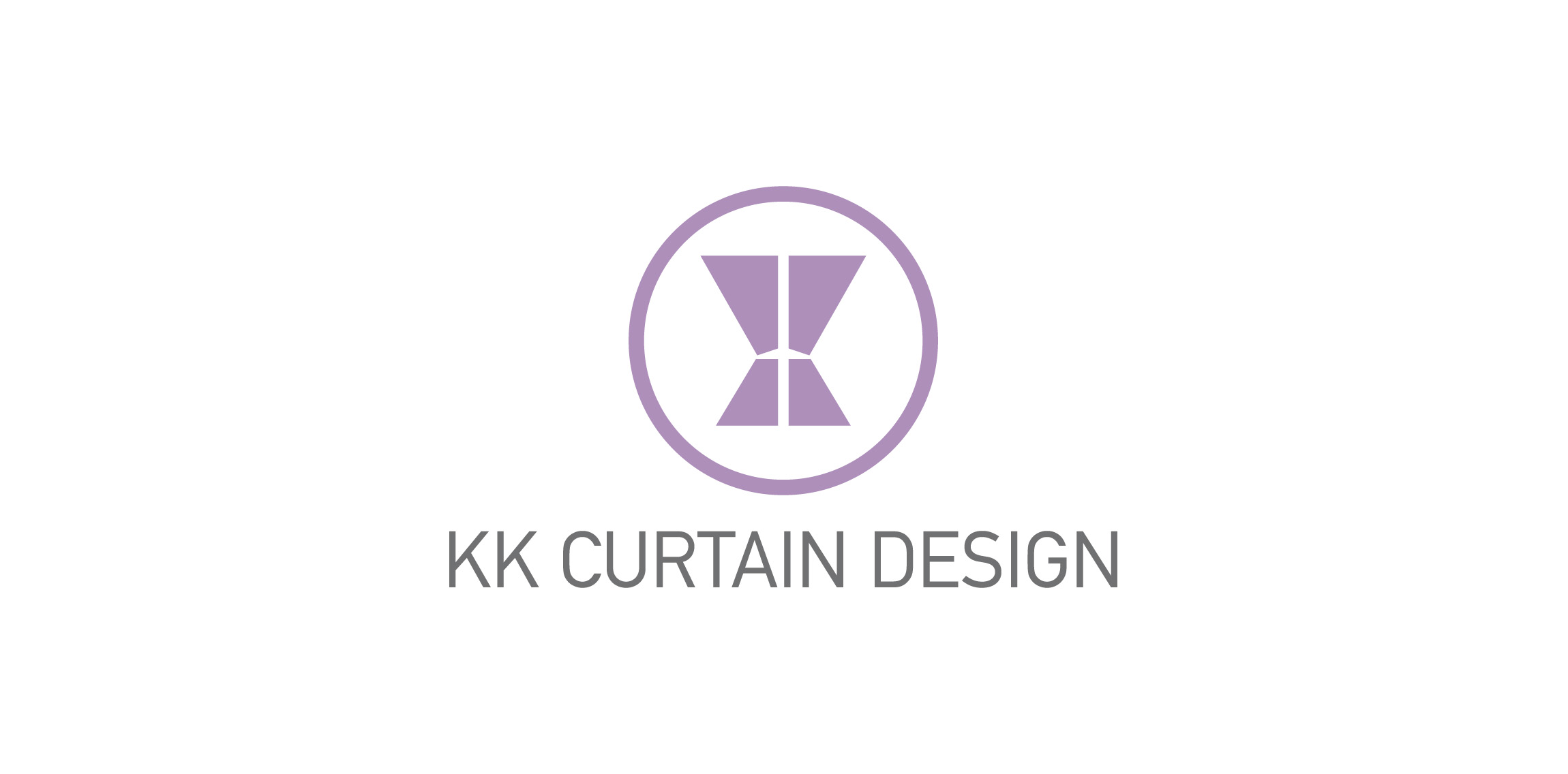
Unused idea for a curtain studio
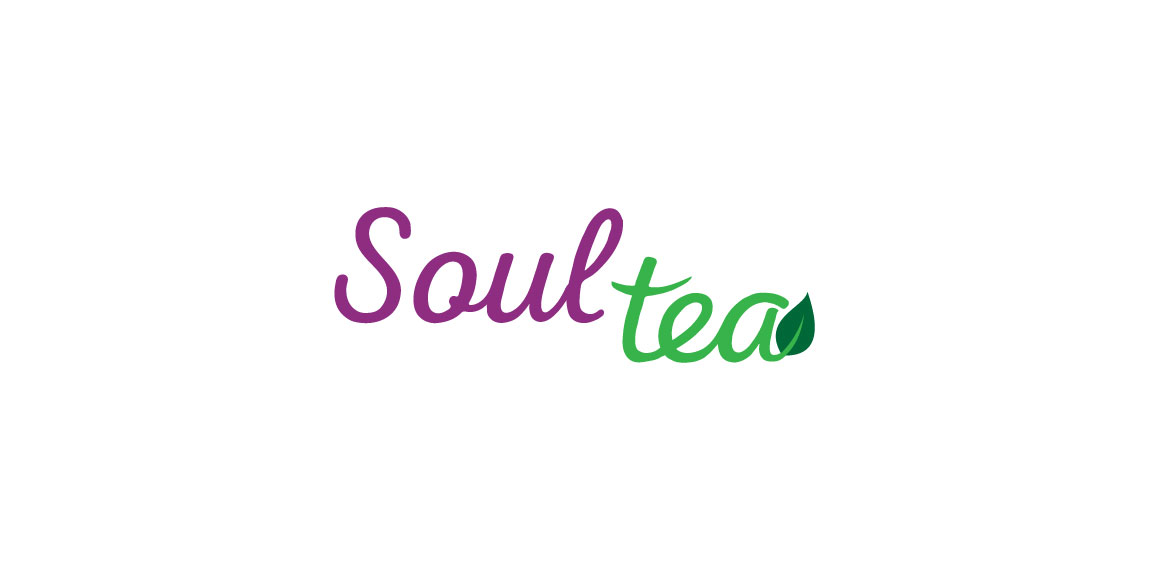
Quirky logo for a tea shop / manufacturer.
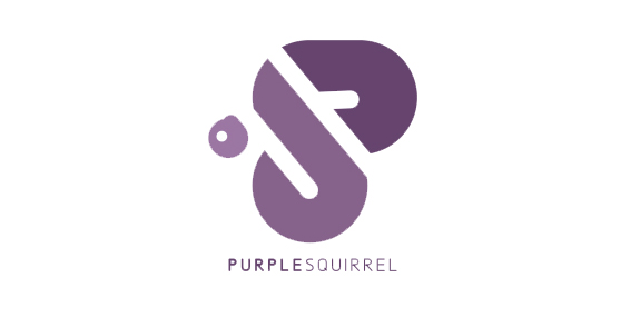
Using an overused term unique to the recruitment industry to create a logo that is updated, flat and reflective of a squirrel as well as the first letters of the business name.
Hi everyone! My latest logo design for háerko - HR Agency. The point is the hidden men/women at the end of the logo. To be fair, I made multi-sex versions :) Check full version on my dribbble: http://bit.ly/1R8fp9v
Brand identity for a Canada based brand consultancy.
Logo for a web development agency.
Metamorphosis logo
Logotype based on a Name Mandala (www.namemandalas.com), designed for a Yoga Studio.
Logotype created for China based web & mobile apps developer. - - - follow us on www.instagram.com/triptic.pl
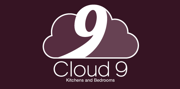
The number 9 blended into a cloud shape with subtle shading
Consulting company (consulting, law, finance). www.onedot.pl www.youradvisors.pl
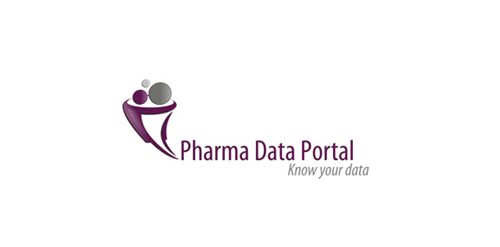
Logo designed for a project of a global pharmaceutical company. Iconic part of the logo represents a funnel gathering data particles, whist alluding to a human embracing this data.

Logo incorporated letter "A" and "M".
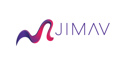
The identity of the builder JIMAV is based on the inspiration that we had with organic architecture. With curved forms we achieved a symbol with plenty life, which is balanced with a simple, legible and solid typography. The logo is a form developed with the approach of the letter “J” of Jiménez and the letter “A”of Avelar, which compound the name of the builder JIMAV. We developed a variety of the logo’s versions and compositions for the use in different applications and to make easier it’s reproduction.
Exclusive Customizable Logo at Eisaks Logo Design
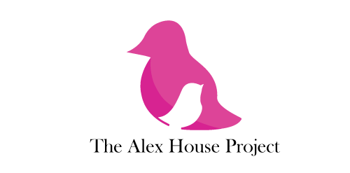
The Alex House Project is a multifaceted program designed and led by young mothers to increase long term self sufficiency and independence by providing parenting and leadership development in a safe and caring environment.
Proposal for a Geek Community from Colombia.
Logo for entertainment club.
Logo design for 4G Network Limited based in England, UK
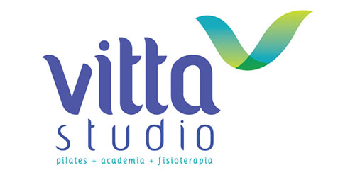
Logo for a wellness gym, especialized in pilates.