
Real Estate logos (45)
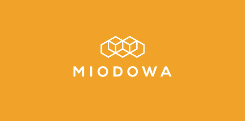
Miodowa is the name of the residential estate at Miodowa street in Wroclaw. Miodowa is an adjective used to describe something that tastes like honey. That is why we join 3 themes in the logo: honeycomb, architectural design and letter M.
Designer: Piotr Ploch


Unused logo proposal
logo for the business card
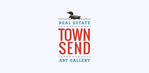
We recently completed this logo for Townsend Real Estate & Art Gallery in Maine. She wanted the logo to encompass the fresh coastal air of Southern Maine.
Logo for real estate
Logo for real estate
Logo for real estate

Logo for real estate
Logo designed as part of an identity for Johnson Modi Capital Ltd.
Real estate company for rental of commercial buildings
Urban Jungle was hired to develop Liv’s brand strategy, including its tagline and brand story. After clarifying its vision and defining its mission, values, personality, promise, experience, Urban Jungle then crafted the new corporate identity for the firm. The new look is simple, bold, and contemporary. It captures the essence of the firm’s fun and friendly personality while communicating its promise to help Edmontonians love where they live.
Sensimmo is a real estate broker for high quality homes.
Proposed concept for a real estate company. The mark has a crown in the center with the letter "M" being formed in the negative space.
The company rents apartments at Baltic Sea.
Real estate services
Logo proposal for client.
Glacier Ridge Media created a logo that represents Real Estate and Lending. Neighbourhood Lending is a Mortgage Specialist and offers solutions for all of your financing requirements.
Designer: Denis Aristov Client: Domseli S.L. Iindustry: Real-estate broker, Property consulting and services Keywords: cockleshell, house, spiral
Sale of apartments in Prague
Logo design for a real estate company, U.S.A.
logo for company which sell an architectural projects of detached house. in english "projekty na miare" mean "projects made to measure". more or less:)
Our logo inspiration gallery will give you the creative boost you're looking for. Get your daily dose of logo design inspiration to work on your own logo design projects and get your business going. Be amazed by our logo designers and their brand guidelines. We are here to help you impress your clients and our fellow designers. Professionalize your logo design skills and get yourself to a new level. Browse our logo design gallery and discover all the new logo design trends and much more. We know you love logos!