Red logos (230)

Customizable Ready Made Logo Design at http://eisaks.wordpress.com/2014/08/20/farenheim/


It is a logo which under the brand of Cantina Lilliu. Combining the horse graphic with the letter of "B" to be the logo.

New personal logo for Steven Oosterbeek - freelance media designer and developer.
A simple logo design ideal for companies that promotes eco-friendly products and services.
Art Plus Design - The project established to help and support Czech and Slovak designers.
http://ArtPlusDesign.cz
Ranoro - modern, bold and dynamic logo / brand. Designed with custom typeface.
more at: http://RadekBlaska.com

Customizable Ready Made Logo Design http://eisaks.wordpress.com/2014/04/08/lovatrone/

‘Curious Alice In Wonderland’ are a start-up London based business who sell erotic books and literature, as well as being a community who offer regular book clubs and events for women. The companies ethos and tagline is ‘Curious Women Unleashing Taboos. Open Talk. Friendly Events’
Although designed for a erotic led company it was essential that the logo design target professional, respectable women from the age of 24 onwards, as well as promote a trustworthy quality business with excellent customer service, providing luxury products beautifully wrapped, and delivered on time.
The decision was made to play on the white rabbit theme from the Alice in Wonderland stories. Where does the white rabbit take Curious Alice as she grows into an adult? Continuously, and playfully running ahead throughout her life. A playful, yet elegant font was crafted to compliment the icon. The final logo is presented below.
For more information visit: http://logogeek.co.uk/?portfolio=curious-alice-in-wonderland-logo-design
Organic Bracelets produced with materials just by the nature and given by the earth.
The logo shows a dancing aborigine.

A nice logo suitable for spa saloon, dating sites, dental, cosmetics. Could easily be adapted for singing events, evening events with singers and actors newcomers. Simple and easily reproducible.

Logo for a cupcake outlet, startup launching soon here.

Logo for signage & stickers that mark all real discounted products in shopping Mall and encourage the clients to buy. The 'go' represents %.
Logo created for a company that focuses on Office solutions in the field of printers and multifunctionals.
To update the clients 'Boys Toys' brand using the same black, red and white colours and to appeal not just to teenage children but to juniors. The rocket was used as a retro element but also shows a moving forward toy brand to inspire imagination within children.
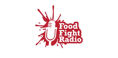
Same for this one the logo tells it all:) This logo is Load, Fun,Simple and got lot of Life its a food splash and the negative is the Radio Seeker and the text. www.prowaystudios.com
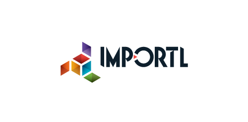
This is a logo for a completely fictitious entity named IMPORTL, which could be an open source web development site, or some type of developer software.
The idea is that the triangular facets form a series of open holes, or "portals," in multidimensional space. The central facets can also be seen to form a cube which is open on three sides. Lying before each opening is another opening on that side's respective "floor," yet, in an Escher-like paradox, where spatial orientation is an irrelevant construct, there is no floor. There is no up, down, left, right, back, or forth. This hyperspatial environment suggests infinite possibilities for the arrangement, manipulation, and exchange of data.
For color, the idea is that the primary colors that form the central cube beget the secondary colors that rotate outward, suggesting expansion, transformation, evolution.
The mark employs a custom typeface that compliments the angularity of the mark.
Click here to see the case study for this logo, which chronicles its development, and includes full design rationale, sketches, electronic roughs, and alternate designs.