
Red logos (234)
Cupcake, Bakery Logo


Logo and Brand Identity Re-design for Kerr Recruitment, England.
Customizable Ready Made Logo Design at http://eisaks.wordpress.com/2014/08/20/farenheim/
A sample logo created in Illustrator.
A logo with a bull in it. A red bull. This was just an exercise. I wanted to achieve that angular feel a lot of designers do so well. I wonder if I managed even a little bit.
It is a logo which under the brand of Cantina Lilliu. Combining the horse graphic with the letter of "B" to be the logo.
New personal logo for Steven Oosterbeek - freelance media designer and developer.
A simple logo design ideal for companies that promotes eco-friendly products and services.
Art Plus Design - The project established to help and support Czech and Slovak designers.
http://ArtPlusDesign.cz
Ranoro - modern, bold and dynamic logo / brand. Designed with custom typeface.
more at: http://RadekBlaska.com
Customizable Ready Made Logo Design http://eisaks.wordpress.com/2014/04/08/lovatrone/
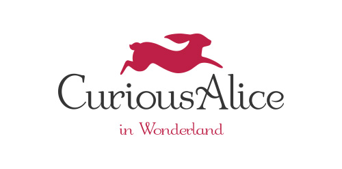
‘Curious Alice In Wonderland’ are a start-up London based business who sell erotic books and literature, as well as being a community who offer regular book clubs and events for women. The companies ethos and tagline is ‘Curious Women Unleashing Taboos. Open Talk. Friendly Events’
Although designed for a erotic led company it was essential that the logo design target professional, respectable women from the age of 24 onwards, as well as promote a trustworthy quality business with excellent customer service, providing luxury products beautifully wrapped, and delivered on time.
The decision was made to play on the white rabbit theme from the Alice in Wonderland stories. Where does the white rabbit take Curious Alice as she grows into an adult? Continuously, and playfully running ahead throughout her life. A playful, yet elegant font was crafted to compliment the icon. The final logo is presented below.
For more information visit: http://logogeek.co.uk/?portfolio=curious-alice-in-wonderland-logo-design
Mainacres Coal Company
Logo Created for a Mountain Lodge in Montana
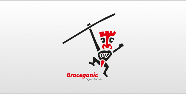
Organic Bracelets produced with materials just by the nature and given by the earth.
The logo shows a dancing aborigine.
A nice logo suitable for spa saloon, dating sites, dental, cosmetics. Could easily be adapted for singing events, evening events with singers and actors newcomers. Simple and easily reproducible.
Logo for a book publisher, especialized in suburbian literature, wich is a culture in Brazil. Rap, Hip-hop, samba, graffiti, street art, theater, etc.
Omega is a painting shop Celebrating 45 years anniversary
Logo for a cupcake outlet, startup launching soon here.
Logo for signage & stickers that mark all real discounted products in shopping Mall and encourage the clients to buy. The 'go' represents %.
Cupcake Bakery and cake decoration
Logo created for a company that focuses on Office solutions in the field of printers and multifunctionals.
To update the clients 'Boys Toys' brand using the same black, red and white colours and to appeal not just to teenage children but to juniors. The rocket was used as a retro element but also shows a moving forward toy brand to inspire imagination within children.
DJ/KJ Services
Our logo inspiration gallery will give you the creative boost you're looking for. Get your daily dose of logo design inspiration to work on your own logo design projects and get your business going. Be amazed by our logo designers and their brand guidelines. We are here to help you impress your clients and our fellow designers. Professionalize your logo design skills and get yourself to a new level. Browse our logo design gallery and discover all the new logo design trends and much more. We know you love logos!