
Science logos (38)
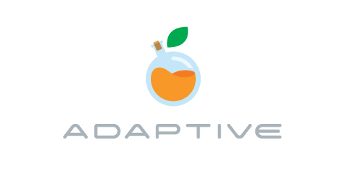
Developed for a food science orginisation, the goal is to maximise dietry intake for the purposes of weight loss, muscle growth and/or general well being. They also develop meal plans for people with food allergies. The concept; a focus on things like protein supplements, vitamins & other nutrients in their isolated forms - such as whey, the protein strain isolated from cow's milk that aides muscle development. The bottle is half full; therefore the fruit is still growing, when the chemical mixture is at its prime, the bottle will be full & the fruit complete.


Research and experimental laboratory.
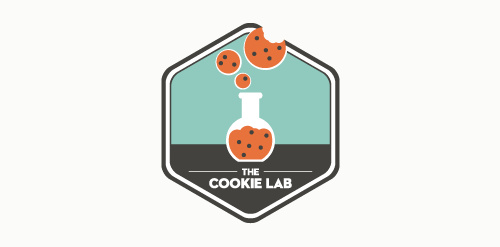
Logo design for the Boston-based bakery specializing in nerd-chic cookies.
Creative , unique and funny logo design concept perfect for Entartainement or Science based companies.
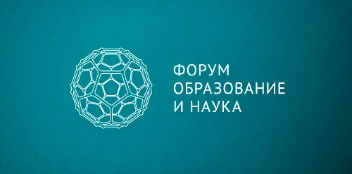
Designer: Denis Aristov Client: "Perm Fair" Exhibition Center Industry: Event, Forum Keywords: forum, science, education, molecule, structure, complex, blue
Logo design for my domain MantaLabs.com - Just one I liked a bit so wanted to share it.

Playing with negative space... White dots represent the wrists of the doors (just for those who have not noticed). It's on purpose that I have not added more details to the doors... I wanted the logo to be as minimalist as possible.
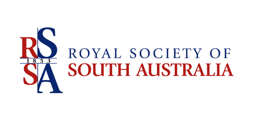
This concept is based around a simple typographical focus on the RSSA acronym. The Society’s diverse scientific interests helped to form this visual approach, ie deliberately avoiding reference to any particular field with a recognisable visual. The intention was to provide a current day sensibility regarding identity design and construction, in combination with more traditional styling for a long established scientific body. To aid this desire, a modern serif was chosen as the primary font and a secondary sans serif for the tagline versions. These fonts were chosen as a combination for their ability to convey this future/past feel. The icon structure has the added effect of allowing the reading of ‘RS’ & ‘SA’ in either direction, and utilises the Society’s formation date within the design, as it adds historical weight and relevance, plus is also a small visual indicator regarding who and what the RSSA represents.
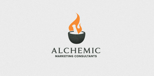
For a Marketing/PR Company. The concept behind the mark is based on the age-old alchemic practice of attempting to artificially mass produce gold by way of fusion/synthesis with other elements. Since gold has only one stable isotope (the element Au) a massive chemical reaction would need to occur to generate this isotope. There is only x3 active protons difference between Lead & Gold. They're 'chemically' different...reaction to solvents, melting temp, etc...but, if you were to extract those x3 protons from lead theoretically, you would have gold. Things like American Idol employ this 'extraction' tactic...slowly removing the unnecessary protons (contestants) till they have their 'golden result' - a season winner.
design for a group of beer brewer's.
Technology, Science, Photography, Design and Music inspiration website.
Logo for my art & design studio.
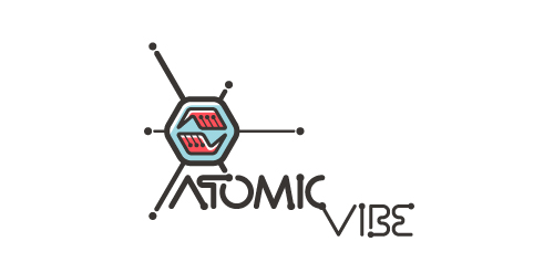
I define ATOMICvibe as the "a-HA!" moment of clarity in the creative process. Like nuclear fusion, it's when tiny ideas coalesce, and then explode into beautiful design.
The logo visually depicts this creative reaction. Forming abstract A & V shapes, the converging hands cradle the tiny beginnings of a big idea, fusing them until they discharge a shockwave of creativity. The custom type, designed to perfectly integrate with the mark, is meant to symbolize electron paths. Heavily inspired by retro imagery from the Atomic Age: science, the Space Race, Sputnik, the iconic George Nelson Ball Clock.
Click here to see the case study for this logo, which chronicles its development, and includes full design rationale, sketches, electronic roughs, and alternate designs.
technawi is a wepsite for the students of Jordan University Of Science & technology.
Scorpion venom is known for it's destructive properties, but less known for the improvement that it has brought to the pharmaceutical progress.
Our logo inspiration gallery will give you the creative boost you're looking for. Get your daily dose of logo design inspiration to work on your own logo design projects and get your business going. Be amazed by our logo designers and their brand guidelines. We are here to help you impress your clients and our fellow designers. Professionalize your logo design skills and get yourself to a new level. Browse our logo design gallery and discover all the new logo design trends and much more. We know you love logos!