
Splat logos (4)
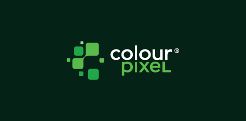
Logotype for digital advertising agency/print house. The mark is an abstract form based on "C" letter combined from pixels (digital) with spots of paint (print house). - - Follow us on www.fb.me/triptic.design -


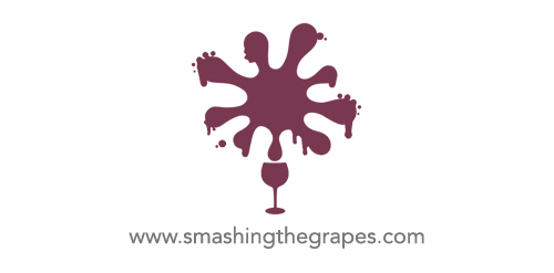
A logo for a new wine distributor
Art projects using toothbrushes.
This logo communicates a fun, playful message while presenting the “g” that makes Geoff’s name unique. The splat was created by throwing paint soaked objects at board, and scanned in to get the perfect splat. The “g” is created from the negative space to provide an aesthetically interesting symbol, while allowing this mark to be produced in a wide variety of printing and post-printing methods.
Our logo inspiration gallery will give you the creative boost you're looking for. Get your daily dose of logo design inspiration to work on your own logo design projects and get your business going. Be amazed by our logo designers and their brand guidelines. We are here to help you impress your clients and our fellow designers. Professionalize your logo design skills and get yourself to a new level. Browse our logo design gallery and discover all the new logo design trends and much more. We know you love logos!