
Sports logos (49)
ATH Sports Nutrition is a small company created by athletes to improve athletic peak performance. We use the latest research and technology to develop supplements designed for professional athletes that allow us to train harder and recover faster.


ATH Sports Nutrition is a small company created by athletes to improve athletic peak performance. We use the latest research and technology to develop supplements designed for professional athletes that allow us to train harder and recover faster.
Unused logo for Team Sports Manager App.
XS monogram
VS Monogram
Logo for company organizing sports events. Mainly engaged in the organization of running, triathlons, crosses and trails races.
SumoMania logo for Sumo Suit hiring company in Adelaide, South Australia by DivParty
This logo was created for a hockey blog that discusses the good and bad things going on in the hockey world. The logo is meant to look like a stamp and is used to grant 'TheBeautyStatus' to certain players and teams.
Designed by www.logodesigncreation.com
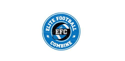
EFC is a football combine testing event for high school age players to test their physical skills. Athletes are tested in speed, agility, strength, and skill.
The letter (c) is made form a cycle chain
The brand is for a sports group that takes care of athletes in high schools and helps them improving their skills . The logo is a running man formed of the company name ,the letters (e) and (s) are forming the body , and the letter g is forming the two legs .
A logo for a line of Hockey gear and apparel.
Sports marketing that specializes in highlight videos of students playing their sport. These videos are to be sent to recruiting coaches for colleges and sports teams.
The official logo used for The National Federation of Professional Trainers.
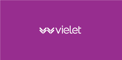
Vielet, meaning to vie for superiority, to let live and inferring the color violet, is a new women's activewear clothing brand featuring Merino wool fabrics and designs that are more feminine, stylish and fashionable.
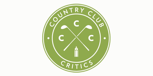
The Country Club Critics review golf courses across North America. I chose to work with the golf pencil symbol, which references the sport as well as the course grading.
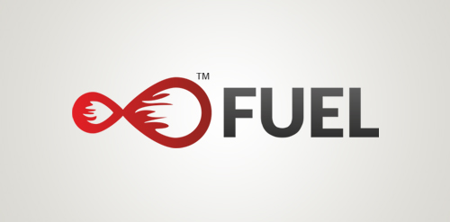
Fuel represents the combination of two distinct elements: flame and drops. The fire inside the two drops suggest the idea of infinite power and energy. This logo will empower your product or service with action. Fit best for auto industry, energy drinks, foods and beverages.
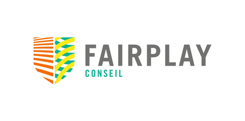
FairPlay is a sports & cultural marketing agency. We chose to design a colorful identity, that could also change and evolve. The logo consists of a shield - evoking the prestige of major sports clubs, with a left side wearing stripes (meaning fair, straight, respectful) and a right side reprensenting the "play" side: curves, meaning creativity, fun, and competition.
Sports and lifestyle dedicated portal in London, Totallysportsinlondon comes in a 60-page bimonthly magazine, a website and travel offers to the British capital. Brand Brothers was given the visual identity, print and web art direction of the the brand and started a graphic so british and dandy.
Logo for a Dutch wakeskating team.. © Gert van Duinen | cresk design
Logo for Highplay
For a Design/Photography studio focused in College sports!
Our logo inspiration gallery will give you the creative boost you're looking for. Get your daily dose of logo design inspiration to work on your own logo design projects and get your business going. Be amazed by our logo designers and their brand guidelines. We are here to help you impress your clients and our fellow designers. Professionalize your logo design skills and get yourself to a new level. Browse our logo design gallery and discover all the new logo design trends and much more. We know you love logos!