
Sun logos (82)
.


A park theme.
:)

A logo for one of my start-ups.
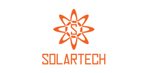
Solartech is best for business and company that uses solar energy.
.
New accounting firm, client wanted a minimal rising sun.
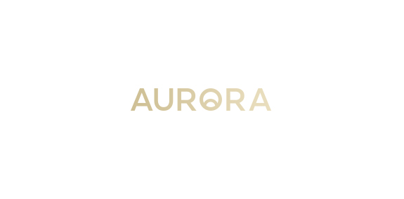
AURORA is a brand that design and manufacture handmade scent candles. With a mission to fulfill and inspire people life's with a happiness and calmness. Idea was to design a logo that is simple and iconic. A logo that reflects their brand. Visually and emotionally warm, evoking experience of life. The iconic O letter presents rising sun ( the dawn ).
Just for fun
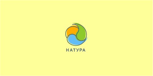
Натура (Nature) logo
Brand development services for entrepreneurs and small businesses. Client request for the symbol was "Sun breaking out from the center of the earth".
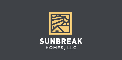
Sunbreak Homes, LLC is real estate company. They buy homes that need work, fix them up to make them beautiful, then list them for sale. The name of Sunbreak Homes was chosen for a special reason. They are based in Seattle, WA, where it rains all the time. So, when the sun does decide to come out from behind the clouds, everybody gets excited. It's called a "sunbreak". The imagery I had in mind for the logo is to somehow incorporate the sun's rays breaking through the clouds, keeping it simple and memorable.
Copyright © 2014 Marius Fechete
Sundial Concept Typo
A project for a travel agency NINJA travel "Japanese sun"
Music Label The harmony of the simple shapes used, the color chosen, makes clear and direct the concept behind the brand: the union of the sun, represented by a flame, more, the empty spaces game of the treble clef.
Ready made logo design.
Ready made logo design.
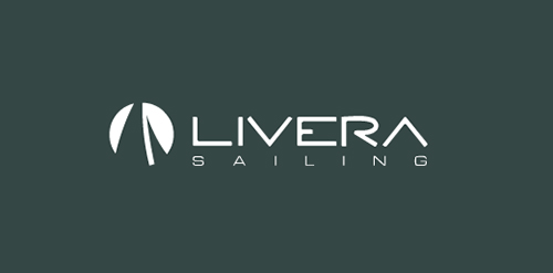
Logo for sailing site. www.livera.it
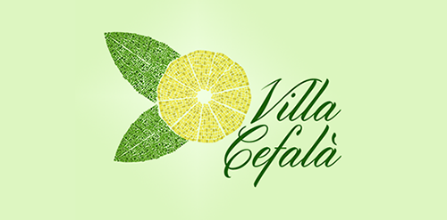
Tenuta Villa Cefalà is an awsome agriturismo (which is like a luxury hotel in the middle of a farm) close to the city of Palermo. It is a place of great history becouse it is a very ancient farm and there is a huge mosaic by the entrance. From every room or apartament they rent you can see their citrus and olives grove. I wanted to play with the old logo (you can see it becouse it's still online but not for so long) making it epic. From every room of this luxury hotel you can see the citrus and olives grove so I thought it was important as for their business as a recall of the land in which this awsome place is (cirturs and olives are very common in Sicily). When I went visiting the site I was amazed by the mosaic near the entrance so I choose to take those two important part of their business and mixing them; the client appreciated very much the idea even if he suggested me a different road to take.
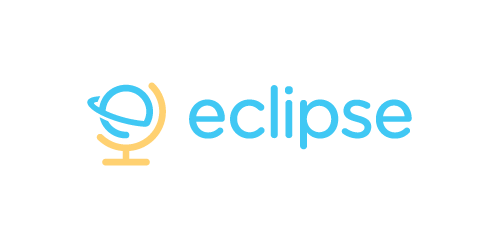
Eclipse offer specialist training software - mostly linguistic, but also teachings on grammar, syntax, etc. The use of the globe device reinforces the idea that language & communication is a ‘global’ exercise. Conceptually the design is of course inspired by a globe on its axis/stand. Since the idea of the eclipse is not necessary representative of solar or lunar, the mark focuses on how eclipses are created, orbit – The precise moment the Earth/Moon orbit is in relation to the Sun. The planet also forming an abstract E, creating a subtle monogram.
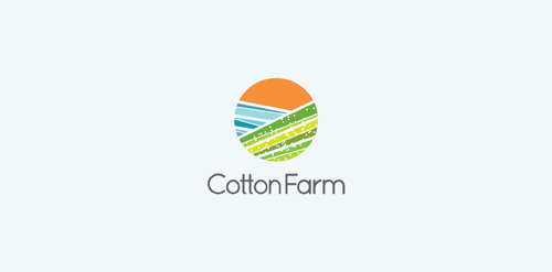
Unused proposal for an Australian Cotton Farm. The logomark represents cotton fields and the textile industry.
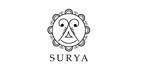
Just for fun. Surya = Sun
Logo concept for Canadian Home Builder project
Our logo inspiration gallery will give you the creative boost you're looking for. Get your daily dose of logo design inspiration to work on your own logo design projects and get your business going. Be amazed by our logo designers and their brand guidelines. We are here to help you impress your clients and our fellow designers. Professionalize your logo design skills and get yourself to a new level. Browse our logo design gallery and discover all the new logo design trends and much more. We know you love logos!