
Tower logos (15)
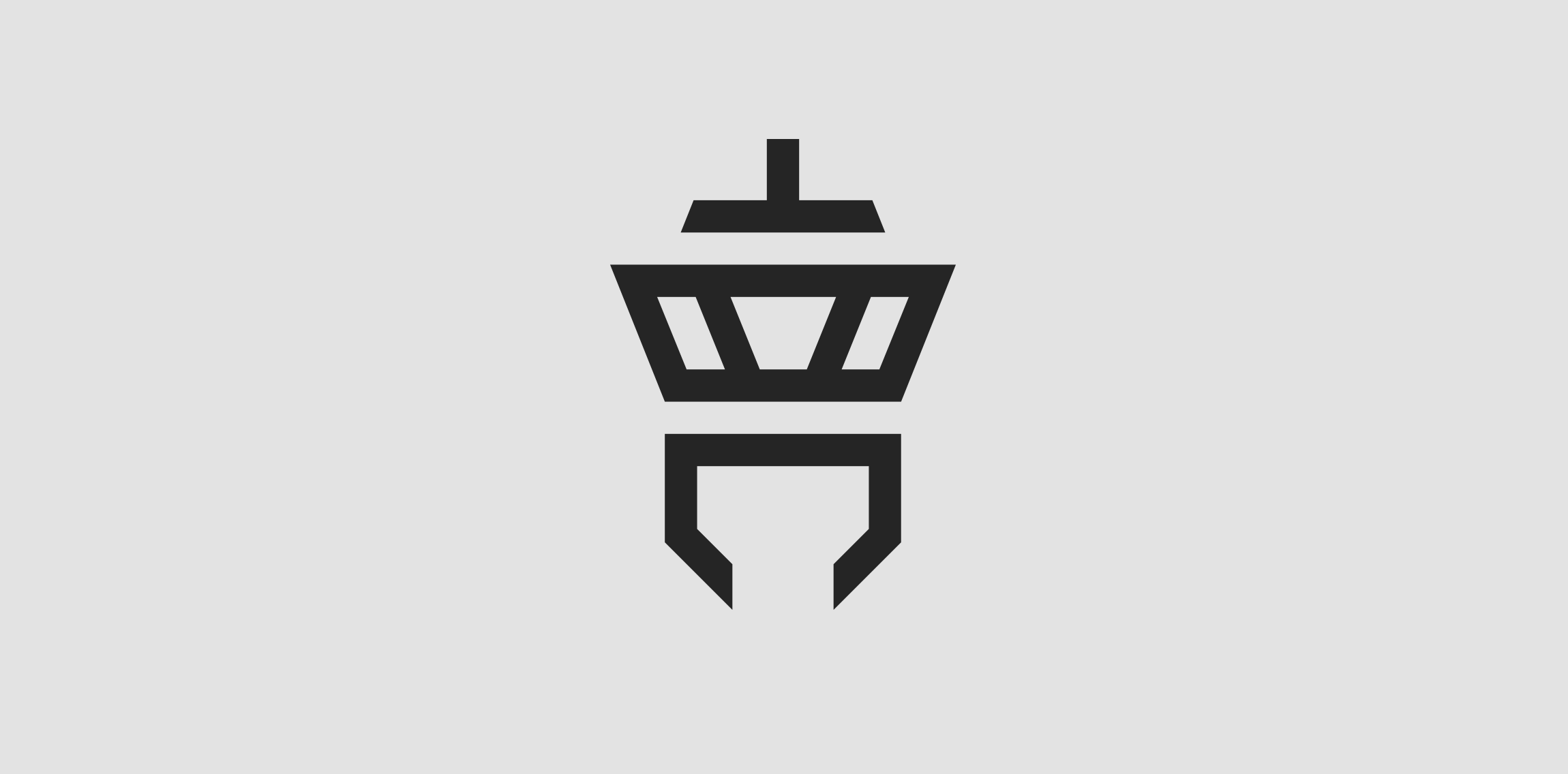
Client: Tower Communication The customer‘s wish was to have an abstract depiction of an airport tower in the logo. The antenna of the tower is an upside down T (for “Tower“) and the lower area is a downwardly open C (for “Communication“).


A logo for construction company called Borooj which means towers in Arabic
Some experiment about verbicon, i hope you like :)

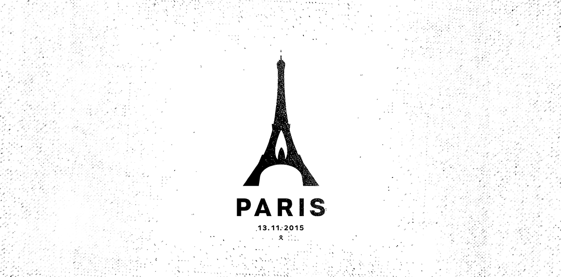
Paris 13. 11. 2015
Custom letters created for marketing company. "K" letter has incorporated a rook/tower shape which refers to "protect the King" idea. • • • Follow us on www.instagram.com/triptic.pl
audio systems
Full service agency specialized in branding, marketing strategies, PR, campaigns, events and more. They combine creative thinking with strategic approach.
Design logo for a music store.
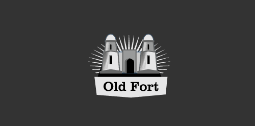
It's a logo inspired by a famous fort called 'Hissar Fort' in Tajikistan.
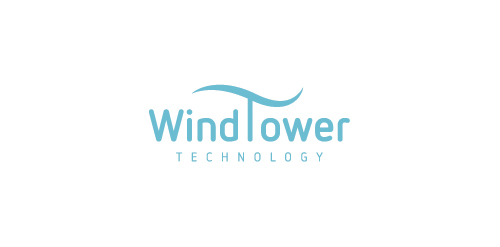
company logo to harnessing wind resources
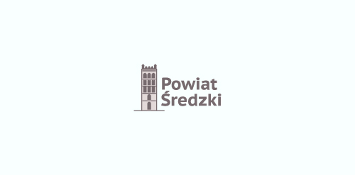
another concept for the Powiat Sredzki - region in Poland - showing a gothic tower - a part of a great church complex in the region.
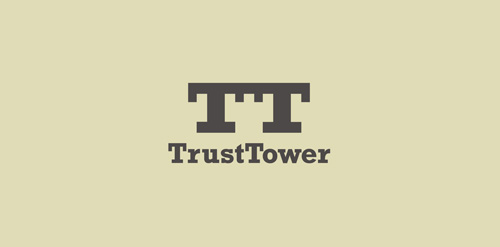
Two "T" connected with tower in negative space.
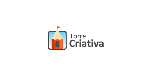
Brand test designed for Torre Criativa (Creative Tower, in English), a small Design Agency in Brasil. The logo is a pencil with a medieval window (like a princess tower) and a flag (point of the pencil) on the wood roof. The colors are sugestive, but the blue color inside the rounded square representing the sky, causing to appear high tower as well as the level of creativity.
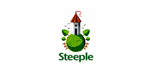
Logo for an an online estate agency called steeple - client work
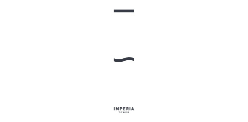
Imperia Tower | one of the Moscow City skyscrapers (unused proposal)
Made for Nile studio
Our logo inspiration gallery will give you the creative boost you're looking for. Get your daily dose of logo design inspiration to work on your own logo design projects and get your business going. Be amazed by our logo designers and their brand guidelines. We are here to help you impress your clients and our fellow designers. Professionalize your logo design skills and get yourself to a new level. Browse our logo design gallery and discover all the new logo design trends and much more. We know you love logos!