Typeface logos (38)
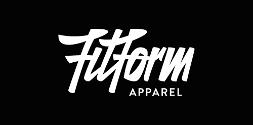
New logotype/custom lettering for a clothing company based in Australia!


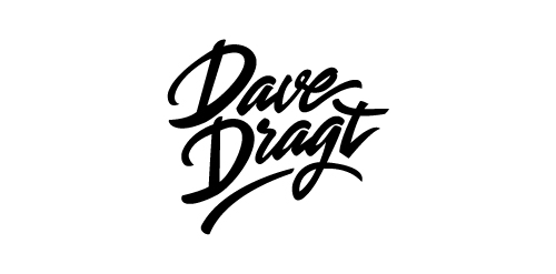
Personal brush Logotype for Dave Dragt

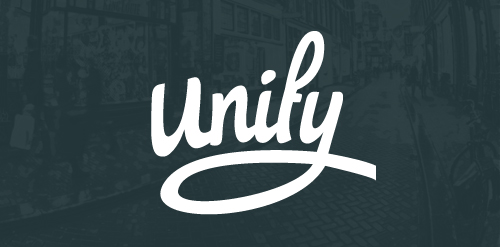
The new identity of Unify, which is a graphic design and development studio based in the Netherlands. The aim of the logo was to make it personal and strong, a logo which really stand out!
http://dribbble.com/shots/1386788-Unify-Logotype

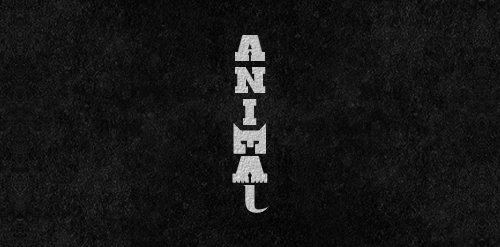
This is logo for website that is helping to correct typefaces, find names of fonts, etc.
Self logo and identity of my face.
Letters 'M', 'A' used to form the animal and 'L' for its tail...
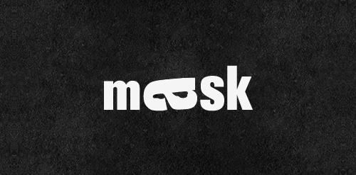
Mask | Playing With Type. Rotation of the letter "a" to form the mask (for those who have not noticed)
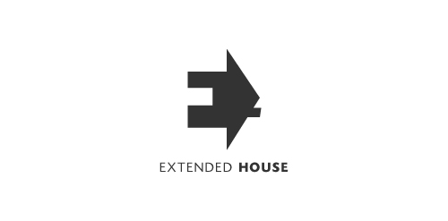
Extended House. Negative space used for the letter E. The house serves as a perspective to this letter E.

A concept given for lovers community..
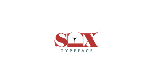
Sex Typeface Logo