
Logo inspiration
Inspirational logos
Ray Cheung is web designer As his mark I made RC monogram (Letter c in negative space) and I think that both R and C letters are quite well visible isn't it? :)


A logo for productions company.
Logo for music portal
https://www.behance.net/gallery/31088181/ADRIFT This brand has as strategic goal, to represent and communicate through a set of visual signs or identifiers the prestigious shop Adrift. It intends to position itself among the top 5 five best brands in the world, represented by the quality of its products and the personalized attention. Transmitting a concept of constant growth and innovation to thus become unique.
Bowling club logo.
bird
Hand lettered approach on the word "Hashtag" with a smart incorporation of the "#" symbol.
Fresh Fruits
Wallen logo
logo for horizon on and on, italy
Wedding Agency
Gurmella is a bakery, specializing in French and European pastries, bread, baguettes, croissants, french dessert, and all sorts of goodies.
Logo prepared for a logo competition for a small town in mountainous region. Hills are stylized into letter U for the name of the town.
for panoramic wiew project.
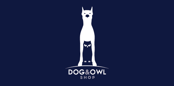
Dog and Owl shop logo design. Owl is below the dog.
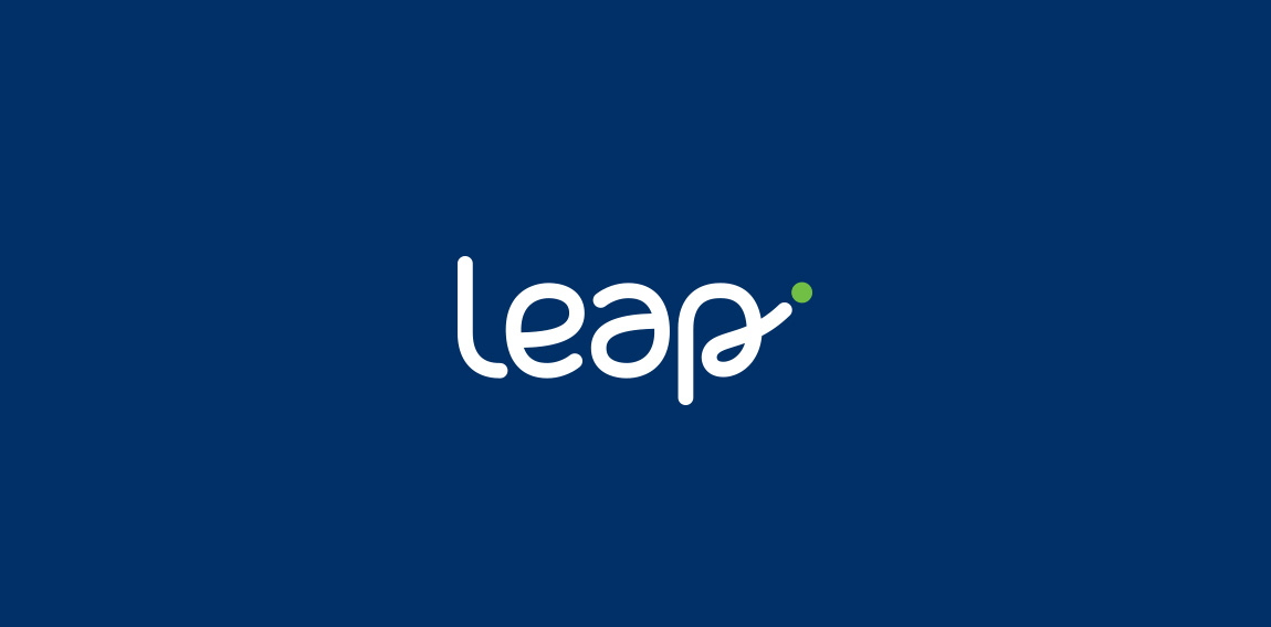
Proposed concept for Leap - A community controlled credit union that provides better service than traditional banking. Main target: “Gen-Y” group.
Krystian Prorok - Personal Logo
☆ HONORS ☆

-
shtef-sokolovich
190 logos
-
Boldflower Design Studio
189 logos
-
Ailton Marques
115 logos
-
Light Rainer
114 logos
-
Alek • Triptic.pl
107 logos
-
almosh82
96 logos
-
sadany
96 logos
-
Duminda Perera
93 logos
-
pizelato™
91 logos
-
Aleksandar
91 logos

Recent comments
حسین:
please send me...
chirag_j:
Hello is the above issue resolved?...
mrgraphics:
great logo...
Aleksandar:
Thank you Gile!...
fraGile:
Thanks a lot!...
Marko Bulatovic:
Great work!...
Popular tags
Our logo inspiration gallery will give you the creative boost you're looking for. Get your daily dose of logo design inspiration to work on your own logo design projects and get your business going. Be amazed by our logo designers and their brand guidelines. We are here to help you impress your clients and our fellow designers. Professionalize your logo design skills and get yourself to a new level. Browse our logo design gallery and discover all the new logo design trends and much more. We know you love logos!