
Center logos (29)
Afaq (Horizons)
Education and Training Center


Initial logo for an online blog helping people focus on the things they can control.
INTEX is a leader in the automation systems training market, working uninterruptedly since 1993.
Scope of our work was complete rebranding of visual identification, including among other new logo and key visual design, photo session, website design and customer panel design.
Our cooperation resulted in consistent and strong corporate identity, which allows to easily communicate with the customer and what is also important it distinguished company from the competition.

https://www.behance.net/gallery/7960947/Centro-Psicosocial-Estar-en-Camino-branding Hospital Escuela de Salud Mental, Dr. Carlos Pereyra, diseño de branding realizado en el año 2011 para un Programa destinado a la reahabilitación de pacientes que padecen patología psiquiátrica crónica

A nucleus symbolises as the center of all things in the universe. For Nucleus Financial, the central core value is the customer's wealth and welfare. The company will not stop until it gives the best output to help achieve financial stability and growth of each of it's clients.
Logo para um centro automotivo especializado em troca de óleo
designed for english learning course at specialized centers
A logo for an iranian game reviews. The logo is a typography of the word "BaziCenter" in Persian. ("Bazi" means "Game" in Persian)
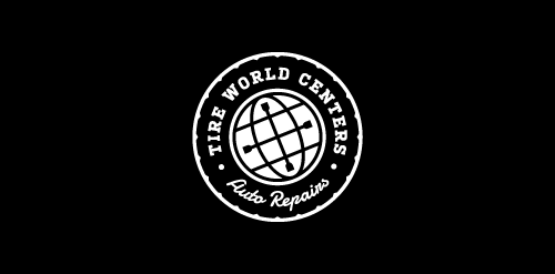
Unused concept for Colorado Sping based car repair shop. - - - Logotype is a combination of tire (their main profession), globe angled about 22.1° (inclination angle of the earth) with tire wrench incorporated in it to make mark more dynamic. - - Follow us on www.fb.me/triptic.design -
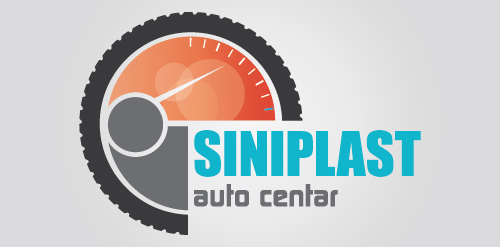
Logo for auto center
Ready made logo design.
The city of Torcy, France recently built a great complex dedicated to the promotion of Culture & Arts, highlighting local and national artists. I was contacted to work on its complete Brand Identity, including Naming, Logotype, visual identity, Print communication, exterior & interior signage, website design and clothing.
The main goal was to create a total new and innovative identity. Naming took a great part in that sense. I focused on trying to create a simple yet effective name for that building. C2 was chosen from a couple of hundred names for its international recognition, pronunciation and readibility. It stands simply for Cultural Center or the two initials 2xC -> C2.
As far as the logo is concerned, it followed in a logical way the naming process. A will to create a modern and contemporary logotype, yet efficient, minimal, powerful and durable. It was created so it could nicely fit and be readable at a great or tiny size on any document. The logotype guidelines show a slight dipping of the « C » and the « . » to create the optical illusion that all characters are aligned on the same baseline.
logo designed for social welfare center
Logo for a aviation formations center.
Project for competition.
Designer: Denis Aristov Client: «Пермский краевой перинатальный центр»(The Perinatal Center of Perm Region) Keywords: Perm, perinatal, center, hospital, clinic, medicine, baby, head, flowers, Children are flowers of life
Designer: Denis Aristov Client: Meridian Iindustry: Business Center Keywords: meridian, business, center, blue, globe, sphere
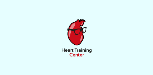
Another concept made for the team of cardio doctors. Wanted to make this one bit different form a pack of quite formal ones since those doctors are around 30.
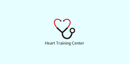
A concept made for a team of cardio doctors.
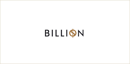
Designer: Denis Aristov Client: Sweden Group Industry: Business Center Keywords: billion, $, business, center
logo for arts education program for children
beauty center logo proposition - not kept ;)
Logo for Center Dr. Sauta. It is a drug rehab center. This is a non-governmental public organization. The center helps people get rid of the dependency problems.
Center of automation - is the use of information technologies to reduce the need for human work.
Our logo inspiration gallery will give you the creative boost you're looking for. Get your daily dose of logo design inspiration to work on your own logo design projects and get your business going. Be amazed by our logo designers and their brand guidelines. We are here to help you impress your clients and our fellow designers. Professionalize your logo design skills and get yourself to a new level. Browse our logo design gallery and discover all the new logo design trends and much more. We know you love logos!