
Logo inspiration
Inspirational logos


Hand-lettered logo design for Rooster Guitars. Designed by: www.studioefficio.com
Isaac Bear Bearhawks athletic logo. Developed as an upside down triangle and using the golden mean for placement and cause Bearhawks are awesome.

Acid Animation: creating movies

A human zippper, connecting little people, bringing them closer together.

A friendly and fun Buddha surfing the internet. Available for sale

CAR DASHBOARD APP
Croquis web design
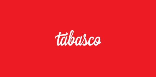
The logotype is custom made to give that unique and stylish feeling. Tabasco comes from the hot pepper, hence the color of the logo.
Dog Treats and Food
.
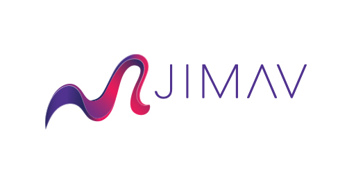
The identity of the builder JIMAV is based on the inspiration that we had with organic architecture. With curved forms we achieved a symbol with plenty life, which is balanced with a simple, legible and solid typography. The logo is a form developed with the approach of the letter “J” of Jiménez and the letter “A”of Avelar, which compound the name of the builder JIMAV. We developed a variety of the logo’s versions and compositions for the use in different applications and to make easier it’s reproduction.
Some experiment about verbicon, i hope you like :)
house wood
Czech Jewellery
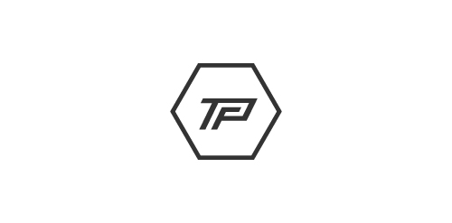
The Peoples Fitness is a website providing information, articles and advice for fitness and gym users. The concept was a monogram of the letters 'T,P & F'.

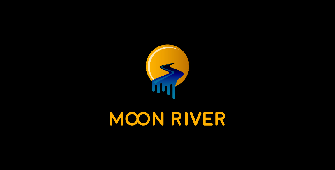
Moon river, wider than a mile I'm crossing you in style some day Oh, dream maker, you heart breaker Wherever you're going, I'm going your way..
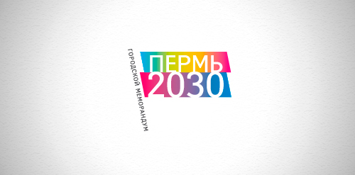
Designer: Denis Aristov Client: The Government of Perm Region Industry: Event, Non-profit Keywords: Perm City, memorandum, flag, spectral, gradient, sans, typographic, dynamic, leadership
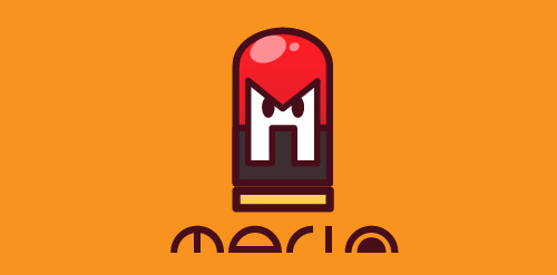
Logo I made for myself. Head of a robot that resemble its shape to a pencil eraser. The letter "M" taken from the first letter of the name "Mario"
☆ HONORS ☆

-
shtef-sokolovich
190 logos
-
Boldflower Design Studio
189 logos
-
Ailton Marques
115 logos
-
Light Rainer
114 logos
-
Alek • Triptic.pl
107 logos
-
almosh82
96 logos
-
sadany
96 logos
-
Duminda Perera
93 logos
-
pizelato™
91 logos
-
Aleksandar
91 logos

Recent comments
حسین:
please send me...
chirag_j:
Hello is the above issue resolved?...
mrgraphics:
great logo...
Aleksandar:
Thank you Gile!...
fraGile:
Thanks a lot!...
Marko Bulatovic:
Great work!...
Popular tags
Our logo inspiration gallery will give you the creative boost you're looking for. Get your daily dose of logo design inspiration to work on your own logo design projects and get your business going. Be amazed by our logo designers and their brand guidelines. We are here to help you impress your clients and our fellow designers. Professionalize your logo design skills and get yourself to a new level. Browse our logo design gallery and discover all the new logo design trends and much more. We know you love logos!