Interested in this domain and website? Contact [email protected]

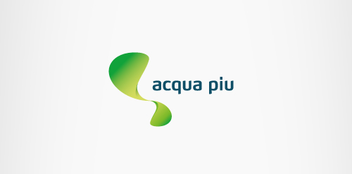
Acqua Piu
Acqua Piu


- Get unique ready made logos for $99.99
- Logo design for a company, focussing on saving water and energy, based in Belgium.
- Submitted: 04/23/2013 • Featured: 05/12/2013
- Stats: This logo design has 5833 views and is 0 times added to someone's favorites. It has 7 votes with an average of 3.57 out of 5.
Designer
Comments: 3
Leave a Reply
Our logo inspiration gallery will give you the creative boost you're looking for. Get your daily dose of logo design inspiration to work on your own logo design projects and get your business going. Be amazed by our logo designers and their brand guidelines. We are here to help you impress your clients and our fellow designers. Professionalize your logo design skills and get yourself to a new level. Browse our logo design gallery and discover all the new logo design trends and much more. We know you love logos!
One of few logos where a gradient looks great, very nice!
ReplyThanks for the comment, totally agree with you! I think in this case the gradient helps the logo being ‘liquid’.
ReplyBy the way, you can check some more details of this identity project on my Behance: http://www.behance.net/gallery/Acqua-Piu/8316753
Reply