Interested in this domain and website? Contact [email protected]

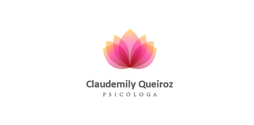
Claudemily Queiroz
Claudemily Queiroz


- Get unique ready made logos for $99.99
- Designed for Claudemily Queiroz, Psychologist in Brazil in 2011
- Submitted: 05/12/2011 • Featured: 05/23/2011
- Stats: This logo design has 6689 views and is 0 times added to someone's favorites. It has 4 votes with an average of 3.50 out of 5.
Designer
Comments: 6
Leave a Reply


Our logo inspiration gallery will give you the creative boost you're looking for. Get your daily dose of logo design inspiration to work on your own logo design projects and get your business going. Be amazed by our logo designers and their brand guidelines. We are here to help you impress your clients and our fellow designers. Professionalize your logo design skills and get yourself to a new level. Browse our logo design gallery and discover all the new logo design trends and much more. We know you love logos!
I love this. Nice work.
I’ve noticed the trend to do logos like this. I’d like to know how this (and others like this) can be reproduced in one color.
I’m not picking on you per se, just wondering about this type of logo in general.
ReplyAt first,
thanks for your comment!
to reproduce this logo, in this case,
it will be necessary to use three colors: yelow, pink and red.
However,
to obtain this result,
this logo has been created in “Alpha Chanel”,
with transparence (75% or 50% depending).
For more,
Replysend-me a mail!
Very nice!
ReplyThank you!
ReplyCOOL.
ReplyThanks!
Reply